Find a Band is an online platform where people can find musicians to perform at their events; such as weddings, birthday parties or alike.
The app offers a wide range of music bands and solo performers of different pricing levels.

My role
UX Design & Research
Leading the dedicated mobile app design from conception to delivery.

Timeline
Jul ’22 – Oct ’22
Case study, Google UXD
Certificate Program

Tools
Pen & Paper
Figma
Photoshop
Office Suite
OVERVIEW
The Problem
Lack of tools to find and compare music performers for special events.
The Goal
Design an app that allows users to easily find, compare and book musicians fitting to their needs and interests.
Responsibilities
Conducting interviews, paper and digital wireframing,
low and high-fidelity prototyping, conducting usability studies,
accounting for accessibility, and iterating on designs.
Methods
Interviews
Empathy Maps
Personas
User Stories
Problem Statements
User Journey Maps
Competitive Audits
User Studies
Research data *
I carried out the Find a Band project with 5 participants in total.
Interviews
5 participants, incl. a performing musician
around an hour in total
User Studies
10 test runs with 5 distinct users
over 6 hours in total
(40% covers Lo-Fi, 60% Hi-Fi)
* I believe in quality > quantity! These digits are only indicative for those who are not involved in these projects.
They are raw amounts of the sessions too, so in fact I spent far more time than mentioned.
PROJECT IN DETAIL
Problem
People who are in need of finding musicians for any event don’t have a direct link with the performers. They use social media to get in touch or simply search on Google to reach them.
People who want to hold an event in a hall are mostly compelled to hire the musicians who are linked to that event hall. Therefore their options are limited. This approach became common for wedding organizations.
There are very few apps on the market to serve this need. The most popular ones are built on the existing relationships between the hall owners and their musicians. Performers who are not linked to any place are limited.
Audience
People who want to hire musicians.
Musicians who want to perform for events.
Constraints
The design solution must be on a mobile app.
Deliverables
High-fidelity prototype in Figma.
Research
Audit
- Mobile apps and websites of similar hiring platforms.
- Mobile apps of booking agencies.
Interview
- Users who are in need of hiring musicians.
- Musicians who perform live.
UNDERSTANDING THE USER
User Research: Summary
I defined my research goals and conducted interviews. I created empathy maps to understand the users I’m designing for and their needs. A primary user group identified through research was working young adults who have difficulties finding music performers for their events.
Interviews: The Content
I interviewed with 5 people to understand how they find musicians when they are in need of or what they do if they can’t reach them out. Asking people stood out as the dominating path.
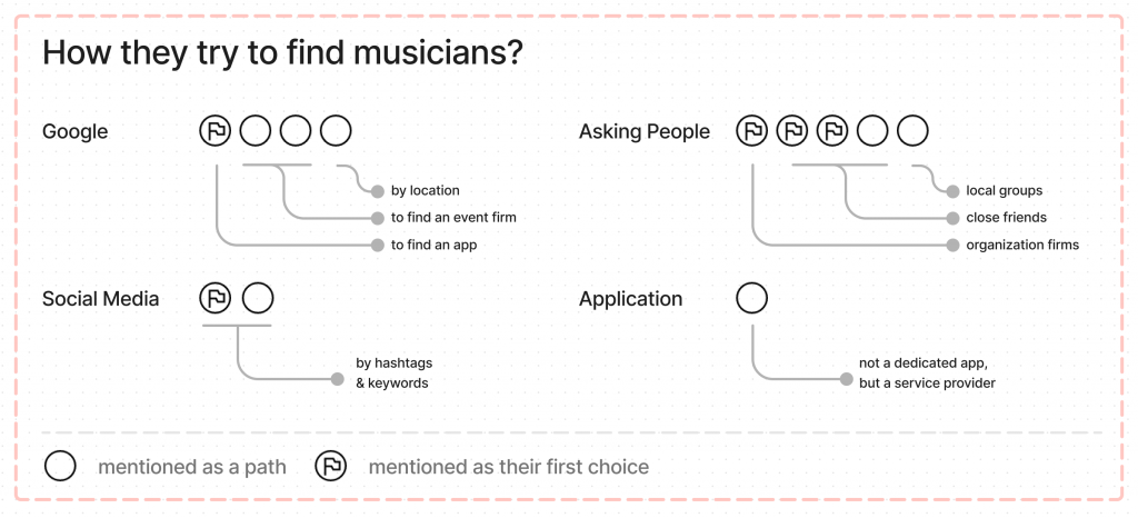
The research revealed that the lack of connection was not the only factor limiting users from finding and choosing musicians. Other user problems included personal interests, the performing history of the bands, or comments from other customers that make it more complicated to find the best suited music performers for their special events.
Target Users’ Pain Points
Connections
Lack of tools to book the music performers
Community
Social platforms for finding musicians are rare
Content
Samples, history and ratings don’t come as a set
Personas
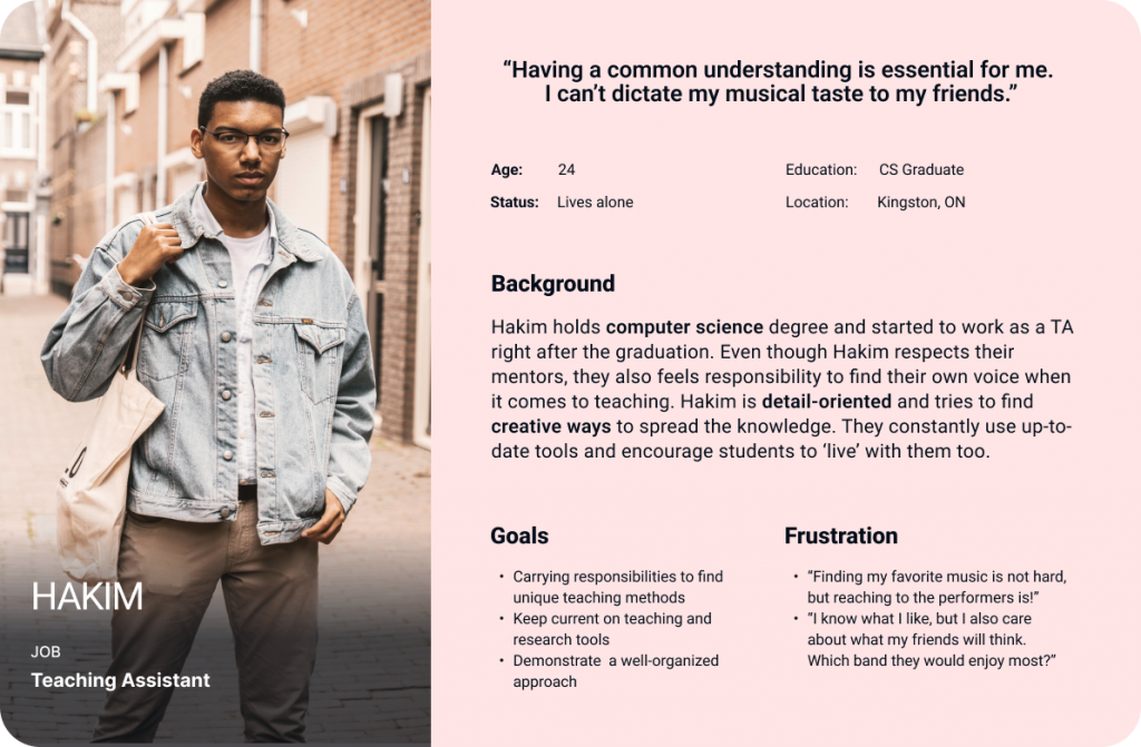
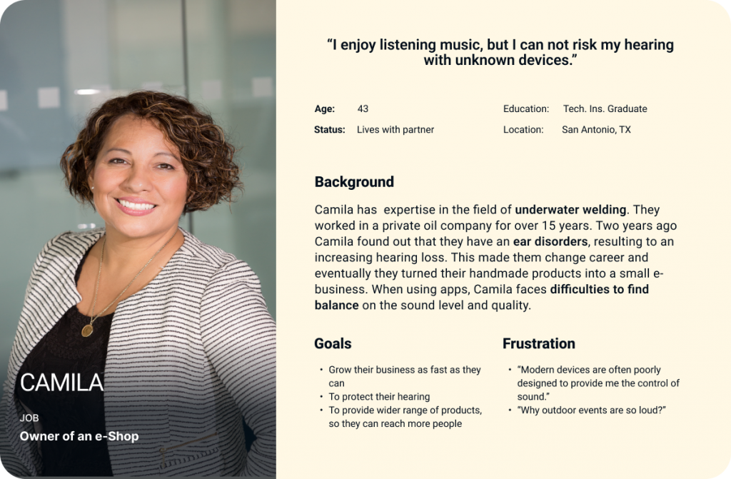
Based on the insights from user interviews I created two personas.
Persona: Hakim
Problem Statement
Hakim is an enthusiastic TA, who needs to find music performers fitting their taste and guests’ interest, because they want to be sure that everyone will enjoy the celebration of their wedding.
Persona: Camila
User Journey Map
Goal: Book musicians for your upcoming wedding and invite your friends.
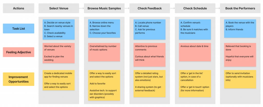
Mapping Hakim’s user journey revealed how helpful it would be for users to have access to a dedicated Find a Band app.
STARTING THE DESIGN
Early Sketches: Paper Wireframes
Taking the time to draft iterations of each screen of the app on paper ensured that the elements which made it to digital wireframes would be well-suited to address user pain points.
I prioritized the following issues for the specified screens:
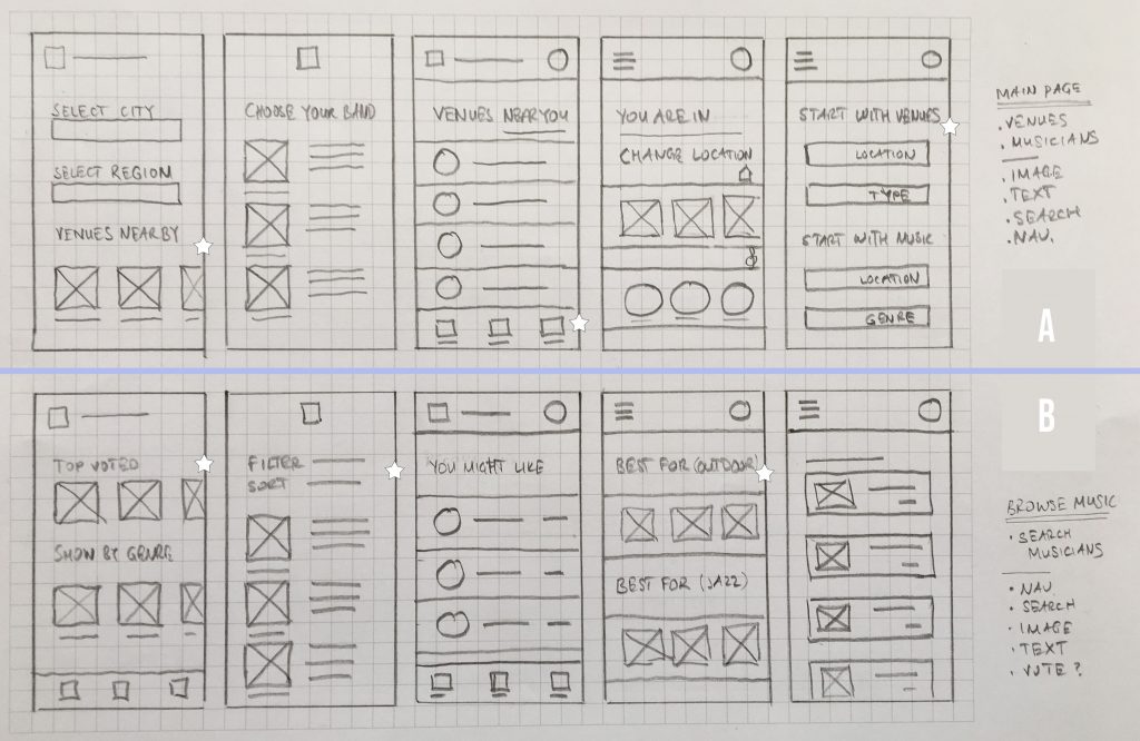
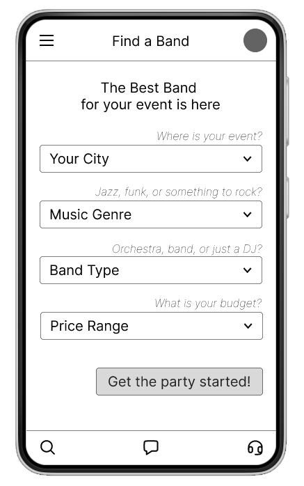
🅐 Home Page
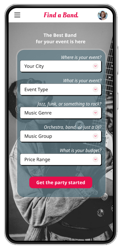
A quick and easy search process to help users save time.
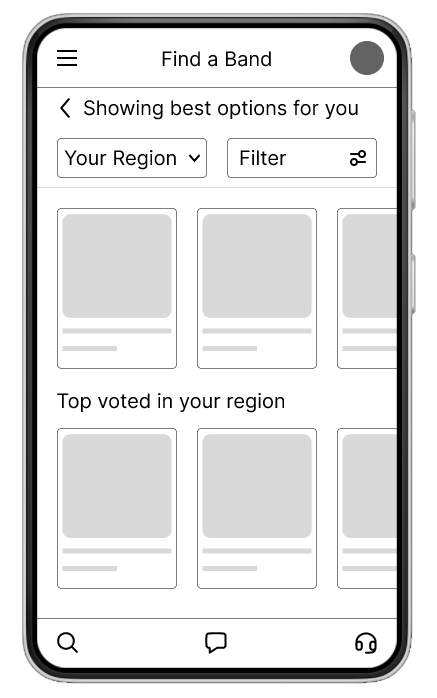
🅑 Browsing Musicians
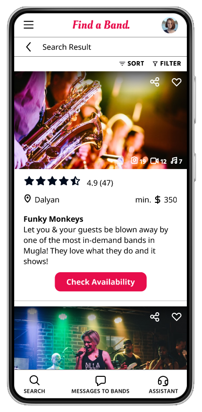
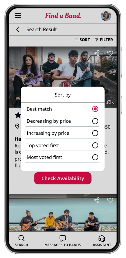
An organized search-based sorting to help users narrow down their options.
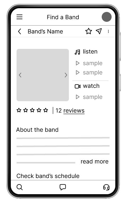
🅒 Musician’s Profile Page
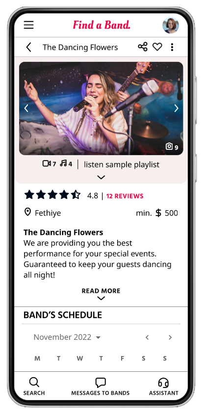
A review section up and front to help users give the hint.
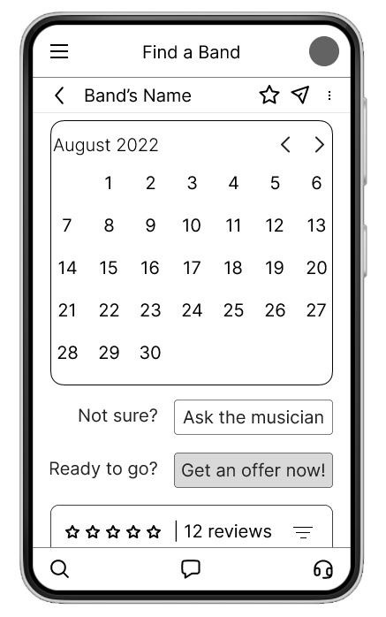
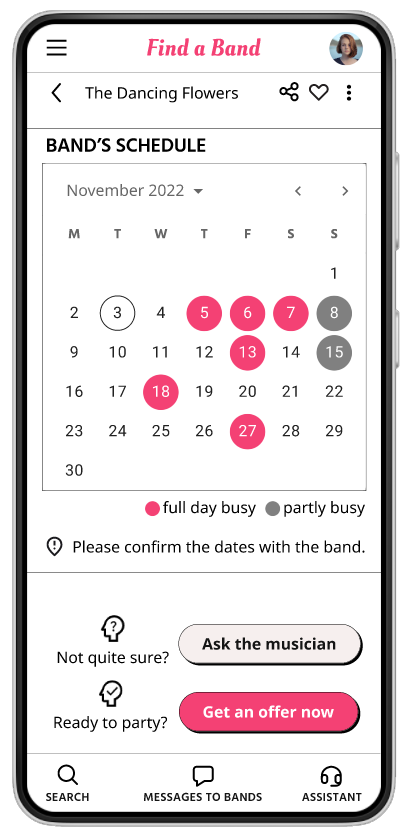
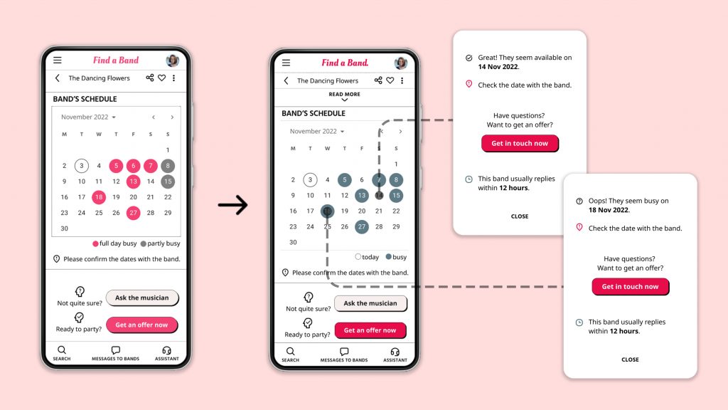
🅓 Calendar View
To easily check the band’s schedule.
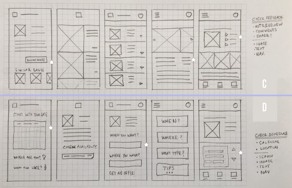
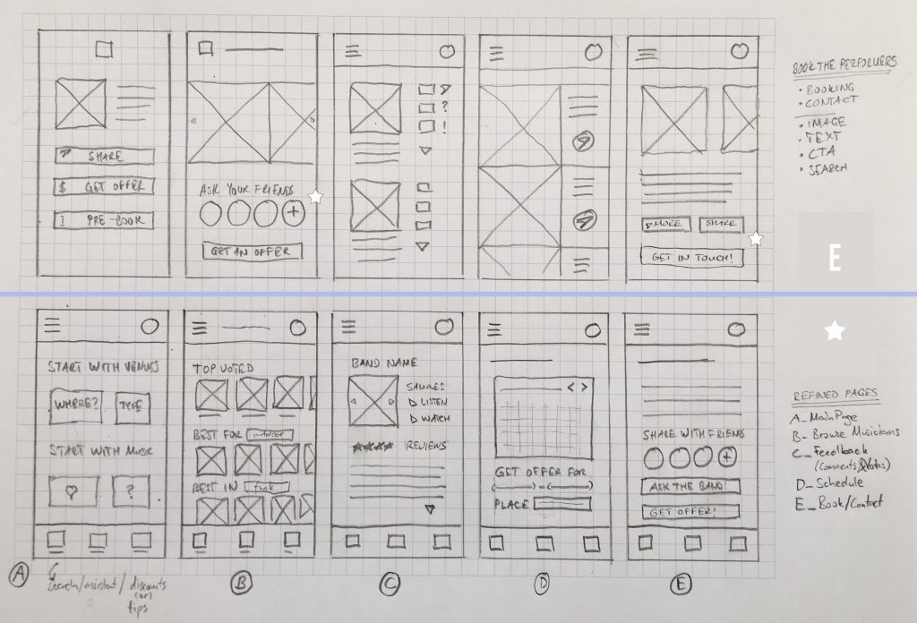
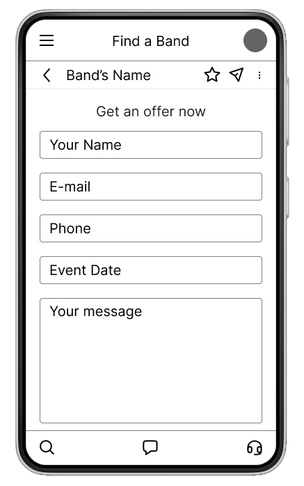
🅔 Sharing Section
To get feedback before booking the musicians.
✪ Stars were used to mark the elements of each sketch
that would be considered in the initial digital wireframes.
Digital Wireframes
As the initial design phase continued, I made sure to base screen designs on feedback and findings from the user research.
Low-fidelity Prototype
I studied a whole user flow, following the tasks below:
❶ Define your criteria
❷ Narrow down the options
❸ Check the band’s songs and feedback from previous customers
❹ Ask your friends about the band
❺ Get in touch with the band
Usability Studies (Lo-Fi): Parameters
Study type:
Moderated usability study
Participants:
5 Participants
Location:
International, remote
Length:
20-30 minutes
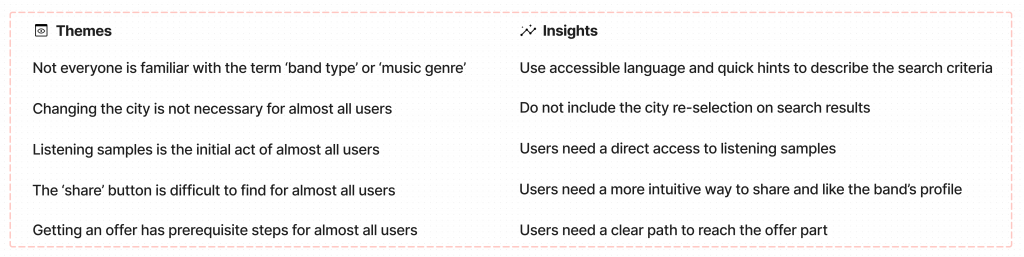
Usability Studies: Findings
After analyzing the results, I created an affinity map to be able to come up with insights. These were the main findings uncovered by the usability study:
Access
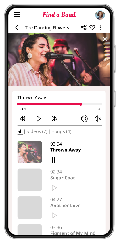
Users want to listen to samples quickly
Actions
Users want to easily share and like
Browse
Users want a smooth path till getting an offer part
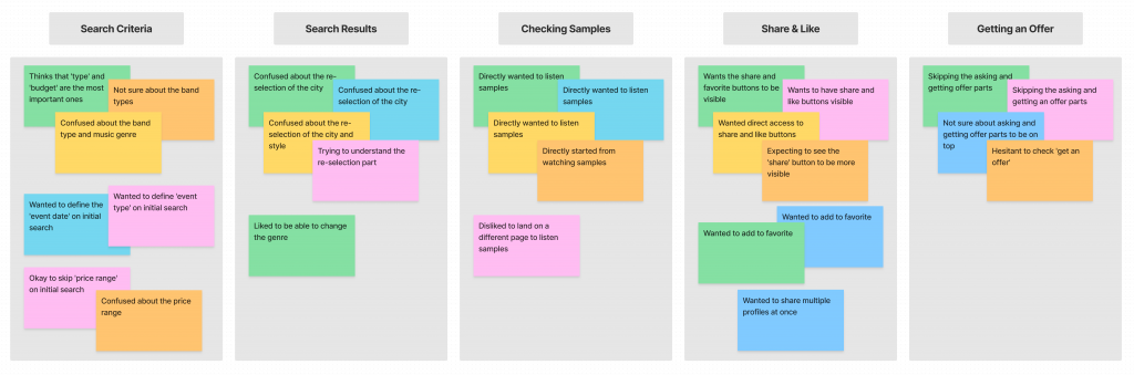
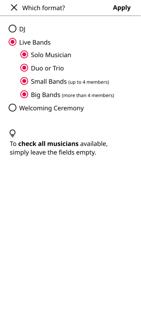
Musical terms and the selection process were the main confusions for the users.
REFINING THE DESIGN
Mockups
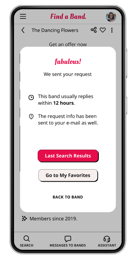
Early designs allowed for some customization, but after the usability studies, I provided an instant access to play sample lists, and moved the asking the band and getting a quote parts down below, as they were the last step of all users’ flows.
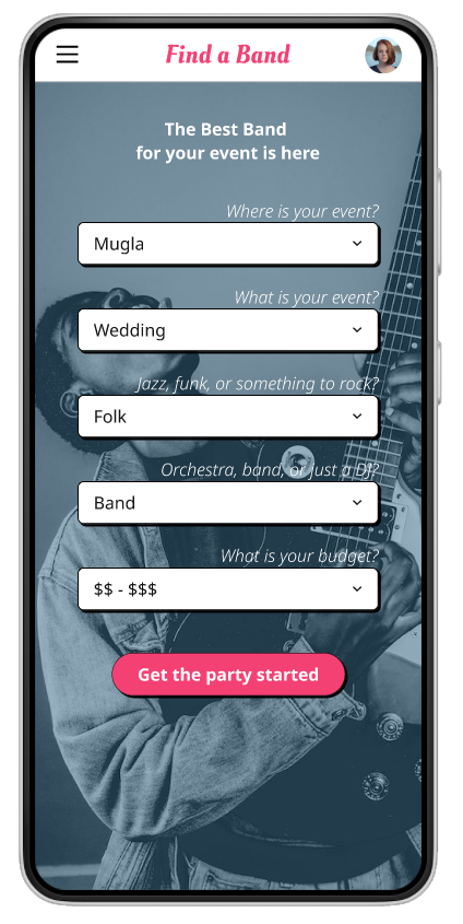
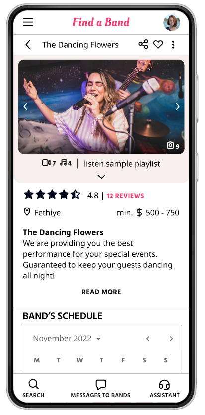
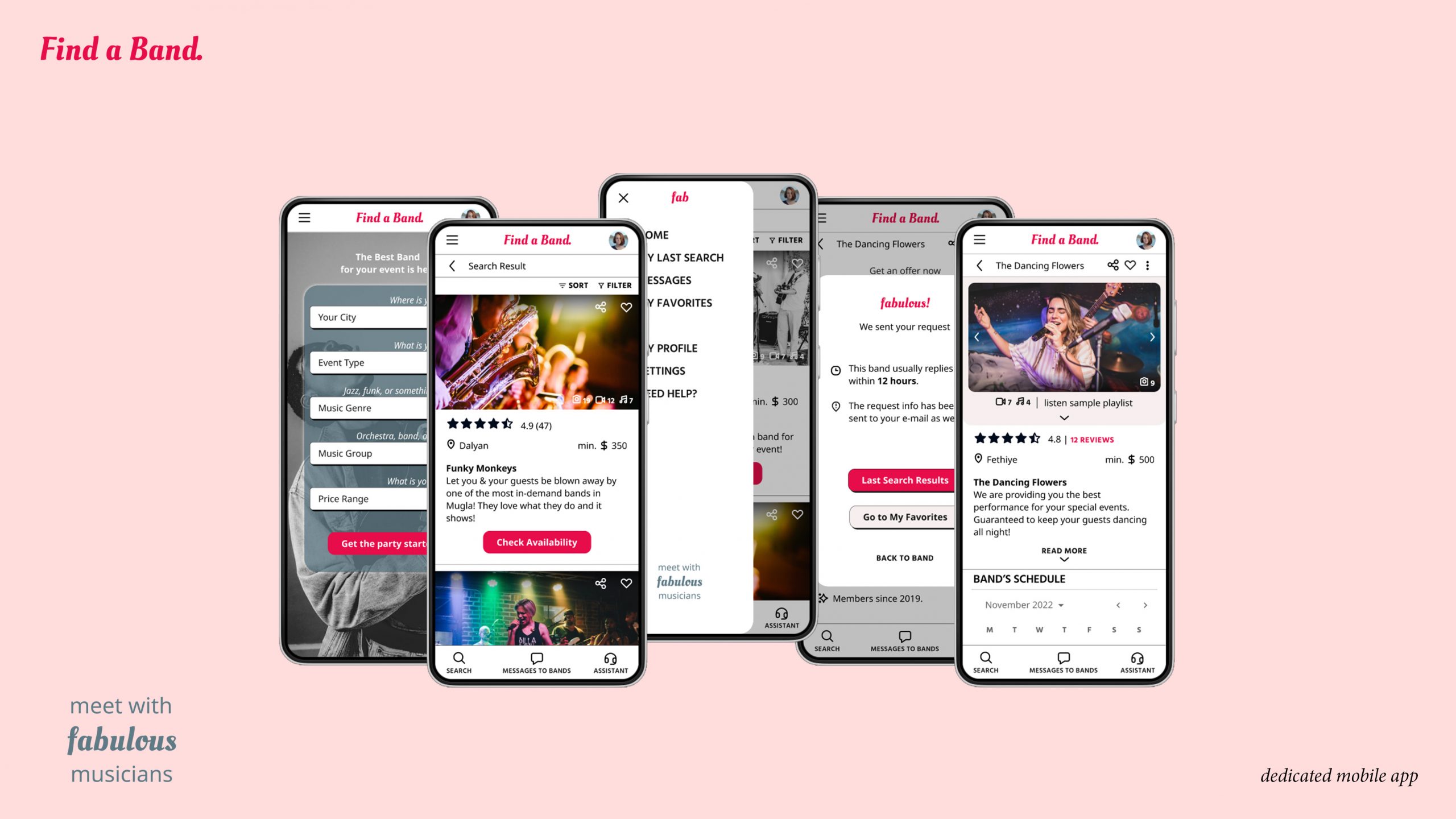
High-fidelity Prototype
The final high-fidelity prototype presented cleaner user flows for browsing and booking musicians. It also met user needs for checking previous customers’ reviews and sharing their findings with friends.
Usability Studies (Hi-Fi): Parameters
Study type:
Moderated usability study
Participants:
5 Participants
Location:
International, remote
Length:
30-45 minutes
Usability Studies: Findings
The second study used a high-fidelity prototype revealed what aspects of the mockups needed refining. These were the main findings uncovered by the usability study:
Terms
The initial criteria selection phase was confusing on some parts
Definitions
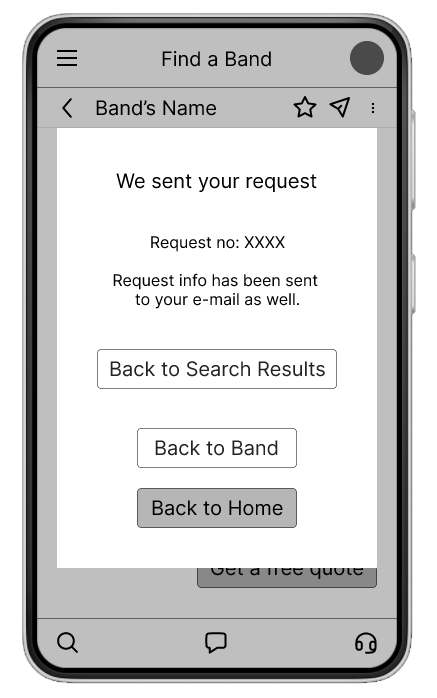
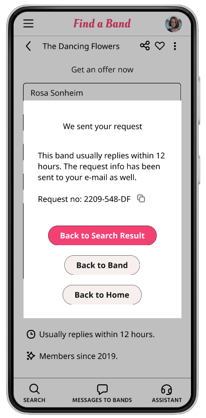
The confirmation page had too many details
Needs
Users were not in need of saving their search criteria
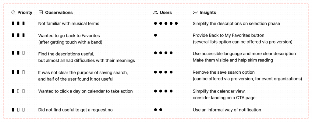
Once again, the usability study revealed frustration with the initial criteria defining. Not all users were familiar with musical terms, although they were simplified after the first study.
EVOLVING THE DESIGN
Mockup Revisions
I applied design changes based on the insights from the second usability study. The main findings mentioned above were studied in depth:
I simplified the descriptions and the process of selection criteria. For instance, band types are clustered under bigger groups and more clear language is used.

On initial mockups, the calendar was used as an indicator only. Following the usage during the usability study, it is turned into an actionable chart. Now users can directly click a date and proceed with the available options.
I used a more friendly language on the notifications and provided a compact content to increase the legibility.

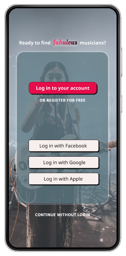
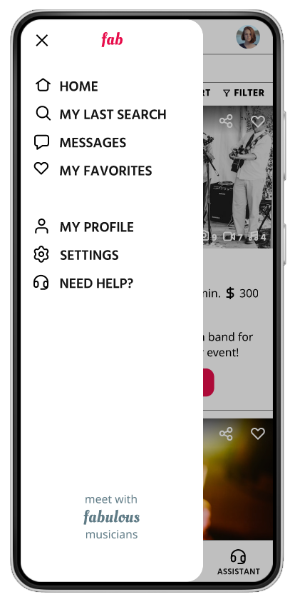
FaB’s DESIGN SYSTEM
Final Mockups
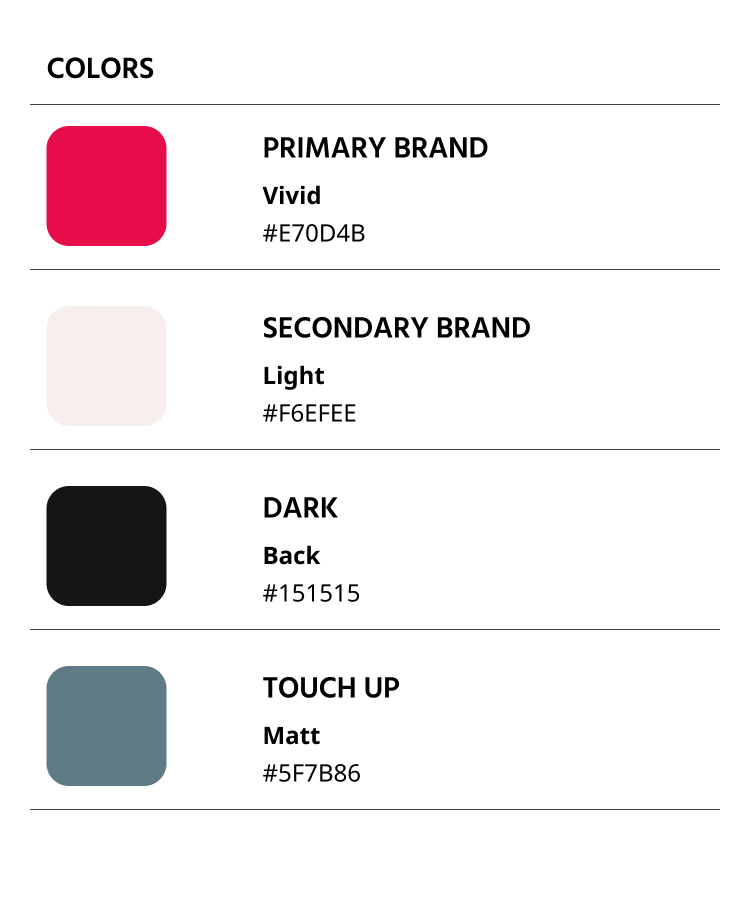
Color
FaB’s primary color is a vibrant, dynamic red to reflect the energetic and artistic character of the app related to music as a performing act.
Typography
Typefaces
Find a Band uses two typefaces, both with multiple weights and varied styles: Noto Sans, and Hind. The two typefaces make a balanced and very legible pair.
FaB uses Noto Sans on contents and Hind on headers.
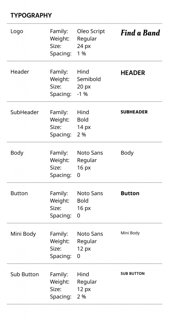
Logo & Branding
Find a Band’s logo is based on Oleo Script typeface, a flowy yet legible font. Its casual letters resemble musical notation’s curves. A small dot is added at the end of the logotype to underline this approach.
The app carries this dynamic character in its language as well. Main expression of the app, fabulous, is based on the initials of its name: Find a Band.
Motion
Loading Animation
Loading is expressed using a combination of
an animated hourglass and a processing text,
which uses a fun and engaging language
matching the app’s active outlook.
Accessibility considerations
❶ The initial mockups were using other tones of the colors. I updated the color palette using WebAIM Contrast Checker to comply with WCAG standards.
3.58:1
WCAG AA: Fail
4.6:1
WCAG AA: Pass
❷ Provided detailed imagery (pictures and movie clips) for musicians’ profiles to help all users better understand the designs and serve their needs.
❸ Used globally recognized icons to help make navigation easier.
❹ The site to be designed with alt text available on each page for smooth screen reader access.
GOING FORWARD
Takeaways
Impact:
The app fulfills a lack in the market, finding musicians and getting in touch with them to discuss the performance details.
“The flow is exactly how I expected. I liked the step-by-step approach towards more detailed sections.”
P3 on Hi-Fi testing
“Preparing for a wedding is a mess and mostly people handle music at the very last moment. For them using this app can be quick and useful.”
P2 on Hi-Fi testing
What I learned:
While designing the Find a Band app, I learned that the first ideas for the app are only the beginning of the process. Usability studies are essentials and they influenced each iteration of the app’s designs tremendously.
Some of the issues continue to show up even after taking necessary actions, like the musical terms being the one of the main confusions among the users. These studies are the only way to realize that!
Next Steps
The existing state of the Find a Band provides varied options for users to choose on their search of finding musicians. The future of the app can be extended with the following steps:
❶ Deepen the Insights: Conduct another round of usability studies to validate whether the pain points users experienced have been effectively addressed.
❷ Scope and Impact: Run a research on music venues and musicians to better understand the relationship between these two parties.
❸ Functionality: Some users* developed an expectation to book the services without getting a quote from the musicians. Following research on the musicians’ part, this feature could be refined.
(* they were also the ones who used the app for more than 50 min)
“This app is useful, but looks like it promises more!”
P4 on Hi-Fi testing
Some others also mentioned that options for kids can be useful too. The logarithm behind some events for specific age groups can be studied further.
Previous UX Project
Next UX Project