Calculation percentile
There are two ways to talk about percentile:
- The percentage of the data that is below the amount in question,
- The percent of the data that is at or below the amount in question.
With the first one we don’t include the data point that is on our focus, in the second one we include the data point.
Analyzing a cumulative relative frequency graph
Below is a cumulative relative frequency graph (for 32 drinks and their sugar content) that we can interpret by using percentiles and quartiles to estimate central tendency and spread within a distribution.
The data points on the y-axis tell us that much percentage of all our data has the x-axis value or less amount of sugar. Since this is a cumulative relative frequency, at each of the points (on y-axis), we say this is frequency that has that much sugar (x-axis) or less.
Q: An iced coffee has 15 grams of sugar. Estimate the percentile of this drink to the nearest whole percent.
A: 20%
Q: Estimate the median of the distribution of drinks.
A: Median: ~25gr
We can also calculate the interquartile range based on the interpretation of the graph.
Q: What is the best estimate for the IQR of the distribution of drinks?
A: 75%: ~39gr and 25%: ~18gr. So Q3-Q1: ~21gr
Z-scores
Normal distribution problem: Z-scores
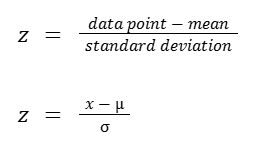
A standardized score, also called z-score measures exactly how many standard deviations above or below the mean a data point is.

Some important facts about z-scores:
- A positive z-score says the data point is above average.
- A negative z-score says the data point is below average.
- A z-score close to 0 says the data point is close to average.
- A data point can be considered unusual if its z-score is above 3 or below -3.
The last note above is a guideline, not an absolute rule. In Google’s Advanced Data Analytics Certificate Program they also mentioned ±3 as the limit for outliers. However, some may say that a z-score beyond ±2 is unusual, while beyond ±3 is highly unusual. Some may use ±2.5 as the cutoff.
Comparing with z-scores
Use z-scores to compare data points from different distributions. A sample is given below.
| Exam | Mean | Std Dev |
| Exam A | 151 | 10 |
| Exam B | 25.1 | 6.4 |
Q: The person who took both exams and scored 172 on the exam A and 37 on the exam B. Which exam did they do relatively better on?
A: They did 2.1 std. dev. on exam A and 1.86 std. dev. on exam B.
Effects on linear transformations
Let’s check how parameters change as data is shifted and scaled.
| Data | Data + 5 | Data * 5 | |
| 7 5 8 10 13 … | 12 10 13 15 18 … | 35 25 40 50 65 … | |
| Mean | 6.166 | 11.166 | 30.833 |
| Median | 5.5 | 10.5 | 27.5 |
| Standard Deviation | 2.995 | 2.995 | 14.976 |
| IQR | 2.75 | 2.75 | 13.75 |
The typical measures of central tendency (mean and median), they both shift and scale as we shift and scale the data. But the typical measures of spread (standard deviation and inter quartile range) don’t change when we shift the data, but they do change and scale as we scale the data.
It is very common to take data and apply the same transformation to every data point in the set. For example, we may take a set of temperatures taken in degrees fahrenheit and convert them all to degrees celsius.
Density Curves
How to visualize the distribution of data?
In a frequency histogram we create categories and put the values in whatever category they fit and show these categories as bars in the chart.
But we might be interested in what percentage of our data fits within each category. Or, if we have many data points (like millions or billions of them), just knowing the absolute number that fits into each category isn’t so useful. The percent that fits into each category is a lot more useful. For that, we could set up a relative frequency histogram.
While the bar height in a frequency histogram will show the absolute counts, in a relative frequency histogram it will show the percentages.
But there are also cases where we have many more data points (like millions or billions of them), and we want more ‘granular’ categories.
We can always create ‘narrower’ categories, for instance we could be interested in measuring the track records of runners in thousands as in x.000 rather than in hundreds as in x.00. And if we continue doing this, we could get to a point where we’re approaching an infinite number of categories. Eventually each of them will be infinitely thin to a point that, if we just connect the tops of the bars, we will actually get a curve.
In statistics this is called a density curve. And what’s valuable about a density curve is that it is a visualization of a distribution where the data points can take on any value in a continuum.
Some facts about density curves:
- The entire area of the curve is 100% or 1.0. This is true for any density curve.
- A density curve will never take on a negative value.
- The percentage of the data in an interval is not the height of the curve (hence the y-axis), it is the area under the curve in that interval.
- The percentage for an exact number is zero. It is so thin that there is no area under it. Instead, we could say what percentage falls in the interval (of what we’re interested in).
Median, mean and skew from density curves

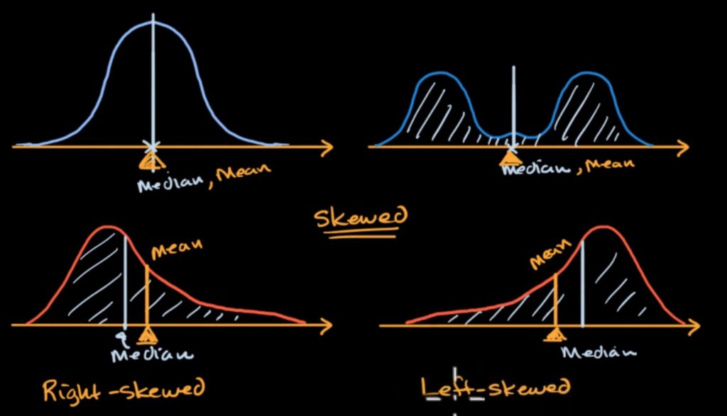
When the area to the left is equal to the right, that line (in the middle) makes the median.
The mean would be (in terms of physics, ~if this would be a mass) our balancing point of the distribution. This comes out of the idea of the weighted average of all of the possible values.
Disclaimer: Like most of my posts, this content is intended solely for educational purposes and was created primarily for my personal reference. At times, I may rephrase original texts, and in some cases, I include materials such as graphs, equations, and datasets directly from their original sources.
I typically reference a variety of sources and update my posts whenever new or related information becomes available. For this particular post, the primary source was Khan Academy’s Statistics and Probability series.
