Modeling objective
We will use K-means to cluster the pixels of a photograph of some tulips based on their encoded color values. We will explore how different values of k affect the clustering of the pixels, and thus the appearance of the photograph. We will also examine what is happening “under the hood” as the algorithm executes.
The main focus here is on the theory and results of its application, not on the codes itself.
Import statements
import numpy as np
import pandas as pd

%pylab inline
import plotly.graph_objects as go

from sklearn.cluster import KMeans
Read in data
The “data” in this case is not a pandas dataframe. It’s a photograph, which we’ll convert into a numerical array.
# Read in a photo
img = plt.imread('using_kmeans_for_color_compression_tulips_photo.jpg')
# Display the photo and its shape
print(img.shape)
plt.imshow(img)
plt.axis('off');(320, 240, 3)
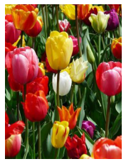
Here we have a photograph of some tulips. The shape of the image is 320 x 240 x 3. This can be interpreted as pixel information. Each dot on our screen is a pixel. This photograph has 320 vertical pixels and 240 horizontal pixels.
The third dimension of “3” refers to the values that encode the color of each pixel. Each pixel has 3 parameters: red (R), green (G), and blue (B), also known as its RGB values. For each color—R, G, and B—the encoded value can range from 0-255. This means that there are 256³, or 16,777,216 different combinations of RGB, each resulting in a unique color on our screen.
To prepare this data for modeling, we’ll reshape it into an array, where each row represents a single pixel’s RGB color values.
# Reshape the image so that each row represents a single pixel
# defined by three values: R, G, B
img_flat = img.reshape(img.shape[0]*img.shape[1], 3)
img_flat[:5, :]
array([[211, 196, 41],
[199, 180, 24],
[179, 152, 0],
[186, 150, 0],
[187, 143, 0]], dtype=uint8)
img_flat.shape(76800, 3)
Plot the data in 3-D space
Now we have an array that is 76,800 x 3. Each row is a single pixel’s color values. Because we have only 3 columns, we can visualize this data in 3-dimensional space. Let’s create a pandas dataframe to help us understand and visualize our data.
# Create a pandas df with r, g, and b as columns
img_flat_df = pd.DataFrame(img_flat, columns = ['r', 'g', 'b'])
img_flat_df.head()| r | g | b | |
|---|---|---|---|
| 0 | 211 | 196 | 41 |
| 1 | 199 | 180 | 24 |
| 2 | 179 | 152 | 0 |
| 3 | 186 | 150 | 0 |
| 4 | 187 | 143 | 0 |
Note: The following code normally gives an interactive plot. However I couldn’t embed it correctly here, so I am just providing a static pic instead.
# Create 3D plot where each pixel in the `img` is displayed in its actual color
trace = go.Scatter3d(x = img_flat_df.r,
                     y = img_flat_df.g,
                     z = img_flat_df.b,
                     mode='markers',
                     marker=dict(size=1,
                                 color=['rgb({},{},{})'.format(r,g,b) for r,g,b
                                        in zip(img_flat_df.r.values,
                                               img_flat_df.g.values,
                                               img_flat_df.b.values)],
                                 opacity=0.5))

data = [trace]

layout = go.Layout(margin=dict(l=0,
                               r=0,
                               b=0,
                               t=0),
                               )

fig = go.Figure(data=data, layout=layout)
fig.update_layout(scene = dict(
                    xaxis_title='R',
                    yaxis_title='G',
                    zaxis_title='B'),
                  )
fig.show()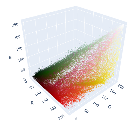
In this graph, each dot represents a color/pixel that is in our original image of tulips. The more intense the color, the more dots are concentrated in that area. The most-represented colors in the graph are the most abundant colors in the photograph: mostly reds, greens, and yellows.
We can train a K-means model on this data. The algorithm will create k clusters by minimizing the squared distances from each point to its nearest centroid.
Let’s first do an experiment. Let’s check what will happen if we built a K-means model with just a single centroid (k = 1) and replaced each pixel in the photograph with the RGB value of that centroid? What would the photograph look like?
Cluster the data: k = 1
# Instantiate the model
kmeans = KMeans(n_clusters=1, random_state=42).fit(img_flat)
# Copy `img_flat` so we can modify it
img_flat1 = img_flat.copy()
# Replace each row in the original image with its closest cluster center
for i in np.unique(kmeans.labels_):
img_flat1[kmeans.labels_==i,:] = kmeans.cluster_centers_[i]
# Reshape the data back to (640, 480, 3)
img1 = img_flat1.reshape(img.shape)
plt.imshow(img1)
plt.axis('off')
To check what happened, let’s run through the K-means steps:
- We randomly placed our centroid in the colorspace.
- We assigned each point to its nearest centroid. Since there was only one centroid, all points were assigned to the same centroid, and thus to the same cluster.
- We updated the centroid’s location to the mean location of all of its points. Again, since there is only a single centroid, it updated to the mean location of every point in the image.
- Repeat until the model converges. In this case, it only took one iteration for the model to converge.
We then updated each pixel’s RGB values to be the same as the centroid’s. The result is the image of our tulips when every pixel is replaced with the average color. The average color of this photo was brown—all the colors muddled together.
We can verify this for ourselves by manually calculating the average for each column in the flattened array. This will give us the average R value, G value, and B value.
# Calculate mean of each column in the flattened array
column_means = img_flat.mean(axis=0)

print('column means: ', column_means)
column means: [125.64397135 78.93165365 43.51584635]
Now, we can compare this to what the K-means model calculated as the final location of its one centroid.
print('cluster centers: ', kmeans.cluster_centers_)cluster centers: [[125.64397135 78.93165365 43.51584635]]
They’re the same! Now, let’s return to the 3-D rendering of our data, only this time we’ll add the centroid.
# Create 3-D plot where each pixel in the `img` is displayed in its actual color
trace = go.Scatter3d(x = img_flat_df.r,
                     y = img_flat_df.g,
                     z = img_flat_df.b,
                     mode='markers',
                     marker=dict(size=1,
                                 color=['rgb({},{},{})'.format(r,g,b) for
                                        r,g,b in zip(img_flat_df.r.values,
                                                     img_flat_df.g.values,
                                                     img_flat_df.b.values)],
                                 opacity=0.5))

data = [trace]

layout = go.Layout(margin=dict(l=0,
                               r=0,
                               b=0,
                               t=0))

fig = go.Figure(data=data, layout=layout)

# Add centroid to chart
centroid = kmeans.cluster_centers_[0].tolist()

fig.add_trace(
    go.Scatter3d(x = [centroid[0]],
                 y = [centroid[1]],
                 z = [centroid[2]],
                 mode='markers',
                 marker=dict(size=7,
                             color=['rgb(125.79706706,78.8178776,42.58090169)'],
                             opacity=1))
)
fig.update_layout(scene = dict(
                    xaxis_title='R',
                    yaxis_title='G',
                    zaxis_title='B'),
                  )
fig.show()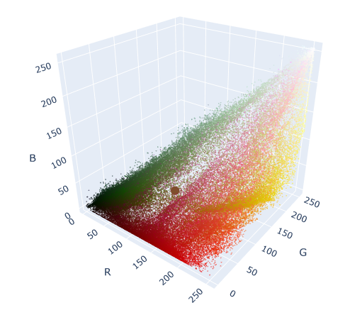
We can see the centroid as a large circle in the middle of the colorspace. Notice that this is the “center of gravity” of all the points in the graph.
Now let’s try something else. Let’s refit a K-means model to the data, this time using k = 3.
Cluster the data: k = 3
# Instantiate k-means model for 3 clusters
kmeans3 = KMeans(n_clusters=3, random_state=42).fit(img_flat)

# Check the unique values of what's returned by the .labels_ attribute
np.unique(kmeans3.labels_)
array([0, 1, 2], dtype=int32)
The .cluster_centers_ attribute returns an array where each element represents the coordinates of a centroid (i.e., their RGB values). We’ll use these coordinates as we did previously to generate the colors that are represented by our centroids.
# Assign centroid coordinates to `centers` variable
centers = kmeans3.cluster_centers_
centers
array([[ 40.7359554 , 50.52854867, 16.24875942],
[177.531583 , 41.76184109, 27.36574693],
[202.22533765, 173.65952858, 109.69783803]])
Now we’ll create a helper function to easily display RGB values as color swatches, and use it to check the colors of the model’s centroids.
# Helper function that creates color swatches
def show_swatch(RGB_value):
    '''
    Takes in an RGB value and outputs a color swatch
    '''
    R, G, B = RGB_value
    rgb = [[np.array([R,G,B]).astype('uint8')]]
    plt.figure()
    plt.imshow(rgb)
    plt.axis('off')
# Display the color swatches
for pixel in centers:
show_swatch(pixel)


We could notice that examining the original image of the tulips, it’s apparent that there are generally three dominant colors: reds, greens, and golds/yellows, which is very close to what the model returned.
Just as before, let’s now replace each pixel in the original image with the RGB value of the centroid to which it was assigned.
# Helper function to display our photograph when clustered into k clusters
def cluster_image(k, img=img):
    '''
    Fits a K-means model to a photograph.
    Replaces photo's pixels with RGB values of model's centroids.
    Displays the updated image.
    Args:
      k:    (int)          - Your selected K-value
      img:  (numpy array)  - Your original image converted to a numpy array
    Returns:
      The output of plt.imshow(new_img), where new_img is a new numpy array \
      where each row of the original array has been replaced with the \
      coordinates of its nearest centroid.
    '''
    img_flat = img.reshape(img.shape[0]*img.shape[1], 3)
    kmeans = KMeans(n_clusters = k, random_state = 42).fit(img_flat)
    new_img = img_flat.copy()

    for i in np.unique(kmeans.labels_):
        new_img[kmeans.labels_ == i, :] = kmeans.cluster_centers_[i]

    new_img = new_img.reshape(img.shape)

    return plt.imshow(new_img), plt.axis('off')
# Generate image when k=3
cluster_image(3)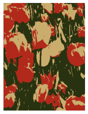
We now have a photo with just three colors. Each pixel’s RGB values correspond to the values of its nearest centroid.
We can return once more to our 3-D colorspace. This time, we’ll re-color each dot in the colorspace to correspond with the color of its centroid. This will allow us to see how the K-means algorithm clustered our data spatially.
# Just to get an understanding of what the data structures look like
print(kmeans3.labels_.shape)
print(kmeans3.labels_)
print(np.unique(kmeans3.labels_))
print(kmeans3.cluster_centers_)
(76800,)
[2 2 1 ... 1 1 1]
[0 1 2]
[[ 40.7359554 50.52854867 16.24875942]
[177.531583 41.76184109 27.36574693]
[202.22533765 173.65952858 109.69783803]]
# Create a new column in the df that indicates the cluster number of each row
# (as assigned by Kmeans for k=3)
img_flat_df['cluster'] = kmeans3.labels_
img_flat_df.head()| r | g | b | cluster | |
|---|---|---|---|---|
| 0 | 211 | 196 | 41 | 2 |
| 1 | 199 | 180 | 24 | 2 |
| 2 | 179 | 152 | 0 | 1 |
| 3 | 186 | 150 | 0 | 1 |
| 4 | 187 | 143 | 0 | 1 |
# Create helper dictionary to map RGB color values to each observation in df
series_conversion = {0: 'rgb' +str(tuple(kmeans3.cluster_centers_[0])),
                     1: 'rgb' +str(tuple(kmeans3.cluster_centers_[1])),
                     2: 'rgb' +str(tuple(kmeans3.cluster_centers_[2])),
                     }
series_conversion
{0: 'rgb(40.735955400323704, 50.528548673661014, 16.248759419210476)',
1: 'rgb(177.5315829990752, 41.76184109234782, 27.36574693083339)',
2: 'rgb(202.2253376469871, 173.65952857804268, 109.69783803213303)'}
# Replace the cluster numbers in the 'cluster' col with formatted RGB values
# (made ready for plotting)
img_flat_df['cluster'] = img_flat_df['cluster'].map(series_conversion)
img_flat_df.head()| r | g | b | cluster | |
|---|---|---|---|---|
| 0 | 211 | 196 | 41 | rgb(202.2253376469871, 173.65952857804268, 109… |
| 1 | 199 | 180 | 24 | rgb(202.2253376469871, 173.65952857804268, 109… |
| 2 | 179 | 152 | 0 | rgb(177.5315829990752, 41.76184109234782, 27.3… |
| 3 | 186 | 150 | 0 | rgb(177.5315829990752, 41.76184109234782, 27.3… |
| 4 | 187 | 143 | 0 | rgb(177.5315829990752, 41.76184109234782, 27.3… |
# Replot the data, now showing which cluster (i.e., color) it was assigned to by K-means when k=3
trace = go.Scatter3d(x = img_flat_df.r,
                     y = img_flat_df.g,
                     z = img_flat_df.b,
                     mode='markers',
                     marker=dict(size=1,
                                 color=img_flat_df.cluster,
                                 opacity=1))
data = trace
layout = go.Layout(margin=dict(l=0,
                               r=0,
                               b=0,
                               t=0))
fig = go.Figure(data=data, layout=layout)
fig.show()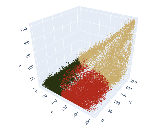
We may be thinking to ourseves that we would have clustered the data differently based on the distribution of points that we saw in the first 3-D plot. For example, why is there a sharp line that separates red and green, when there doesn’t appear to be any empty space there in the data?
We’re not incorrect. Even though there’s no such thing as “wrong” clustering, some ways can definitely be better than others.
We’ll notice in the original 3-D rendering that there are long bands (not round balls) of clustered data. K-means works best when the clusters are more circular, because it tries to minimize distance from point to centroid. It may be worth trying a different clustering algorithm if we want to cluster a long, narrow, continuous band of data.
Nonetheless, K-means successfully compresses the colors of this photograph. This process can be applied for any value of k. Here’s the output of each photo for k = 2–10.
Cluster the data: k = 2-10
# Helper function to plot image grid
def cluster_image_grid(k, ax, img=img):
    '''
    Fits a K-means model to a photograph.
    Replaces photo's pixels with RGB values of model's centroids.
    Displays the updated image on an axis of a figure.
    Args:
      k:    (int)          - Your selected K-value
      ax:   (int)          - Index of the axis of the figure to plot to
      img:  (numpy array)  - Your original image converted to a numpy array
    Returns:
      A new image where each row of img's array has been replaced with the \
      coordinates of its nearest centroid. Image is assigned to an axis that \
      can be used in an image grid figure.
    '''
    img_flat = img.reshape(img.shape[0]*img.shape[1], 3)
    kmeans = KMeans(n_clusters=k, random_state=42).fit(img_flat)
    new_img = img_flat.copy()

    for i in np.unique(kmeans.labels_):
        new_img[kmeans.labels_==i, :] = kmeans.cluster_centers_[i]

    new_img = new_img.reshape(img.shape)
    ax.imshow(new_img)
    ax.axis('off')

fig, axs = plt.subplots(3, 3)
fig = matplotlib.pyplot.gcf()
fig.set_size_inches(9, 12)
axs = axs.flatten()
k_values = np.arange(2, 11)
for i, k in enumerate(k_values):
    cluster_image_grid(k, axs[i], img=img)
    axs[i].title.set_text('k=' + str(k))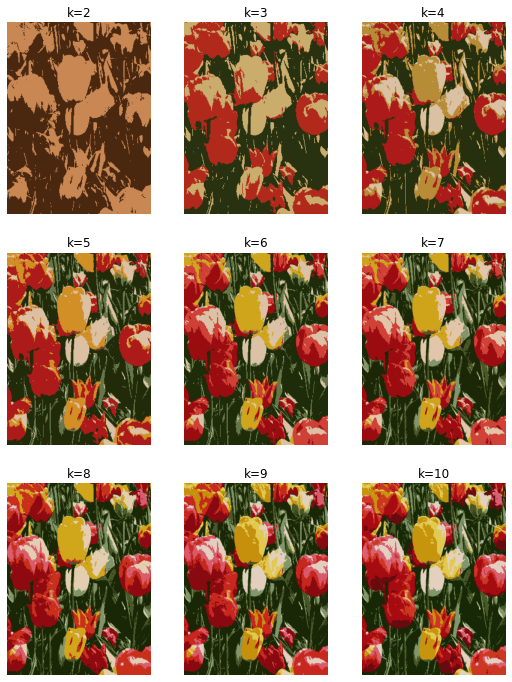
Notice that it becomes increasingly difficult to see the difference between the images each time a color is added. This is a visual example of something that happens with all clustering models, even if the data is not an image that we can see. As we group the data into more and more clusters, additional clusters beyond a certain point contribute less and less to our understanding of our data.
Disclaimer: Like most of my posts, this content is intended solely for educational purposes and was created primarily for my personal reference. At times, I may rephrase original texts, and in some cases, I include materials such as graphs, equations, and datasets directly from their original sources.
I typically reference a variety of sources and update my posts whenever new or related information becomes available. For this particular post, the primary source was Google Advanced Data Analytics Professional Certificate program.
