Linearity, Strength and Direction
A scatterplot is a type of data display that shows the relationship between two numerical variables. Scatterplots are good for helping us see if two variables have positive or negative association (or no association at all).
When we create a scatter plot, we might ask questions like:
- Can we try to fit a line?
- Does it look like there’s a linear or non-linear relationship between the variables on the different axes?
- How strong is that relationship? (~if the data points are not far away from the line)
- Is it a negative or positive relationship?
- Are there some outliers? (when a data point doesn’t fit the pattern)
- Are there some clusters? (when data points form distinct groups)
Trend Lines: Estimating with linear regression (linear models)
When we see a relationship in a scatterplot, we can use a line to summarize the relationship in the data. We can also use that line to make predictions in the data. This process is called linear regression.
In that sense, a line of best fit is a straight line that shows the relationship between two sets of data or the pattern of data points. If we can find a good line, it means there is a linear trend. If not, it means there is no linear trend. We can’t also ignore points that don’t fit the trend.
There are more advanced ways to fit a line to data, but in general, we want the line to go through the “middle” of the points.
Once we fit a line to data, we find its equation and use that equation to make predictions. To find the best equation for the line, we look at the slope and the y-intercept.
Step 1 is to find the slope. Slope = Δy / Δx
Step 2 is to find the y-intercept, that is the value of y when x is zero.
Step 3 is to write the equation in y=mx+b form, where m is the slope and b is the y-intercept.
But, we need to remember that, this is just a model, so it’s not always perfect. We need to be careful while extrapolating with models.
Formula for linear line
In some statistics books we may see the same above equation but with different signs as below.
Linear regression assumes that the relationship between two variables, x and y, can be modeled by a straight line:
y = β0 + β1
where β0 and β1 represent two model parameters. These parameters are estimated using data, and we write their point estimates as β0 and β1. When we use x to predict y, we usually call x the explanatory or predictor variable, and we call y the response.
In almost all real-life situations, we will have some uncertainty regarding our estimates of the model parameters, β0 and β1. Mostly the relationship wouldn’t be perfectly linear, but it could be helpful to partially explain the connection between these variables with a straight line.
Yet then, we might wonder, should we move the line up or down a little, or should we tilt it more or less? These kinds of questions are based on the different criteria for line-fitting and the uncertainty associated with estimates of model parameters.
Note: Straight lines should only be used when the data appear to have a linear relationship. A curved line, for instance, will require more advanced techniques.
Since we examine here the criteria for identifying a linear model, we need to introduce ourselves a new statistic, correlation.
Correlation coefficients
The main idea behind the correlation coefficients are trying to measure how well a linear model can describe the relationship between two variables.
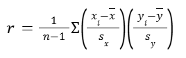
The correlation coefficient r measures the direction and strength of a linear relationship. Calculating r is pretty complex, so we usually rely on technology for the computations. But let’s have a look at the formula for a better grasp anyway.
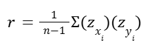
Formally, we can compute the correlation for observations (x1,y1), (x2,y2), …, (xn,yn) using the formula:
The last part is actually the sum of the products of the Z scores:
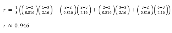
Calculating correlation coefficient r
Let’s assume we have four data points (x, y) as:
(1, 1), (2, 2), (2, 3), (3, 6)
Then the mean of x and y and their standard deviation would be:
x̄ = 2
sx = 0.816
ȳ = 3
sy = 2.160
Now let’s calculate the correlation coefficient (r)
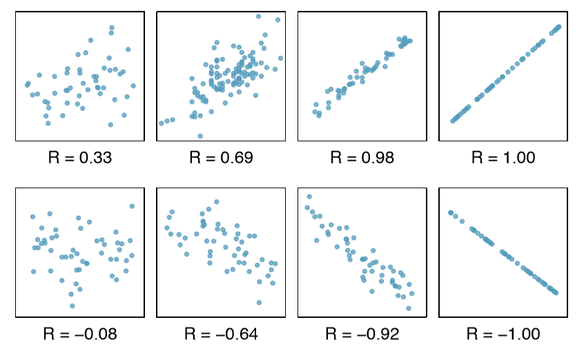
Remember, the correlation coefficient is a measure of how well a line can describe the relationship between X and Y. And r will be always:
-1 ≤ r ≤ 1
To sum up some facts about r:
- It always has a value between -1 and 1.
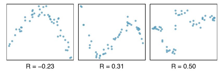
- Strong positive linear relationships have values of r close to 1.
- Strong negative linear relationships have values of r close to -1.
- Weaker relationships have values of r closer to 0.
In the situation above, r is pretty close to one, which means that a line can get pretty close to describing the relationship between our Xs and our Ys.
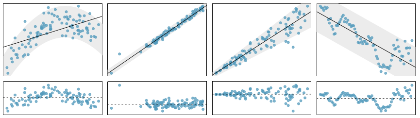
Below are some sample graphs with their relative r scores, to have a better sense of it.
Correlation with non-linear trends
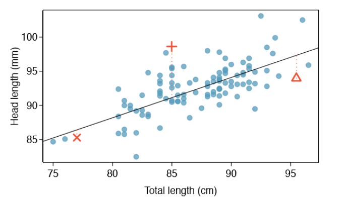
The correlation is intended to quantify the strength of a linear trend. Nonlinear trends, even when strong, sometimes produce correlations that do not reflect the strength of the relationship. Check such examples below.
In each case, there is a strong relationship between the variables. However, the correlation is not very strong, and the relationship is not linear.
Least-squares regression equations
Least squares regression is one of the methods for us to find the best fitting line. But before we explore this method, first we need to understand the residuals.
Residuals
The idea, the difference between the actual data points and what would have been predicted (y), given the value (of x), is called a residual.
Every data point (each observation) has a residual. If an observation is above the regression line, then its residual, the vertical distance from the observation to the line, is positive. Observations below the line have negative residuals (when our actual is below our predicted).
A residual is saying how a given data point compares to our line, our regression model. And what we want to do is to think about some combination of all the residuals and try to minimize it.
A sample scatter plot is below, where three of the data points and their residual lines are shown visually.
Residual Plot
Residuals are helpful in evaluating how well a linear model fits a data set and we often display them in a residual plot such as the one below. The residuals are plotted at their original horizontal locations but with the vertical coordinate as the residual.
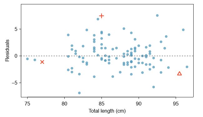
Residual plots give us a sense of how good a fit it is (regardless of whether the regression line is upward or downward sloping) and whether a line is good at explaining the relationship between the variables.
The general idea is if we see the points pretty evenly scattered or randomly scattered above and below the line (x-axis at zero residual), we don’t really discern any trend there. Then a line is probably a good model for the data.
But if we do see some type of trend, if the residuals had an upward or downward trend or if they were curving up and then curving down, then we might consider doing a non-linear model.
Let’s check more samples below to have a better understanding.
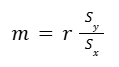
Reading residual plots
Now we know that one purpose of residual plots is to identify characteristics or patterns still apparent in data after fitting a model. Let’s check the below samples and try to identify any patterns remaining in the residuals.
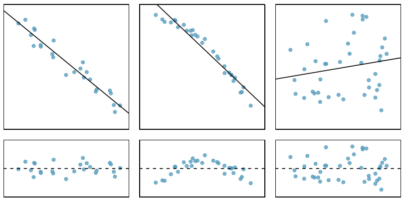
- In the first data set, the residuals show no obvious patterns. The residuals appear to be scattered randomly around the dashed line that represents 0.
- The second data set shows a pattern in the residuals. There is some curvature in the scatterplot, which is more obvious in the residual plot. We should not use a straight line to model this data. Instead, a more advanced technique should be used.
- The last plot shows very little upwards trend, and the residuals also show no obvious patterns. It is reasonable to try to fit a linear model to the data. However, it is unclear whether there is statistically significant evidence that the slope parameter is different from zero. The point estimate of the slope parameter is not zero, but we might wonder if this could just be due to chance.
An Objective Measure for Finding the Best Line
Mathematically, we want a line that has small residuals. We might add up all the residuals and try to minimize that:
Σ |rn|
Then we could change m and b for our line to minimize the above notation. That would be a technique of trying to create a regression line. (But that gets tricky, because some big negative residual could counterbalance the big positive residual and it would add up to zero, looking like there is no residual.)
But there are other ways to do that and the most typical way that we see in statistics is to take the sum of the squares of the residuals:
Σ (rn)2
When we square something, whether it’s negative or positive, it’s going to be positive. So it takes care of that issue of negatives and positives canceling out with each other.
And when we square a number, things with large residuals are going to become -relatively- larger. So they are going to represent a bigger proportion of the sum.
This technique that minimizes the sum of the squares of the residuals is called least square regression.
The reason why it is used most is that it tries to take in account data points that are significant outliers. Those become even bigger factors (when we square them) and this regression is going to minimize that. (In many applications, a residual twice as large as another residual is more than twice as bad. For example, being off by 4 is usually more than twice as bad as being off by squaring the residuals accounts for this discrepancy.)
Note: There are applications where minimizing the sum of the magnitudes (rather than the sum of the squared) may be more useful, and there are plenty of other criteria we might consider. However, here we’ll apply the least squares criterion.
Conditions for the Least Squares Line
We’ve already made some notes about what we should pay attention to. Let’s summarize and underline them. When fitting a least squares line, we generally require the following.
Linearity: The data should show a linear trend. If there is a nonlinear trend, an advanced regression method should be applied.
Nearly normal residuals: Generally the residuals must be nearly normal. When this condition is found to be unreasonable, it is usually because of outliers or concerns about influential points.
Constant variability: The variability of points around the least squares line remains roughly constant.
Let’s bring some visuals again.
Four examples showing when the methods in this chapter are insufficient to apply to the data.
- A straight line does not fit the data.
- There are outliers; two points on the left are relatively distant from the rest of the data, and one of these points is very far away from the line. (violates ‘nearly normal residuals’)
- The variability of the data around the line increases with larger values of x. (violates ‘constant variability’)
- A time series data set is shown, where successive observations are highly correlated.
Finding the Least Squares Line
Calculating the equation of a regression line
Above we talked about the correlation coefficient r, that is telling us if two variables have a correlation and if yes, how strong it is. Therefore it is also used to show how well our model fits the data points too.
Now let’s build on this notion and come up with the equation for the least squares line that tries to fit data points.
The equation for any line is:
y = mx+b
For the regression line, we put a hat over it (to signify that this is an estimate):
ŷ = mx+b
Let’s go step by step for our regression line, like we did before for any line.
As a reminder these were the data points (x, y):
(1, 1)
(2, 2)
(2, 3)
(3, 6)
Then the mean of x and y and their standard deviation were:
x̄ = 2
sx = 0.816
ȳ = 3
sy = 2.160
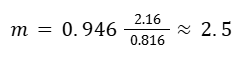
Step 1: Calculate the slope.
The slope is going to be r times the ratio between the sample standard deviation in the y direction over the sample standard deviation in the x direction.
Before we continue further, we can elaborate two things:
1- If we can calculate our slope, then to calculate the y-intercept, we can ask ourselves:
What point is definitely going to be on our line?
We are definitely going through the point of ‘sample mean of x and sample mean of y’.
(x̄, ȳ)
2- If r were 1 (if we had a perfect positive correlation), then our slope would be the standard deviation of y over the standard deviation of x.
Because we’re looking at our (average) spread of y over our (average) spread of x, if r were equal to one, this would be our slope:
standard deviation of y over standard deviation of x.
Step 2: Calculate the y-intercept.
Remember, we can use the mean of x and mean of y.
ȳ = mx̄+b
3 = 2.5 * 2 + b
b = – 2
Step 3: Write the equation.
y = 2.5x-2
Disclaimer: Like most of my posts, this content is intended solely for educational purposes and was created primarily for my personal reference. At times, I may rephrase original texts, and in some cases, I include materials such as graphs, equations, and datasets directly from their original sources.
I typically reference a variety of sources and update my posts whenever new or related information becomes available. For this particular post, the primary sources were Khan Academy’s Statistics and Probability series and OpenIntro Statistics by David Diez, Christopher Barr, & Mine Çetinkaya-Rundel.