Under my Math notes, we introduced before the conditions for the least squares line. Now it’s time to elaborate those assumptions.
One of the first tasks in simple linear regression analysis (at plan stage) is to check the assumptions of the model. In addition to the technical needs of the model, we’ll need to consider the business context of the problem we’re working on.
Model assumptions are statements about the data that must be true in order to justify the use of a particular modeling technique.
Model assumptions are like the bridge between the analyze and construct phase of the PACE framework. We need to examine the assumptions before the construct phase, when possible. However, while some assumptions can be checked before a model is built, some others can only be checked after the model is constructed, and predicted values are calculated.
Many of the simple linear regression assumptions can be checked through data visualizations and linear regression assumptions are:
- Linearity
- Normality
- Independent observations
- Homoscedasticity
Linearity
Linearity assumption – Each predictor variable (Xi) is linearly related to the outcome variable (Y).
In order to assess whether or not there is a linear relationship between the independent and dependent variables, it is easiest to create a scatterplot of the dataset. And to detect if this assumption is met, we just have to make sure that the points on the plot appear to fall along a straight line. Testing the linearity assumption should occur before the model is built.
# Create pairwise scatterplots of Chinstrap penguins data
sns.pairplot(chinstrap_penguins)
Normality
Normality assumption – The residuals or errors are normally distributed.
The normality assumption focuses on the errors, which can be estimated by the residuals (the difference between the observed values in the data and the values predicted by the regression model). For that reason, the normality assumption can only be confirmed after a model is built and predicted values are calculated.
Once the model has been built, we can either create a QQ-plot to check that the residuals are normally distributed, or create a histogram of the residuals. Whether the assumption is met is up to some level of interpretation.
Quantile-quantile plot:
The quantile-quantile plot (Q-Q plot) is a graphical tool used to compare two probability distributions by plotting their quantiles against each other. Here’s how Q-Q plots work when assessing the normality of a model’s residuals:
- Rank-order the residuals. Sort your n residuals from least to greatest. For each one, calculate what percentage of the data falls at or below this rank. These are the n quantiles of your data.
- Compare to a normal distribution. Divide a standard normal distribution into n+1 equal areas (i.e., slice it n times). If the residuals are normally distributed, the quantile of each residual (i.e., what percentage of the data falls below each ranked residual) will align closely with the corresponding z-scores of each of the n cuts on the standard normal distribution (these can be found in a normal z-score table or, more commonly, using statistical software).
- Construct a plot. A Q-Q plot has the known quantile values of a standard normal distribution along its x-axis and the rank-ordered residual values on its y-axis. If the residuals are normally distributed, the quantile values of the residuals will correspond with those of the standardized normal distribution, and both will increase linearly.
If you first standardize your residuals (convert to z-scores by subtracting the mean and dividing by the standard deviation), the two axes will be on identical scales, and, if the residuals are indeed normally distributed, the line will be at a 45° angle. However, standardizing the residuals is not a requirement of a Q-Q plot. In either case, if the resulting plot is not linear, the residuals are not normally distributed.
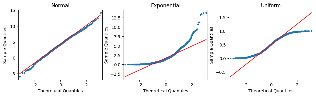
Samples of Q-Q plots
In the following figure, the first Q-Q plot depicts data that was taken from a normal distribution. It forms a line when plotted against the quantiles of a standard normal distribution. The second plot depicts data that was drawn from an exponential distribution. The third plot uses data drawn from a uniform distribution. Notice how the second and third plots don’t adhere to a line.
Code a Q-Q plot
Thankfully, we don’t have to manually perform the steps above. There are computing libraries to handle that. One way to create a Q-Q plot is to use the statsmodels library. If we import statsmodels.api, we can use the qqplot() function directly. The example below uses the residuals from a statsmodels ols model object. The model regresses penguins’ flipper length on their bill depth (Y on X).
import statsmodels.api as sm
import matplotlib.pyplot as plt

residuals = model.resid
fig = sm.qqplot(residuals, line = 's')
plt.show()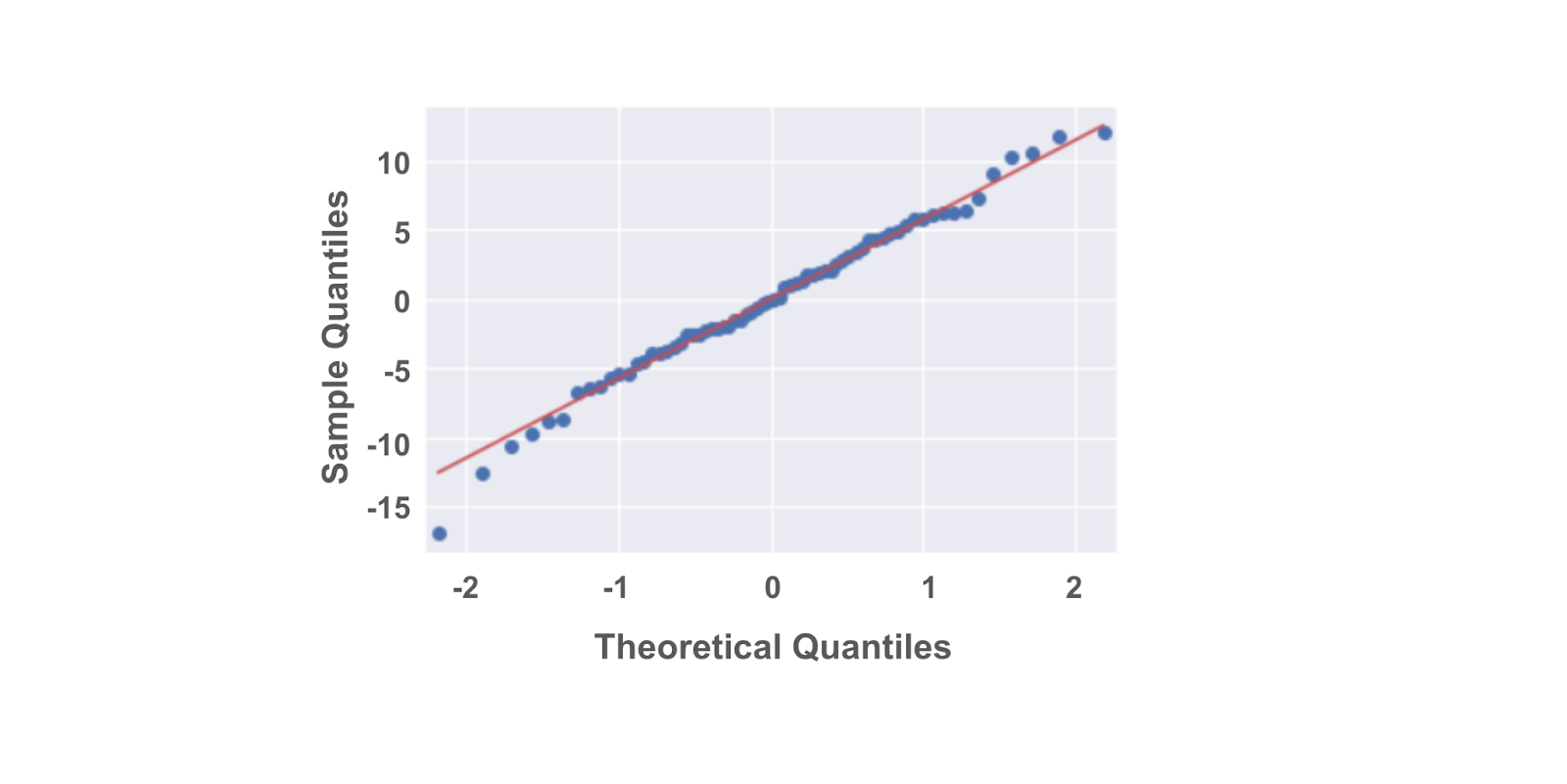
Plot a histogram (of the same data):
fig = sns.histplot(residuals)
fig.set_xlabel("Residual Value")
fig.set_title("Histogram of Residuals")
plt.show()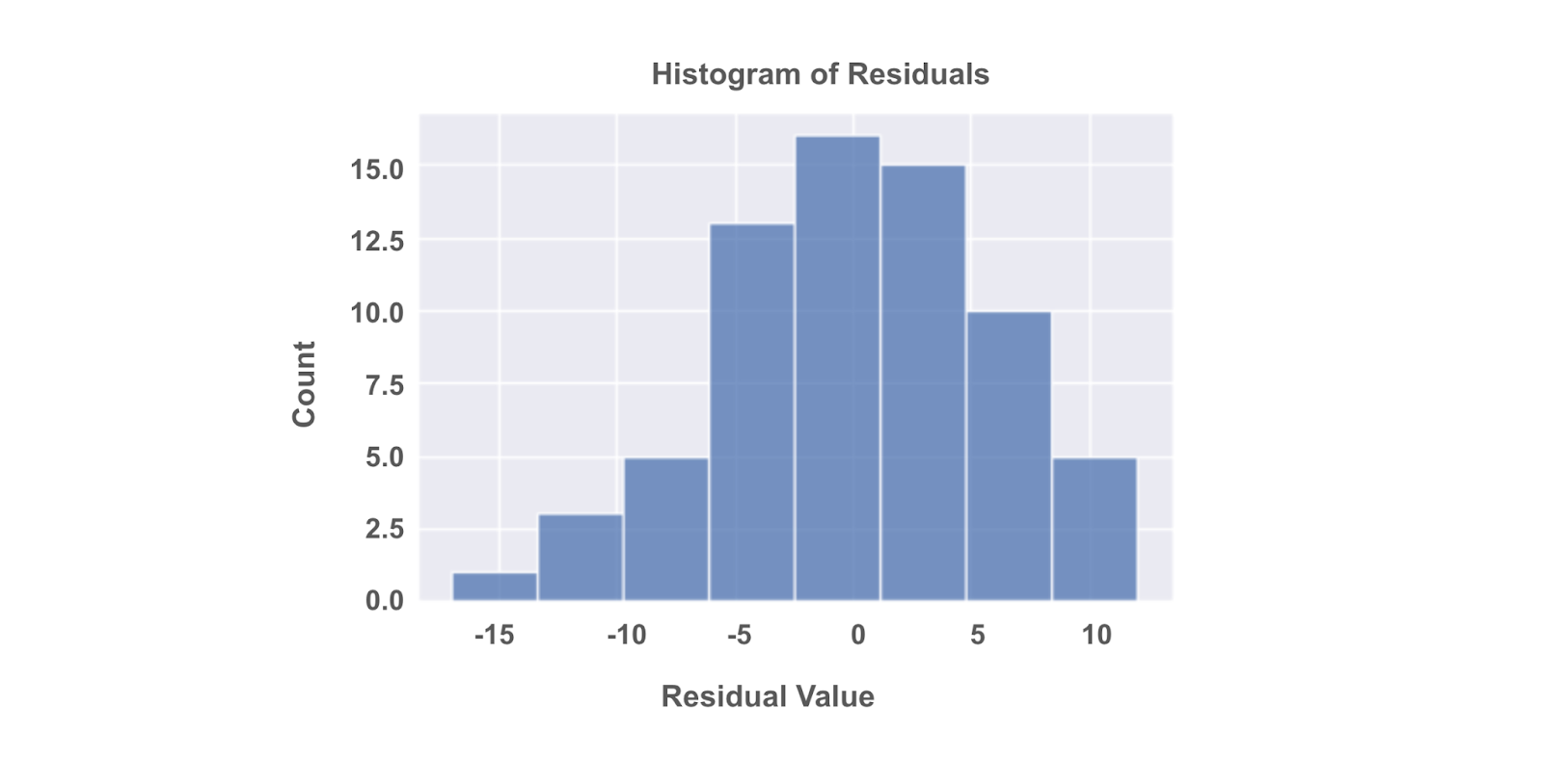
Data professionals often prefer Q-Q plots to histograms to gauge the normality of a distribution because it’s easier to discern whether a plot adheres to a straight line than it is to determine how closely a histogram follows a normal curve.
Independent observation
Independent observation assumption – Each observation in the dataset is independent.
Here, it is helpful to use contextual information about data collection and the variables used to determine if this is true. Because whether or not observations are independent is dependent on understanding our data. Asking questions like:
- How was the data collected?
- What does each data point represent?
- Based on the data collection process, is it likely that the value of one data point impacts the value of another data point?
An objective review of these questions, which would include soliciting insights from others who might notice things we don’t, can help us determine whether or not the independent observations assumption is violated. This in turn will allow us to determine our next steps in working with the dataset at hand.
If the assumption is met, we would expect a scatter plot of the fitted values versus residuals to resemble a random cloud of data points. If there are any patterns, then we might need to re-examine the data.
Homoscedasticity
Homoscedasticity assumption – The variation of the residuals (errors)* is constant or similar across the model. (Homoscedasticity means having the same scatter.)
Returning to the scatter plot of fitted values versus residuals, there should be constant variance along the values of the dependent variable. This assumption is true if we notice no clear pattern in a scatter plot. Sometimes we’ll hear this described as a random cloud of data points. But for example, if we observe a cone-shaped pattern, then the assumption is invalid.
(* In actuality, there is a difference between residuals and errors:
- Residuals are the difference between the predicted and observed values. You can calculate residuals after you build a regression model by subtracting the predicted values from the observed values.
- Errors are the natural noise assumed to be in the model.
- Residuals are used to estimate errors when checking the normality and homoscedasticity assumptions of linear regression.)
Like the normality assumption, the homoscedasticity assumption concerns the residuals of a model, so it can only be evaluated after a regression model has already been constructed. A scatterplot of the fitted values (i.e., the model’s predicted Y values) versus the residuals can help determine whether the homoscedasticity assumption is violated.
import matplotlib.pyplot as plt

fig = sns.scatterplot(fitted_values, residuals)
fig.axhline(0)
fig.set_xlabel("Fitted Values")
fig.set_ylabel("Residuals")
plt.show()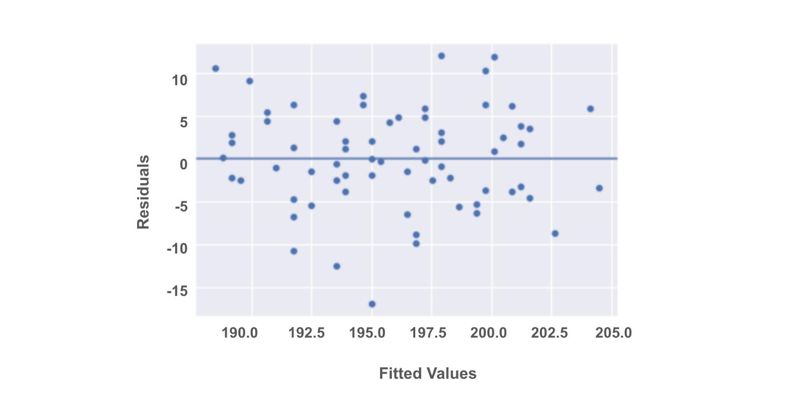
What to do if an assumption is violated
Two things are worth to mention before we continue:
- If we transform the data, this might change how we interpret the results.
- If these potential solutions don’t work for our data, we have to consider trying a different kind of model.
For now, let’s focus on a few essential approaches only.
Linearity
Transform one or both of the variables, such as taking the logarithm.
For example, if we are measuring the relationship between years of education and income, we can take the logarithm of the income variable and check if that helps the linear relationship.
Normality
Transform one or both variables. Most commonly, this would involve taking the logarithm of the outcome variable.
When the outcome variable is right skewed, such as income, the normality of the residuals can be affected. So, taking the logarithm of the outcome variable can sometimes help with this assumption.
If we transform a variable, we will need to reconstruct the model and then recheck the normality assumption to be sure. If the assumption is still not satisfied, we’ll have to continue troubleshooting the issue.
Independent observations
Take just a subset of the available data.
If, for example, we are conducting a survey and get responses from people in the same household, their responses may be correlated. We can correct for this by just keeping the data of one person in each household.
Another example is when we are collecting data over a time period. Let’s say we are researching data on bike rentals. If we collect our data every 15 minutes, the number of bikes rented out at 8:00 a.m. might correlate with the number of bikes rented out at 8:15 a.m. But, perhaps the number of bikes rented out is independent if the data is taken once every 2 hours, instead of once every 15 minutes.
Homoscedasticity
Define a different outcome variable.
If we are interested in understanding how a city’s population correlates with the number of restaurants in a city, we know that some cities are much more populous than others. We can then redefine the outcome variable as the ratio of population to restaurants.
Transform the Y variable: As with the above assumptions, sometimes taking the logarithm or transforming the Y variable in another way can potentially fix inconsistencies with the homoscedasticity assumption.
Disclaimer: Like most of my posts, this content is intended solely for educational purposes and was created primarily for my personal reference. At times, I may rephrase original texts, and in some cases, I include materials such as graphs, equations, and datasets directly from their original sources.
I typically reference a variety of sources and update my posts whenever new or related information becomes available. For this particular post, the primary source was Google Advanced Data Analytics Professional Certificate.