Introduction
Here, we will be analyzing a small business’ historical marketing promotion data. Each row corresponds to an independent marketing promotion where their business uses TV, social media, radio, and influencer promotions to increase sales. They previously had you work on finding a single variable that predicts sales, and now they are hoping to expand this analysis to include other variables that can help them target their marketing efforts.
To address the business request, we will conduct a multiple linear regression analysis to estimate sales from a combination of independent variables. This will include:
- Exploring and cleaning data
- Using plots and descriptive statistics to select the independent variables
- Creating a fitting multiple linear regression model
- Checking model assumptions
- Interpreting model outputs and communicating the results to non-technical stakeholders
Imports & Load
# Import libraries and modules
import pandas as pd
import matplotlib.pyplot as plt
import seaborn as sns
import statsmodels.api as sm
from statsmodels.formula.api import ols
# Load the data
data = pd.read_csv('marketing_sales_data.csv')
# Display the first five rows.
data.head()| TV | Radio | Social Media | Influencer | Sales | |
|---|---|---|---|---|---|
| 0 | Low | 3.518070 | 2.293790 | Micro | 55.261284 |
| 1 | Low | 7.756876 | 2.572287 | Mega | 67.574904 |
| 2 | High | 20.348988 | 1.227180 | Micro | 272.250108 |
| 3 | Medium | 20.108487 | 2.728374 | Mega | 195.102176 |
| 4 | High | 31.653200 | 7.776978 | Nano | 273.960377 |
Data exploration
The features in the data are:
- TV promotional budget (in “Low,” “Medium,” and “High” categories)
- Social media promotional budget (in millions of dollars)
- Radio promotional budget (in millions of dollars)
- Sales (in millions of dollars)
- Influencer size (in “Mega,” “Macro,” “Micro,” and “Nano” categories)
Create a pairplot of the data
# Create a pairplot of the data
sns.pairplot(data)
RadioandSocial Mediaboth appear to have linear relationships withSales. Given this,RadioandSocial Mediamay be useful as independent variables in a multiple linear regression model estimatingSales.TVandInfluencerare excluded from the pairplot because they are not numeric.
Calculate the mean sales for each categorical variable
# Calculate the mean sales for each TV category
print(data.groupby('TV')['Sales'].mean())
print('')
# Calculate the mean sales for each Influencer category
print(data.groupby('Influencer')['Sales'].mean())
TV
High 300.853195
Low 90.984101
Medium 195.358032
Name: Sales, dtype: float64
Influencer
Macro 181.670070
Mega 194.487941
Micro 188.321846
Nano 191.874432
Name: Sales, dtype: float64
- The average
SalesforHighTVpromotions is considerably higher than forMediumandLowTVpromotions.TVmay be a strong predictor ofSales. - The categories for
Influencerhave different averageSales, but the variation is not substantial.Influencermay be a weak predictor ofSales. - These results can be investigated further when fitting the multiple linear regression model.
Remove missing data
# Drop rows that contain missing data and update the DataFrame
data = data.dropna(axis=0)
Clean column names
The ols() function doesn’t run when variable names contain a space. We need to fix them.
# Rename all columns in data that contain a space
data = data.rename(columns={'Social Media': 'Social_Media'})
Model building
Fit a multiple linear regression model that predicts sales
# Define the OLS formula
ols_formula = 'Sales ~ C(TV) + Radio'

# Create an OLS model
OLS = ols(formula = ols_formula, data = data)

# Fit the model
model = OLS.fit()

# Save the results summary
model_results = model.summary()

# Display the model results
model_results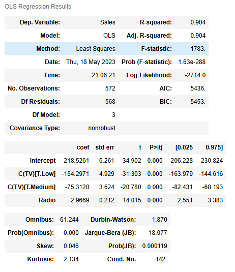
Warnings:
[1] Standard Errors assume that the covariance matrix of the errors is correctly specified.
TVwas selected, as the preceding analysis showed a strong relationship between theTVpromotional budget and the averageSales.Radiowas selected because the pairplot showed a strong linear relationship betweenRadioandSales.Social Mediawas not selected because it did not increase model performance and it was later determined to be correlated with another independent variable:Radio.Influencerwas not selected because it did not show a strong relationship toSalesin the preceding analysis.
Check model assumptions
For multiple linear regression, there is an additional assumption added to the four simple linear regression assumptions: multicollinearity. We’ll check all five multiple linear regression assumptions below.
Model assumption: Linearity
# Create a scatterplot for each independent variable and the dependent variable
# Create a 1x2 plot figure
fig, axes = plt.subplots(1, 2, figsize = (8,4))

# Create a scatterplot between Radio and Sales
sns.scatterplot(x = data['Radio'], y = data['Sales'],ax=axes[0])
# Set the title of the first plot
axes[0].set_title("Radio and Sales")

# Create a scatterplot between Social Media and Sales
sns.scatterplot(x = data['Social_Media'], y = data['Sales'],ax=axes[1])
# Set the title of the second plot
axes[1].set_title("Social Media and Sales")
# Set the xlabel of the second plot
axes[1].set_xlabel("Social Media")

# Use matplotlib's tight_layout() function to add space between plots for a cleaner appearance
plt.tight_layout()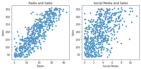
- The linearity assumption holds for
Radio, as there is a clear linear relationship in the scatterplot betweenRadioandSales.Social Mediawas not included in the preceding multiple linear regression model, but it does appear to have a linear relationship withSales.
Model assumption: Independence
The independent observation assumption states that each observation in the dataset is independent. As each marketing promotion (i.e., row) is independent from one another, the independence assumption is not violated.
Model assumption: Normality
We’ll create the following plots to check the normality assumption:
- Plot 1: Histogram of the residuals
- Plot 2: Q-Q plot of the residuals
# Calculate the residuals
residuals = model.resid

# Create a 1x2 plot figure
fig, axes = plt.subplots(1, 2, figsize = (8,4))
# Create a histogram with the residuals.
sns.histplot(residuals, ax=axes[0])

# Set the x label of the residual plot
axes[0].set_xlabel("Residual Value")
# Set the title of the residual plot
axes[0].set_title("Histogram of Residuals")

# Create a Q-Q plot of the residuals
sm.qqplot(residuals, line='s',ax = axes[1])
# Set the title of the Q-Q plot
axes[1].set_title("Normal QQ Plot")

# Use matplotlib's tight_layout() function to add space between plots for a cleaner appearance
plt.tight_layout()
# Show the plot
plt.show()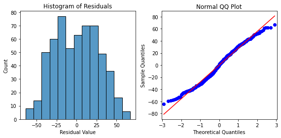
- The histogram of the residuals are approximately normally distributed, which supports that the normality assumption is met for this model. The residuals in the Q-Q plot form a straight line, further supporting that this assumption is met.
Model assumption: Constant variance
# Create a scatterplot with the fitted values from the model and the residuals
fig = sns.scatterplot(x = model.fittedvalues, y = model.resid)

# Set the x axis label
fig.set_xlabel("Fitted Values")
# Set the y axis label
fig.set_ylabel("Residuals")
# Set the title
fig.set_title("Fitted Values v. Residuals")

# Add a line at y = 0 to visualize the variance of residuals above and below 0
fig.axhline(0)
# Show the plot
plt.show()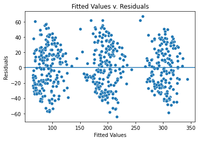
- The fitted values are in three groups because the categorical variable is dominating in this model, meaning that TV is the biggest factor that decides the sales.
- However, the variance where there are fitted values is similarly distributed, validating that the assumption is met.
Model assumption: No multicollinearity
Two common ways to check for multicollinearity are to:
- Create scatterplots to show the relationship between pairs of independent variables
- Use the variance inflation factor to detect multicollinearity
# Create a pairplot of the data
sns.pairplot(data)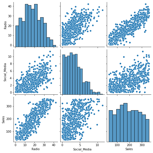
# Calculate the variance inflation factor (optional)
# Import variance_inflation_factor from statsmodels
from statsmodels.stats.outliers_influence import variance_inflation_factor

# Create a subset of the data with the continuous independent variables
X = data[['Radio','Social_Media']]

# Calculate the variance inflation factor for each variable.
vif = [variance_inflation_factor(X.values, i) for i in range(X.shape[1])]

# Create a DataFrame with the VIF results for the column names in X.
df_vif = pd.DataFrame(vif, index=X.columns, columns = ['VIF'])

# Display the VIF results.
df_vif| VIF | |
|---|---|
| Radio | 5.170922 |
| Social_Media | 5.170922 |
- The preceding model only has one continous independent variable, meaning there are no multicollinearity issues.
- However if a model used both
RadioandSocial_Mediaas predictors, there would be a moderate linear relationship betweenRadioandSocial_Mediathat violates the multicollinearity assumption. - Furthermore, the variance inflation factor when both
RadioandSocial_Mediaare included in the model is 5.17 for each variable, indicating high multicollinearity.
Results and evaluation
Let’s display the OLS regression results again.
# Display the model results summary
model_results- Using
TVandRadioas the independent variables results in a multiple linear regression model with R2=0.904. In other words, the model explains 90.4% of the variation inSales. This makes the model an excellent predictor ofSales.
Interpreting model coefficients
- When
TVandRadioare used to predictSales, the model coefficients are:- β0 = 218.5261
- βTVLow = −154.2971
- βTVMedium = −75.3120
- βRadio = 2.9669
- We could write the relationship between
Salesand the independent variables as a linear equation:- Sales = β0 + β1 ∗ X1 + β2 ∗ X2 + β3 ∗ X3
- Sales = β0 + βTVLow ∗ XTVLow + βTVMedium ∗ XTVMedium + βRadio ∗ XRadio
- Sales = 218.5261 − 154.2971 ∗ XTVLow − 75.3120 ∗ XTVMedium + 2.9669 ∗ XRadio
- The default
TVcategory for the model isHighsince there are coefficients for the other twoTVcategories,MediumandLow. Because the coefficients for theMediumandLowTVcategories are negative, that means the average of sales is lower forMediumorLowTVcategories compared to theHighTVcategory whenRadiois at the same level.- For example, the model predicts that a
LowTVpromotion is 154.2971 lower on average compared to ahighTVpromotion given the sameRadiopromotion.
- For example, the model predicts that a
- The coefficient for
Radiois positive, confirming the positive linear relationship shown earlier during the exploratory data analysis.
- The p-value for all coefficients is 0.0000.000, meaning all coefficients are statistically significant at p=0.05.
- The 95% confidence intervals for each coefficient should be reported when presenting results to stakeholders.
- For example, there is a 95% chance that the interval [−163.979,−144.616] contains the true parameter of the slope of βTVLow, which is the estimated difference in promotion sales when a
LowTVpromotion is chosen instead of aHighTVpromotion.
- For example, there is a 95% chance that the interval [−163.979,−144.616] contains the true parameter of the slope of βTVLow, which is the estimated difference in promotion sales when a
- Potential areas to explore include:
- Providing the business with the estimated sales given different TV promotions and radio budgets.
- Additional plots to help convey the results, such as using the
seabornregplot()to plot the data with a best fit regression line
- Given how accurate
TVwas as a predictor, the model could be improved by getting a more granular view of theTVpromotions, such as by considering more categories or the actualTVpromotional budgets. - Furthermore, additional variables, such as the location of the marketing campaign or the time of year, could increase model accuracy.
Considerations
What findings could we share with others?
According to the model, high TV promotional budgets result in significantly more sales than medium and low TV promotional budgets. For example, the model predicts that a Low TV promotion is 154.2971 lower on average than a high TV promotion given the same Radio promotion.
The coefficient for radio is positive, confirming the positive linear relationship shown earlier during the exploratory data analysis.
The p-value for all coefficients is 0.0000.000, meaning all coefficients are statistically significant at p=0.05. The 95% confidence intervals for each coefficient should be reported when presenting results to stakeholders.
For example, there is a 95% chance the interval [−163.979,−144.616] contains the true parameter of the slope of βTVLow, which is the estimated difference in promotion sales when a low TV promotional budget is chosen instead of a high TV promotion budget.
How could we frame our findings to stakeholders?
High TV promotional budgets have a substantial positive influence on sales. The model estimates that switching from a high to medium TV promotional budget reduces sales by $75.3120 million (95% CI [−82.431,−68.193]), and switching from a high to low TV promotional budget reduces sales by $154.297 million (95% CI [−163.979,−144.616]).
The model also estimates that an increase of $1 million in the radio promotional budget will yield a $2.9669 million increase in sales (95% CI [2.551,3.383]).
Thus, it is recommended that the business allot a high promotional budget to TV when possible and invest in radio promotions to increase sales.
Disclaimer: Like most of my posts, this content is intended solely for educational purposes and was created primarily for my personal reference. At times, I may rephrase original texts, and in some cases, I include materials such as graphs, equations, and datasets directly from their original sources.
I typically reference a variety of sources and update my posts whenever new or related information becomes available. For this particular post, the primary source was Google Advanced Data Analytics Professional Certificate.