
My role
Data Analysis & Research
Performing a detailed EDA, building ML Models

Timeline
Feb ’25
Set Exercise, BSBI
MSc Data Analytics

Tools
Python
Jupyter
Office Suite
OVERVIEW
The Data
The Twitter Dataset holds different attributes such as reach, likes and retweet counts and also user-related details like klout and sentiment scores.
The Goal
I’ll analyze and categorize user behavior patterns based on their activity, aiming to improve user engagement.
Tools
Pandas and Numpy for basics,
Matplotlib for analysis and visualization,
Seaborn for visualization and correlation matrix,
Sklearn for clustering algorithms.
Methods
Statistics
Data Processing
Exploratory Analysis
Feature Engineering
Data Modeling
Data Visualization
Encoding & Scaling
Sampling
Research data *
Twitter dataset is publicly available, and more information about the dataset can be found below.
* I performed this analysis only for educational purposes and to demonstrate my skills and how I approach to a dataset, build different models and evaluate them.
1 Introduction
Structure
This study works on a Twitter dataset that holds different attributes such as reach, likes and retweet counts and also user-related details like klout and sentiment scores. The aim of this study is to improve user engagement and optimize personalized content delivery. After cleaning and transforming the data for the exploratory analysis, the data was prepared for modeling and then different algorithms (K-Means, Hierarchical and DBSCAN) used to come up with user clusters.
Method
The data was transformed by creating segments from existing features. During the EDA phase, time-based trends and impact of engagements are observed by using grouping and visualization techniques. The data is encoded and scaled by Standardization (Z-score scaling). Due to computational load, the dataset was sampled down using a random and a stratified method. The selected algorithms are implied and the models are then evaluated using various metrics such as Silhouette score and Davies-Bouldin index. Because this is an unsupervised learning (no clear outcome), all clusters are then compared side by side by using visualization techniques and combined statistics.
1.1 The Twitter Dataset
The Twitter dataset was found during MSc Data Analytics, as part of the end-of-the-term assignments via a Kaggle link. The dataset was created by Krystal Jensen (Data World 2022). An Excel analysis of this dataset can be found here as well.
1.2 Data Dictionary
The dataset holds tweet information such as Tweet id, the time of the tweets, language and is reshared or not; engagement metrics like reach, likes and retweet counts; and also user-related details such as klout and sentiment scores. The Klout score indicates the influence of the user who posted the tweet. A higher Klout score suggests greater influence and reach. Sentiment, on the other hand, measures the emotional tone of tweets (e.g., positive or negative).
2 Understand the Data
# import libraries
import pandas as pd
import numpy as np
import matplotlib.pyplot as plt
import seaborn as sns

# Read the dataset
df_tw = pd.read_csv('/content/Twitter_data_ack.csv')
df_tw.head()| index | TweetID | Weekday | Hour | Day | Lang | IsReshare | Reach | RetweetCount | Likes | Klout | Sentiment | text | |
|---|---|---|---|---|---|---|---|---|---|---|---|---|---|
| 0 | 0 | tw-6827128… | Thursday | 17 | 31 | en | False | 44 | 0 | 0 | 35 | 0.0 | We are hiring: Senior Software Engineer – Prot… |
| 1 | 1 | tw-6827130… | Thursday | 17 | 31 | en | True | 1810 | 5 | 0 | 53 | 2.0 | RT @CodeMineStatus: This is true Amazon Web Se… |
| 2 | 2 | tw-6827132… | Thursday | 17 | 31 | en | False | 282 | 0 | 0 | 47 | 0.0 | Devops Engineer Aws Ansible Cassandra Mysql Ub… |
| 3 | 3 | tw-6827134… | Thursday | 17 | 31 | en | False | 2087 | 4 | 0 | 53 | 0.0 | Happy New Year to all those AWS instances of o… |
| 4 | 4 | tw-6827140… | Thursday | 17 | 31 | en | False | 953 | 0 | 0 | 47 | 0.0 | Amazon is hiring! #Sr. #International Tax Mana… |
df_tw.shape(100000, 13)
df_tw.isna().sum().sum()0
df_tw.duplicated().sum()0
df_tw.info()RangeIndex: 100000 entries, 0 to 99999
Data columns (total 13 columns):
# Column Non-Null Count Dtype
--- ------ -------------- -----
0 index 100000 non-null int64
1 TweetID 100000 non-null object
2 Weekday 100000 non-null object
3 Hour 100000 non-null int64
4 Day 100000 non-null int64
5 Lang 100000 non-null object
6 IsReshare 100000 non-null bool
7 Reach 100000 non-null int64
8 RetweetCount 100000 non-null int64
9 Likes 100000 non-null int64
10 Klout 100000 non-null int64
11 Sentiment 100000 non-null float64
12 text 100000 non-null object
dtypes: bool(1), float64(1), int64(7), object(4)
▶ Initial inspection:
- There are 100.000 observations under 13 variables.
- There are no missing values.
- There are no duplicates.
- Columns hold different data types.
Descriptive Statistics: Checking numerical features
# Check descriptive stats for numerical values
df_tw.describe()| index | Hour | Day | Reach | RetweetCount | Likes | Klout | Sentiment | |
|---|---|---|---|---|---|---|---|---|
| count | 100000.000000 | 100000.000000 | 100000.000000 | 1.000000e+05 | 100000.000000 | 100000.000000 | 100000.000000 | 100000.000000 |
| mean | 49999.500000 | 11.412490 | 15.894960 | 8.542396e+03 | 8.052750 | 0.152770 | 40.389260 | 0.380921 |
| std | 28867.657797 | 6.053577 | 8.399852 | 8.867027e+04 | 97.863474 | 2.583633 | 13.636513 | 1.046559 |
| min | 0.000000 | 0.000000 | 1.000000 | 0.000000e+00 | 0.000000 | 0.000000 | 0.000000 | -6.000000 |
| 25% | 24999.750000 | 7.000000 | 9.000000 | 1.510000e+02 | 0.000000 | 0.000000 | 32.000000 | 0.000000 |
| 50% | 49999.500000 | 11.000000 | 16.000000 | 4.485000e+02 | 0.000000 | 0.000000 | 43.000000 | 0.000000 |
| 75% | 74999.250000 | 16.000000 | 23.000000 | 1.496000e+03 | 3.000000 | 0.000000 | 49.000000 | 0.666667 |
| max | 99999.000000 | 23.000000 | 31.000000 | 1.034245e+07 | 26127.000000 | 133.000000 | 99.000000 | 7.333333 |
# Check consistency of Hour and Day
print('Hours:', sorted(df_tw.Hour.unique()))
print('Days:', sorted(df_tw.Day.unique()))
Hours: [0, 1, 2, 3, 4, 5, 6, 7, 8, 9, 10, 11, 12, 13, 14, 15, 16, 17, 18, 19, 20, 21, 22, 23] Days: [1, 2, 3, 4, 5, 6, 7, 8, 9, 10, 11, 12, 13, 14, 15, 16, 17, 18, 19, 20, 21, 22, 23, 24, 25, 26, 27, 28, 29, 30, 31]
▶ Descriptive statistics for numerical values:
- The interaction columns (‘Reach’, ‘RetweetCount’ and ‘Likes’) have higher standard deviation than the mean. This indicates a dispersed distribution.
- ‘Klout’ is ranging from 0 to 99.
- Q1 and Q3 of ‘Sentiment’ are very close to the median that is zero, meaning that zero takes the big proportion.
- The values of Hour and Day are consistent in terms of holding all the possible outcomes.
Distributions of Numerical Values
Klout
The Klout score indicates the influence of the user who posted the tweet. A higher Klout score suggests greater influence and reach.
sns.histplot(df_tw['Klout'], bins=50)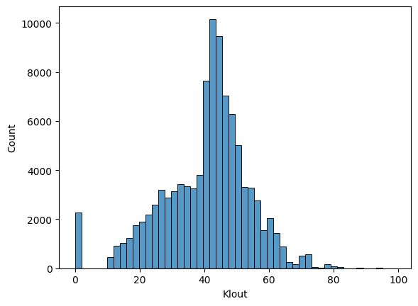
plt.figure(figsize = (12, 1))
sns.boxplot(df_tw['Klout'], orient='h')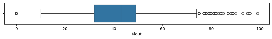
▶ ‘Klout’ has a wide spread of distributions with outliers on both edges. Grouping them might be helpful for clustering studies.
Sentiment
The sentiment of the tweet, indicating whether it is positive, negative, or neutral.
sns.histplot(df_tw['Sentiment'], bins=12)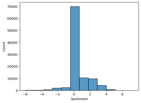
▶ ‘Sentiment’ has a range from -6 till 7.3. Its values likely come from a sentiment analysis tool that assigns a score representing the emotional tone of the tweet. Regrouping them under -1, 0, 1 might be more helpful.
Likes
Total number of likes that a tweet got.
sns.histplot(df_tw['Likes'])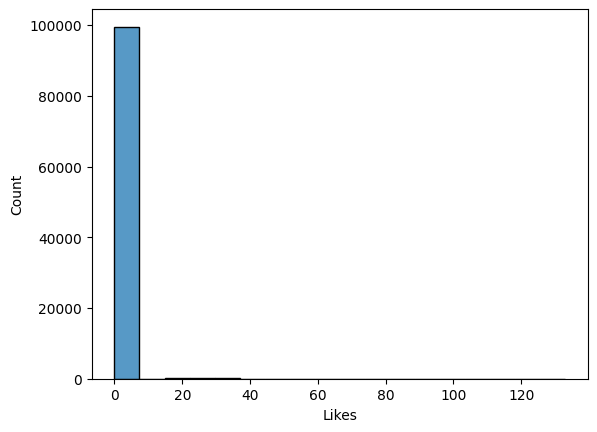
df_tw.Likes.value_counts(normalize=True).head()| proportion | |
|---|---|
| Likes | |
| 0 | 0.99492 |
| 1 | 0.00020 |
| 22 | 0.00019 |
| 21 | 0.00017 |
| 32 | 0.00016 |
▶ Almost all of ‘Likes’ are zero, meaning that the vast majority of tweets in the dataset received no likes, making it a highly imbalanced and sparse feature. Binary Transformation could still be useful.
RetweetCount
The number of times the tweet was retweeted.
plt.figure(figsize = (12, 1))
sns.boxplot(df_tw['RetweetCount'], orient='h')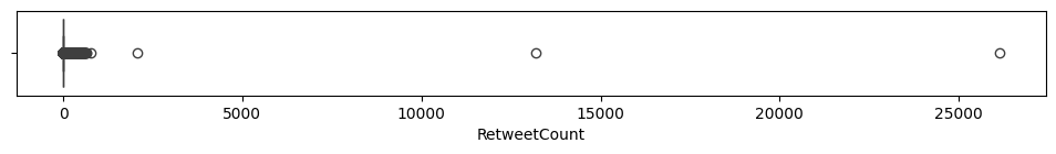
# Boxplot without outliers
plt.figure(figsize = (12, 1))
sns.boxplot(df_tw['RetweetCount'], orient='h', showfliers=False)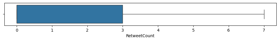
df_tw.RetweetCount.value_counts(normalize=True).head(| RetweetCount | proportion |
|---|---|
| 0 | 0.52721 |
| 1 | 0.15849 |
| 2 | 0.06083 |
| 3 | 0.03431 |
| 4 | 0.02219 |
Likes & Retweets
# Check counts of some combination of Likes and Retweets
zero_likes = df_tw[df_tw['Likes'] == 0]
print('Number of Tweets without any like:', len(zero_likes))

zero_retweets = df_tw[df_tw['RetweetCount'] == 0]
print('Number of Tweets that are not retweeted:', len(zero_retweets))

zero_interaction = df_tw[(df_tw['Likes'] == 0) & (df_tw['RetweetCount'] == 0)]
print('When a tweet has no likes and no retweets:', len(zero_interaction))

with_likes = df_tw[df_tw['Likes'] != 0]
print('Number of Tweets with min. one like:', len(with_likes))
Number of Tweets without any like: 99492
Number of Tweets that are not retweeted: 52721
When a tweet has no likes and no retweets: 52711
Number of Tweets with min. one like: 508
▶ Distribution of Retweet counts:
- More than half of the records have no retweets. Other values are sparse and it has extreme outliers too.
- In 10 instances, a tweet got a like but not retweeted.
- There are totally 508 tweets that have a minimum one like.
- Since both Likes and RetweetCount has outliers, these two could be combined to have a binary outcome as: 1 if Likes > 0 or Retweets > 0, otherwise 0.
- Another composite metric could be an engagement score as: (Likes + Retweets) / Reach.
Reach
The number of unique users who saw the tweet.
plt.figure(figsize = (12, 1))
sns.boxplot(df_tw['Reach'], orient='h')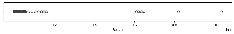
# Boxplot with log transformation
plt.figure(figsize = (12, 1))
plt.boxplot(np.log(df_tw['Reach'] + 1), vert=False)
plt.title('Boxplot of Log-Transformed Reach')
plt.xlabel('Log(Reach + 1)')
plt.show()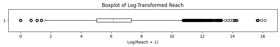
# Log transformation
log_reach = np.log(df_tw['Reach'] + 1)

# Plot histogram
plt.hist(log_reach, bins=30, color='skyblue', edgecolor='black')
plt.title('Log-Transformed Reach Distribution')
plt.xlabel('Log(Reach + 1)')
plt.ylabel('Frequency')
plt.show()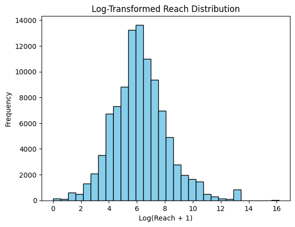
zero_reach = df_tw[df_tw['Reach'] == 0]
print('Number of Tweets without any reach:', len(zero_reach))
Number of Tweets without any reach: 151
▶ Distribution of Reach counts:
- 151 tweets did not reach anyone.
- Log transformed Reach values reflect almost a normal distribution.
Descriptive Statistics: Checking categorical features
# Check descriptive stats for categorical values
df_tw.describe(include=['object'])| TweetID | Weekday | Lang | text | |
|---|---|---|---|---|
| count | 100000 | 100000 | 100000 | 100000 |
| unique | 100000 | 7 | 36 | 70271 |
| top | tw-682712873332805633 | Tuesday | en | Zombiler uyandnda Amazon Web Services hazr ola… |
| freq | 1 | 18468 | 91886 | 484 |
# Check consistency of Weekday
print(df_tw.Weekday.unique())
['Thursday' 'Friday' 'Saturday' 'Sunday' 'Monday' 'Tuesday' 'Wednesday']
# Check top distributions of Language
df_tw['Lang'].value_counts(normalize=True).head()| proportion | |
|---|---|
| Lang | |
| en | 0.91886 |
| es | 0.01700 |
| fr | 0.01085 |
| tr | 0.00877 |
| _u | 0.00861 |
▶ Descriptive statistics for categorical values:
- Weekday column looks consistent in terms of having all possible outcomes.
- Almost 92% of the Language column comes with English. Again, we could consider a binary outcome of having Eng. or not. However this requires a deeper research that we need to be sure of each text are consistent and they reflect the language correctly rather than showing the user’s Twitter preference language. For this reason and for the simplicity of this study, I’ll rely on the Sentiment column and I won’t take the Language column as a feature.
top_lang = df_tw[df_tw['text'] == df_tw['text'].mode()[0]]
top_lang.head(3)| index | TweetID | Weekday | Hour | Day | Lang | IsReshare | Reach | RetweetCount | Likes | Klout | Sentiment | text | |
|---|---|---|---|---|---|---|---|---|---|---|---|---|---|
| 50211 | 50211 | tw-700021064202657792 | Wednesday | 11 | 17 | tr | False | 43374 | 0 | 0 | 52 | 0.0 | Zombiler uyandnda Amazon Web Services hazr ola… |
| 50225 | 50225 | tw-700024681546543104 | Wednesday | 11 | 17 | tr | False | 43767 | 0 | 0 | 52 | 0.0 | Zombiler uyandnda Amazon Web Services hazr ola… |
| 50316 | 50316 | tw-700044085386723328 | Wednesday | 12 | 17 | tr | False | 895 | 0 | 0 | 32 | 0.0 | Zombiler uyandnda Amazon Web Services hazr ola… |
Descriptive Statistics: Checking binary features
IsReshare: Indicates whether the tweet is a reshare or not.
df_tw['IsReshare'].value_counts(normalize=True)| proportion | |
|---|---|
| IsReshare | |
| False | 0.64538 |
| True | 0.35462 |
Around two thirds of Tweets are not re-shared.
3 Clean and Transform the Data
Drop Columns
Following the descriptive statistics done above, I’ll drop the columns:
- index, TweetID: We won’t need them for clustering studies.
- Day: Since it’s not clear for which month/s these days are, they won’t contribute to the analysis.
- Lang: As explained earlier, english language is dominating the distribution and checking their consistency will require much deeper research than this study.
- Text: We won’t check the contents deeper, but rely on the sentiment and klout records instead.
Because I’ll change the orginal dataset, I’ll assign these changes into different named dataframe.
df_tw.columnsIndex(['index', 'TweetID', 'Weekday', 'Hour', 'Day', 'Lang', 'IsReshare',
'Reach', 'RetweetCount', 'Likes', 'Klout', 'Sentiment', 'text'],
dtype='object')
df = df_tw.drop(columns=['index', 'TweetID', 'Day', 'Lang', 'text'])Transform Data
To handle the outliers and scales of some columns I’ll imply transformations.
Reach
Reach column hold huge values, log-transformation might help the models to perform better.
# Log-transform the Reach column
df['Reach_log'] = np.log(df['Reach'] + 1)
RetweetCount
RetweetCount has outliers towards the end part of the distribution. Grouping them might be helpful. Let’s first check how the grouped values will vary.
retweet_first = df_tw[df_tw['RetweetCount'] == 0]
print('Number of Re-Tweets that are 0:', len(retweet_first))

retweet_second = df_tw[(df_tw['RetweetCount'] > 0) & (df_tw['RetweetCount'] <= 3)]
print('Number of Re-Tweets that are >0 and <=3:', len(retweet_second))

retweet_third = df_tw[(df_tw['RetweetCount'] > 3) & (df_tw['RetweetCount'] <= 7)]
print('Number of Re-Tweets that are >3 and <=7:', len(retweet_third))

retweet_outliers = df_tw[df_tw['RetweetCount'] > 7]
print('Number of Re-Tweets that are >7:', len(retweet_outliers))
Number of Re-Tweets that are 0: 52721
Number of Re-Tweets that are >0 and <=3: 25363
Number of Re-Tweets that are >3 and <=7: 6251
Number of Re-Tweets that are >7: 15665
len(df_tw['RetweetCount']) == len(retweet_first) + len(retweet_second) + len(retweet_third) + len(retweet_outliers)True
# Create the 'Retweet_encoded' column with conditions
df['Retweet_enc'] = np.select(
    [
        df_tw['RetweetCount'] == 0,
        (df_tw['RetweetCount'] > 0) & (df_tw['RetweetCount'] <= 3),
        (df_tw['RetweetCount'] > 3) & (df_tw['RetweetCount'] <= 7),
        df_tw['RetweetCount'] > 7
    ],
    [
        0,
        1,
        2,
        3
    ],
    default = 0  # If no condition matches, default to 0 instead of NaN
)
Likes
As mentioned earlier, Likes column is highly skewed while the ‘0’ values (no likes) hold more than 99%. Counting all other values (min one likes) all together as 1 might still bring new insights.
# Create the 'Likes_binary' column with conditions
df['Likes_bin'] = np.select(
    [
        df['Likes'] == 0,
        df['Likes'] > 0
    ],
    [
        0,
        1,
    ],
)df['Likes_bin'].value_counts()| count | |
|---|---|
| Likes_bin | |
| 0 | 99492 |
| 1 | 508 |
Engagement
Newly created ‘likes_bin’ is also very imbalanced. I’ll try to create a new engagement feature by combining Likes and RetweetCount.
# Create the 'Engagement_binary' column with conditions
df['Engage_bin'] = np.select(
    [
        (df['Likes'] == 0) & (df['RetweetCount'] == 0),
        (df['Likes'] > 0) | (df['RetweetCount'] > 0)
    ],
    [
        0,
        1,
    ],
    default = 0  # If no condition matches, default to 0 instead of NaN
)df['Engage_bin'].value_counts()| count | |
|---|---|
| Engage_bin | |
| 0 | 52711 |
| 1 | 47289 |
Because Likes column has very low 1 values, this new ‘Engage_bin’ column didn’t bring any new insight than ‘RetweetCount’. It is the same result as having a RetweetCount as zero. So ‘Engage_bin’ doesn’t bring us much.
df = df.drop(columns=['Engage_bin'])df.head(3)| Weekday | Hour | IsReshare | Reach | RetweetCount | Likes | Klout | Sentiment | Reach_log | Retweet_enc | Likes_bin | |
|---|---|---|---|---|---|---|---|---|---|---|---|
| 0 | Thursday | 17 | False | 44 | 0 | 0 | 35 | 0.0 | 3.806662 | 0 | 0 |
| 1 | Thursday | 17 | True | 1810 | 5 | 0 | 53 | 2.0 | 7.501634 | 2 | 0 |
| 2 | Thursday | 17 | False | 282 | 0 | 0 | 47 | 0.0 | 5.645447 | 0 | 0 |
Sentiment
Similar to Likes column, greatest part of the Sentiment column is ‘0’. Grouping the negatives and positives together within themselves might be useful.
# Create the 'Sentiment_encoded' column with conditions
df['Sentiment_enc'] = np.select(
    [
        df['Sentiment'] < -0.5,
        (df['Sentiment'] >= -0.5) & (df['Sentiment'] <= 0.5),
        df['Sentiment'] > 0.5
    ],
    [
        -1,
        0,
        1
    ],
    default = 0  # If no condition matches, default to 0 instead of NaN
)df['Sentiment_enc'].value_counts()| count | |
|---|---|
| Sentiment_enc | |
| 0 | 70120 |
| 1 | 25057 |
| -1 | 4823 |
Klout
Klout comes as a continuous value ranging from 0 till 99. Considering it as clusters based on IQR might be helpful too.
# Create the 'Klout_encoded' column with conditions
# Calculate quartiles and IQR
Q1 = df['Klout'].quantile(0.25)
Q2 = df['Klout'].quantile(0.50)  # Median
Q3 = df['Klout'].quantile(0.75)
IQR = Q3 - Q1

# Define the boundaries
lower_bound = Q1 - 1.5 * IQR
upper_bound = Q3 + 1.5 * IQR

# Create a function to assign groups
def assign_group(value):
    if value < lower_bound:
        return 0  # Less than lower bound
    elif lower_bound <= value < Q1:
        return 1  # Between lower bound and Q1
    elif Q1 <= value < Q2:
        return 2  # Between Q1 and Q2 (Median)
    elif Q2 <= value < Q3:
        return 3  # Between Q2 (Median) and Q3
    elif Q3 <= value <= upper_bound:
        return 4  # Between Q3 and upper bound
    else:
        return 5  # Greater than upper bound

# Apply the function to create the group column
df['Klout_enc'] = df['Klout'].apply(assign_group)df['Klout_enc'].value_counts().sort_index()| count | |
|---|---|
| Klout_enc | |
| 0 | 2275 |
| 1 | 21234 |
| 2 | 26076 |
| 3 | 25361 |
| 4 | 24687 |
| 5 | 367 |
4 Feature Engineering
While I introduced new columns by encoding above, considering some new features might be also helpful.
Time-related features
IsWeekend
Creating new column to indicate whether is weekend or not.
#Define Weekday's order
weekday_order = ['Monday','Tuesday', 'Wednesday', 'Thursday','Friday','Saturday','Sunday']

# Convert 'Weekday' to Categorical with the specified order
df['Weekday'] = pd.Categorical(df['Weekday'], categories=weekday_order, ordered=True)

# Create IsWeekend column
df['IsWeekend'] = df['Weekday'].isin(['Saturday', 'Sunday'])df.value_counts(['IsWeekend', 'Weekday']).sort_index(level='Weekday')| IsWeekend | Weekday | count |
|---|---|---|
| False | Monday | 15420 |
| Tuesday | 18468 | |
| Wednesday | 18236 | |
| Thursday | 18458 | |
| Friday | 15004 | |
| True | Saturday | 7421 |
| Sunday | 6993 |
▶ On weekends the tweet counts per day are almost half as the counts per working day.
TimeSegment
Creating time segments within a day.
# Create the 'TimeSegment' column with conditions
# Define a function to assign time segments
def assign_time_segment(hour):
    if 5 <= hour < 12:
        return 'Morning'
    elif 12 <= hour < 17:
        return 'Afternoon'
    elif 17 <= hour < 21:
        return 'Evening'
    else:
        return 'Night'

# Apply the function to the 'Hour' column
df['TimeSeg'] = df['Hour'].apply(assign_time_segment)

# Define the order for TimeSegment
time_segment_order = ['Morning', 'Afternoon', 'Evening', 'Night']

# Convert TimeSegment to a categorical type with the defined order
df['TimeSeg'] = pd.Categorical(df['TimeSeg'], categories=time_segment_order, ordered=True)df['TimeSeg'].value_counts().sort_index(level='TimeSeg')| TimeSeg | count |
|---|---|
| Morning | 36235 |
| Afternoon | 26177 |
| Evening | 14370 |
| Night | 23218 |
▶ In terms of Tweet counts, mornings are the most active and evenings are the least.
df.tail(3)| Weekday | Hour | IsReshare | Reach | RetweetCount | Likes | Klout | Sentiment | Reach_log | Retweet_enc | Likes_bin | Sentiment_enc | Klout_enc | IsWeekend | TimeSeg | |
|---|---|---|---|---|---|---|---|---|---|---|---|---|---|---|---|
| 99997 | Saturday | 13 | True | 122 | 435 | 0 | 17 | 1.0 | 4.812184 | 3 | 0 | 1 | 1 | True | Afternoon |
| 99998 | Saturday | 13 | True | 287 | 30 | 0 | 42 | 0.0 | 5.662960 | 3 | 0 | 0 | 2 | True | Afternoon |
| 99999 | Saturday | 13 | False | 2422 | 1 | 0 | 34 | 3.0 | 7.792762 | 1 | 0 | 1 | 2 | True | Afternoon |
Engagement metrics
Creating a composite metric like (Likes + Retweets) / Reach might bring a more holistic view of engagement.
# Create an Engagement Score column
df['Engage_score'] = (df['Likes'] + df['RetweetCount']) / (df['Reach'] + 1)sns.histplot(df['Engage_score'], bins=30)
▶ This new Engagement Score is similar to Likes and Retweet counts, highly imbalanced. According to the plot it doesn’t seem that it will bring some different insights than the existing columns. So I’ll drop it not to consider further.
# Drop newly created Engagement Score column
df = df.drop(columns=['Engage_score'])
5 Exploratory Data Analysis
Now it’s time to perform EDA to observe some patterns and trends.
Time-based Trends: Reach, Likes, RetweetCount
Weekday: Reach, Likes, RetweetCount
# Group by Weekday and calculate mean for numerical columns
weekday_summary = df.groupby('Weekday')[['Likes', 'RetweetCount']].mean()

# Plot trends by weekday
weekday_summary.plot(kind='bar', figsize=(9, 5))
plt.title('Engagement Metrics (Likes, Retweets) by Weekday')
plt.xlabel('Weekday')
plt.ylabel('Average Value')
plt.xticks(rotation=45)
plt.legend(title='Metrics')
plt.show()
# Group by Weekday and calculate mean for numerical columns
weekday_summary = df.groupby('Weekday')[['Reach']].mean()

# Plot trends by weekday
weekday_summary.plot(kind='bar', figsize=(9, 5))
plt.title('Engagement Metrics (Reach) by Weekday')
plt.xlabel('Weekday')
plt.ylabel('Average Value')
plt.xticks(rotation=45)
plt.legend(title='Metrics')
plt.show()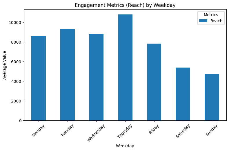
▶ Engagement metrics (on average) by weekday:
- We knew that the Likes count were quite low. It’s hard to observe any difference apart from Sunday’s even-lower counts.
- Retweet counts on average has an increasing trends towards the end of the week, while Wednesday being an exception and having higher average like weekends.
- On average weekends have less Reach counts than weekdays, while Thursday has the highest counts.
Weekend: Reach_log, Likes, RetweetCount
We can narrow down the above graph just by checking weekends vs workdays too.
# Group by IsWeekend and calculate the mean for engagement metrics
weekend_summary = df.groupby('IsWeekend')[['Reach', 'Likes', 'RetweetCount']].mean()
print(weekend_summary)
Reach Likes RetweetCount IsWeekend False 9127.970579 0.158753 7.874804 True 5065.429999 0.117247 9.109338
▶ Engagement on weekends:
- While weekends have on average less Reach and Likes, they have higher Retweets compared to working days.
Hour: Reach, Likes, RetweetCount
# Group by Hour and calculate mean for numerical columns
hour_summary = df.groupby('Hour')[['Likes', 'RetweetCount']].mean()

# Plot trends by Hour
hour_summary.plot(kind='line', figsize=(12, 5))
plt.title('Engagement Metrics (Likes, Retweets) by Hour')
plt.xlabel('Hour of the Day')
plt.ylabel('Average Value')
plt.xticks(range(0, 24, 2))  # Show every 2nd hour for clarity
plt.grid()
plt.legend(title='Metrics')
plt.show()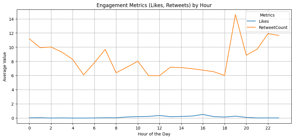
# Group by Hour and calculate mean for numerical columns
hour_summary = df.groupby('Hour')[['Reach']].mean()

# Plot trends by Hour
hour_summary.plot(kind='line', figsize=(12, 5))
plt.title('Engagement Metrics (Reach) by Hour')
plt.xlabel('Hour of the Day')
plt.ylabel('Average Value')
plt.xticks(range(0, 24, 2))  # Show every 2nd hour for clarity
plt.grid()
plt.legend(title='Metrics')
plt.show()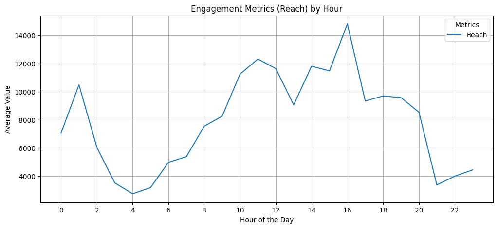
▶ Engagement metrics (on average) by hour:
- Retweet counts have ‘visible’ fluctuating trends throughout a day. The peak points could be reflection of working hours, while the end of the working-day has the highest engagement scores.
- Low numbers of Likes makes it harder to follow a trend.
- Reach counts show high activities during working hours. But the peak points of Reach don’t necessarily follow the Retweet’s most active hours.
Combination of Weekday and Hour: Retweet Count
To have a better insight of the above graphs, let’s check the situation throughout a week for the average retweet counts.
# Filter numerical columns
numerical_cols = df[['Reach', 'Likes', 'RetweetCount']]

# Pivot table for Weekday-Hour analysis
weekday_hour_summary = df.pivot_table(
    index='Weekday',
    columns='Hour',
    values=numerical_cols,
    aggfunc='mean'
)

# Visualize Reach as a heatmap
plt.figure(figsize=(14, 8))
sns.heatmap(weekday_hour_summary['RetweetCount'], cmap='YlGnBu', annot=False, cbar=True)
plt.title('Average Retweet Count by Weekday and Hour')
plt.xlabel('Hour of the Day')
plt.ylabel('Weekday')
plt.show()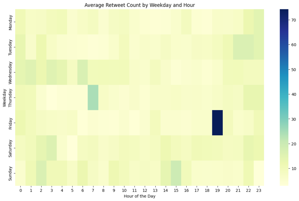
▶ Engagement metrics (Retweet counts on average) by weekday & hour:
- When we check the hours throughout a week rather than a day, it reveals interesting patterns.
- Even though weekends and Wednesdays were holding (on average) the highest engagement scores of retweeting, Friday evenings (could be read as end of the working week) has the highest score among a weekday-hour study.
- Since we don’t necessarily see similar peaks on the same time period on other days, we can think that the high peak we observed before around 19:00 is coming from Fridays.
- Thursday mornings and Sunday afternoons are following.
- Tuesday nights to Wednesday mornings and weekend mornings also seem active in terms of retweeting.
Time-based Trends: Sentiment, Klout
Now we can check weekdays based on Sentiment and Klout.
Weekday: Sentiment
# Frequency count for each sentiment by weekday
sentiment_counts = df.groupby(['Weekday', 'Sentiment_enc']).size().unstack()

# Stacked bar plot for sentiment counts
sentiment_counts.plot(kind='bar', stacked=True, figsize=(9, 5), colormap='viridis')
plt.title('(Encoded) Sentiment Distribution by Weekday')
plt.xlabel('Weekday')
plt.ylabel('Count')
plt.xticks(rotation=45)
plt.legend(title='Sentiment')
plt.show()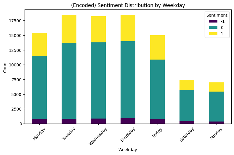
Weekday: Klout
# Frequency count for each sentiment by weekday
klout_counts = df.groupby(['Weekday', 'Klout_enc']).size().unstack()

# Stacked bar plot for sentiment counts
klout_counts.plot(kind='bar', stacked=True, figsize=(9, 5), colormap='viridis')
plt.title('Klout Distribution by Weekday')
plt.xlabel('Weekday')
plt.ylabel('Count')
plt.xticks(rotation=45)
plt.legend(title='Klout')
plt.show()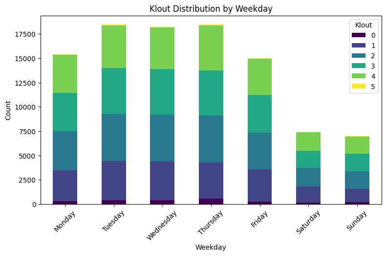
▶ Sentiment and Klout by weekday:
- Both Sentiment and Klout keep the proportion of their distributions within a day similarly compared to any other days. There are no clear patterns differentiating through weekdays.
- In total their average counts are much higher on working days, the highest days being Tuesday, Wednesday and Thursday.
Content Engagement
Let’s check how re-sharing affects the engagement.
# Group by IsReshare and calculate the mean for engagement metrics
content_summary = df.groupby('IsReshare')[['Reach', 'Likes', 'RetweetCount']].mean()

print(content_summary)
Reach Likes RetweetCount IsReshare False 11392.786715 0.236713 0.906319 True 3354.913118 0.000000 21.058683
▶ Content Engagement:
- Resharing doesn’t necessarily bring Reaching more people or more Likes. However it seemed that there is a correlation with re-shared tweets and high Retweet Counts. Two notes to underline:
- 1- This doesn’t mean there is a causation between these two. We can’t say that by only looking at these digits.
- 2- The terms ‘re-share’ and ‘retweet’ are a bit confusing. The dataset might not be the most updated one. I’ll assume re-tweet is sharing within Twitter and re-share is sharing in some other platforms like Facebook.
Sentiment & Klout Impact
Impact of Sentiment
# Group by Sentiment and calculate mean for engagement metrics
sentiment_impact = df.groupby('Sentiment_enc')[['Likes', 'RetweetCount']].mean()

# Plot the relationship between sentiment and engagement
sentiment_impact.plot(kind='line', figsize=(8, 5), marker='o')
plt.title('Impact of Sentiment on Engagement Metrics (Likes and Retweets)')
plt.xlabel('Sentiment')
plt.ylabel('Average Value')
plt.grid()
plt.legend(title='Metrics')
plt.show()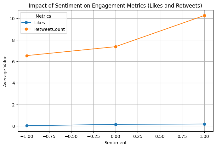
# Group by Sentiment and calculate mean for engagement metrics
sentiment_impact = df.groupby('Sentiment_enc')[['Reach']].mean()

# Plot the relationship between sentiment and engagement
sentiment_impact.plot(kind='line', figsize=(8, 5), marker='o')
plt.title('Impact of Sentiment on Engagement Metrics (Reach)')
plt.xlabel('Sentiment')
plt.ylabel('Average Value')
plt.grid()
plt.legend(title='Metrics')
plt.show()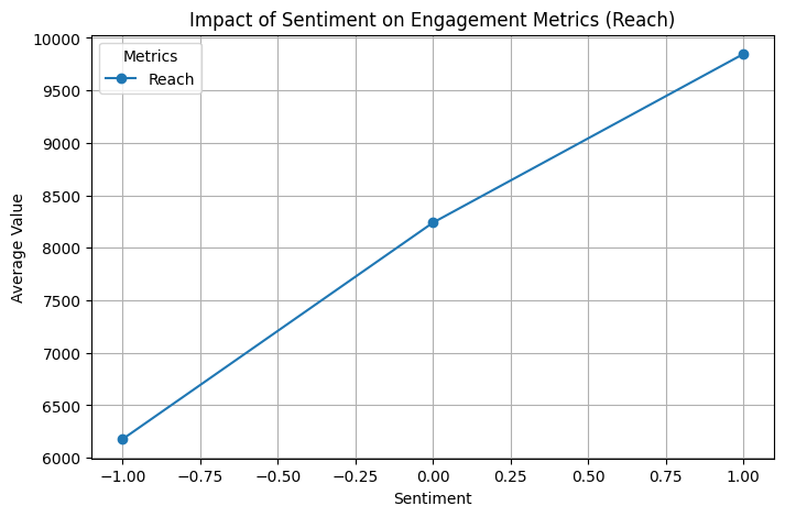
▶ Impact of Sentiment: Having a higher sentiment reflects higher engagement metrics (likes, retweets, reach counts).
from scipy.stats import f_oneway
# Separate engagement metrics by sentiment groups
positive = df[df['Sentiment'] > 0]
neutral = df[df['Sentiment'] == 0]
negative = df[df['Sentiment'] < 0]

# Perform ANOVA for each engagement metric
for metric in ['Reach', 'Likes', 'RetweetCount']:
    f_stat, p_value = f_oneway(positive[metric], neutral[metric], negative[metric])
    print(f"{metric}: F-statistic = {f_stat:.2f}, p-value = {p_value:.4f}")
Reach: F-statistic = 5.73, p-value = 0.0032
Likes: F-statistic = 6.97, p-value = 0.0009
RetweetCount: F-statistic = 5.90, p-value = 0.0027
Klout
# Group by Klout and calculate mean for engagement metrics
klout_impact = df.groupby('Klout_enc')[['Likes', 'RetweetCount']].mean()

# Plot the relationship between klout and engagement
klout_impact.plot(kind='line', figsize=(8, 5), marker='o')
plt.title('Impact of Klout on Engagement Metrics (Likes, Retweets)')
plt.xlabel('Klout')
plt.ylabel('Average Value')
plt.grid()
plt.legend(title='Metrics')
plt.show()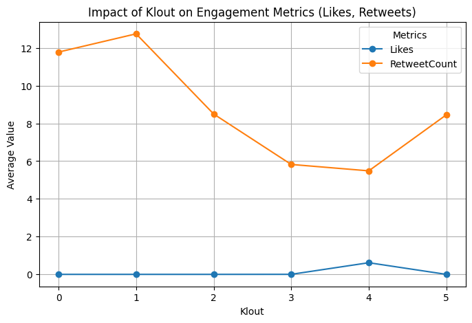
# Group by Klout and calculate mean for engagement metrics
klout_impact = df.groupby('Klout_enc')[['Reach']].mean()

# Plot the relationship between klout and engagement
klout_impact.plot(kind='line', figsize=(8, 5), marker='o')
plt.title('Impact of Klout on Engagement Metrics (Reach)')
plt.xlabel('Klout')
plt.ylabel('Average Value')
plt.grid()
plt.legend(title='Metrics')
plt.show()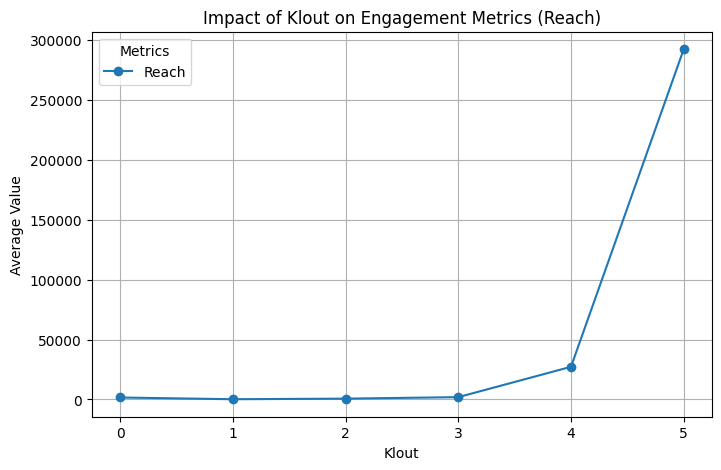
▶ Impact of Klout:
- Klout segment 1 and 0 have the highest impact on Retweet counts, while segment 3 and 4 have the least counts.
- Reach counts on average get higher when Klout scores also get higher. Segment 3 starts from the median, so almost all Reach are observed on the second half of the Klout scores.
- The last statement could be the explanation of higher average value of Retweets observed on segment 5, compared to segment 3 and 4.
- Even though we have very few Likes, seeing them coming only from the Klout segment 4 can be a good starting point for further analysis by finding other sets of data with more balanced Likes distributions.
Correlation Analysis
# Compute correlation matrix for numerical columns
numerical_cols = ['Reach_log', 'Likes', 'Retweet_enc', 'Klout_enc', 'Sentiment_enc', 'IsReshare']
correlation_matrix = df[numerical_cols].corr()

# Plot heatmap
plt.figure(figsize=(8, 6))
sns.heatmap(correlation_matrix, annot=True, fmt=".2f", cmap="coolwarm", cbar=True)
plt.title("Correlation Matrix of Engagement Metrics")
plt.show()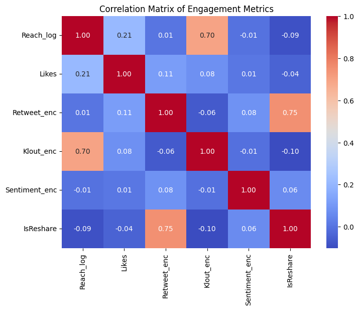
▶ Correlation Matrix:
- Among the presented features, IsReshare and Retweet_enc have the highest correlation with 75%, followed by Klout_enc and Reach_log with 70%. Two notes to underline:
- Log-version of Reach (that has almost a normal distribution) shows such correlation, not the Reach counts.
- Correlation calculation is based on linear relationship, which might not be the case in terms of user engagements.
5 Preparation for Modeling
Eliminating Coupled Columns
Since I’ve been studying different versions of some columns, it’s now time to eliminate some of the redundant ones. Columns to be kept:
- Weekday over IsWeekend: Useful for understanding engagement patterns by day.
- TimeSeg over Hour: Captures broader time patterns. (For detailed patterns, like specific hours, Hours can be considered in future studies as well)
Columns to be used as features for models:
- Reach_log over Reach: Scaled for clustering, represents reach.
- Retweet_enc over RetweetCount: Encoded version simplifies analysis.
- Sentiment_enc over Sentiment: Encoded version simplifies analysis.
- Klout_enc over Klout: Encoded version simplifies analysis.
df_model = df.drop(columns= ['Hour', 'IsWeekend'])df_model.tail(3)| Weekday | IsReshare | Reach | RetweetCount | Likes | Klout | Sentiment | Reach_log | Retweet_enc | Likes_bin | Sentiment_enc | Klout_enc | TimeSeg | |
|---|---|---|---|---|---|---|---|---|---|---|---|---|---|
| 99997 | Saturday | True | 122 | 435 | 0 | 17 | 1.0 | 4.812184 | 3 | 0 | 1 | 1 | Afternoon |
| 99998 | Saturday | True | 287 | 30 | 0 | 42 | 0.0 | 5.662960 | 3 | 0 | 0 | 2 | Afternoon |
| 99999 | Saturday | False | 2422 | 1 | 0 | 34 | 3.0 | 7.792762 | 1 | 0 | 1 | 2 | Afternoon |
Encoding
Clustering algorithms like K-Means and DBSCAN rely on numerical features because they calculate distances. That’s why I’ll convert the values within Weekday and TimeSeg into numerics.
# Weekday ordinal encoding
weekday_order = ['Monday', 'Tuesday', 'Wednesday', 'Thursday', 'Friday', 'Saturday', 'Sunday']
df_model['Weekday_enc'] = df_model['Weekday'].apply(lambda x: weekday_order.index(x))

# TimeSeg ordinal encoding
timeseg_order = ['Morning', 'Afternoon', 'Evening', 'Night']
df_model['TimeSeg_enc'] = df_model['TimeSeg'].apply(lambda x: timeseg_order.index(x))
Scaling
Clustering algorithms like K-Means and Hierarchical Clustering are sensitive to scale, so I’ll need standardizing or normalizing the features.
from sklearn.preprocessing import StandardScaler# Select columns for scaling
columns_to_scale = ['Reach_log']
# Standardization
scaler = StandardScaler()
scaled_data = scaler.fit_transform(df_model[columns_to_scale])
# Replace scaled columns in the DataFrame
data_scaled = df_model.copy()
data_scaled[columns_to_scale] = scaled_data
# Check results
print(data_scaled.tail(3))Weekday IsReshare Reach RetweetCount Likes Klout Sentiment \
99997 Saturday True 122 435 0 17 1.0
99998 Saturday True 287 30 0 42 0.0
99999 Saturday False 2422 1 0 34 3.0
Reach_log Retweet_enc Likes_bin Sentiment_enc Klout_enc TimeSeg \
99997 -0.733647 3 0 1 1 Afternoon
99998 -0.296739 3 0 0 2 Afternoon
99999 0.797001 1 0 1 2 Afternoon
Weekday_enc TimeSeg_enc
99997 5 1
99998 5 1
99999 5 1
print(f"Mean after scaling: {data_scaled['Reach_log'].mean()}")
print(f"Standard deviation after scaling: {data_scaled['Reach_log'].std()}")
Mean after scaling: 5.672973202308639e-16
Standard deviation after scaling: 1.0000050000375131
sns.histplot(data_scaled['Reach_log'], kde=True)
plt.title("Distribution of Reach_log After Scaling")
plt.show()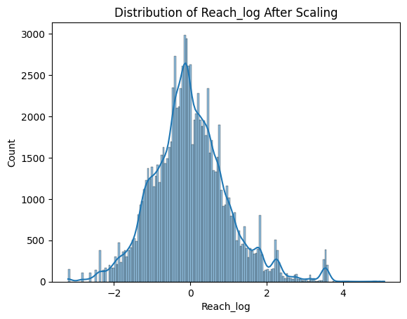
6 Algorithms for Clustering
Sampling
100k observations makes computationally expensive, especially with algorithms like Hierarchical Clustering and DBSCAN. Also in this study, fitting the models with the full set required more memory than is available for me. That’s why I’ll use sampling methods to work with a smaller subset of data.
from sklearn.model_selection import train_test_split# Create stratified sample
stratified_sample, _ = train_test_split(
data_scaled,
test_size=0.8, # Keep only 20% of the data
stratify=data_scaled[['Sentiment_enc', 'Klout_enc']] # Stratify by key categories
)stratified_sample.shape(20000, 15)
# Create random sample
df_sample = data_scaled.sample(frac=0.2, random_state=42)df_sample.shape(20000, 15)
data_summary = data_scaled.groupby('IsReshare')[['Likes', 'RetweetCount', 'Reach']].mean()
print("Stats of the base data:")
print(data_summary)
print()
strat_summary = stratified_sample.groupby('IsReshare')[['Likes', 'RetweetCount', 'Reach']].mean()
print("Stats of the sample data (stratified):")
print(strat_summary)
print()
sample_summary = df_sample.groupby('IsReshare')[['Likes', 'RetweetCount', 'Reach']].mean()
print("Stats of the sample data (random):")
print(sample_summary)
Stats of the base data:
Likes RetweetCount Reach
IsReshare
False 0.236713 0.906319 11392.786715
True 0.000000 21.058683 3354.913118
Stats of the sample data (stratified):
Likes RetweetCount Reach
IsReshare
False 0.229298 0.875515 10418.917503
True 0.000000 20.875473 3515.092170
Stats of the sample data (random):
Likes RetweetCount Reach
IsReshare
False 0.272417 1.026195 13099.865768
True 0.000000 19.772298 3615.538678
# Plot Sentiment distribution in the base data
sns.histplot(data_scaled['Sentiment'], kde=True, color="gray", label="Base", bins=12, stat="density")

# Plot Sentiment distribution in the stratified sample
sns.histplot(stratified_sample['Sentiment'], kde=True, color="orange", label="Stratified", bins=12, stat="density", alpha=0.6)

# Plot Sentiment distribution in the random sample
sns.histplot(df_sample['Sentiment'], kde=True, color="green", label="Random", bins=12, stat="density", alpha=0.6)

# Add title and legend
plt.title("Overlay of Sentiment distributions", fontsize=14)
plt.xlabel("Sentiment", fontsize=12)
plt.ylabel("Density", fontsize=12)
plt.legend(fontsize=12)

# Show the plot
plt.show()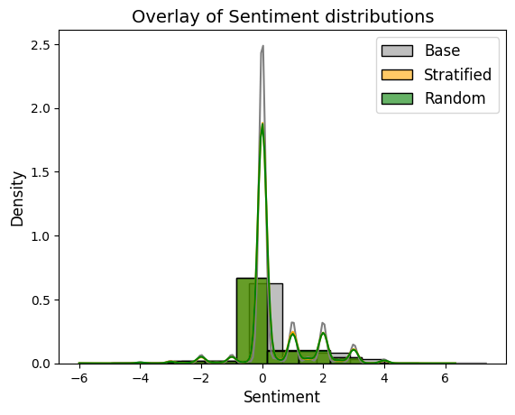
plt.figure(figsize=(10, 6))

# Plot Klout distribution in the base data
sns.histplot(data_scaled['Klout'], kde=True, color="gray", label="Base", bins=40, stat="density")

# Plot Klout distribution in the stratified sample
sns.histplot(stratified_sample['Klout'], kde=True, color="orange", label="Stratified", bins=40, stat="density", alpha=0.6)

# Plot Klout distribution in the random sample
sns.histplot(df_sample['Klout'], kde=True, color="green", label="Random", bins=40, stat="density", alpha=0.6)

# Add title and legend
plt.title("Overlay of Klout distributions", fontsize=14)
plt.xlabel("Klout", fontsize=12)
plt.ylabel("Density", fontsize=12)
plt.legend(fontsize=12)

# Show the plot
plt.show()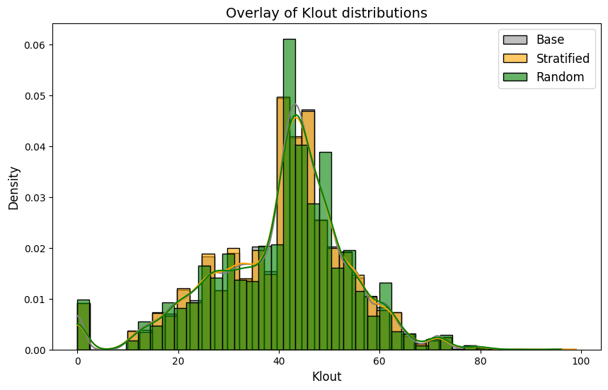
Klout distribution of the stratified-sample seems also closer to the original dataset, compared to the distribution of random-sample. The models will use the stratified-sample.
Feature Selection
As underlined above, the features that will be used for algorithms are determined below.
# Define features for clustering
features = ['IsReshare', 'Reach_log', 'Retweet_enc', 'Likes_bin', 'Sentiment_enc',
       'Klout_enc', 'Weekday_enc', 'TimeSeg_enc']
Perform Clustering
Three algorithms (K-Means, Hierarchical Clustering, DBSCAN) will be performed to identify clusters that may help us to improve user engagement and optimize personalized content delivery. For the first two, the models will start with three clusters.
K-Means
In practice, the k-means algorithm is very fast, one of the fastest clustering algorithms available.
from sklearn.cluster import KMeans# Run K-Means
kmeans = KMeans(n_clusters=3, random_state=42)
stratified_sample['KMeans_Cluster'] = kmeans.fit_predict(stratified_sample[features])# Cluster centroids
print(kmeans.cluster_centers_)[[ 4.44253592e-01 -6.91388983e-01 1.04918801e+00 5.46437895e-16
2.19862586e-01 1.47688944e+00 1.41005621e+00 1.36492817e+00]
[ 2.81815245e-01 7.54605490e-01 7.28843669e-01 1.40503876e-02
1.99612403e-01 3.55345607e+00 1.36062661e+00 1.11094961e+00]
[ 3.44273366e-01 -3.63866695e-02 7.76337115e-01 1.48568341e-03
1.89492166e-01 2.50526742e+00 4.37250135e+00 1.22595894e+00]]
Hierarchical Clustering
Hierarchical clustering is a general family of clustering algorithms that build nested clusters by merging or splitting them successively. This hierarchy of clusters is represented as a tree (or dendrogram). The AgglomerativeClustering object performs a hierarchical clustering using a bottom up approach: each observation starts in its own cluster, and clusters are successively merged together
from sklearn.cluster import AgglomerativeClustering# Use AgglomerativeClustering
hc = AgglomerativeClustering(n_clusters=3, metric='euclidean', linkage='ward')
stratified_sample['HC_Cluster'] = hc.fit_predict(stratified_sample[features])DBSCAN
DBSCAN (Density-Based Spatial Clustering of Applications with Noise) finds core samples of high density and expands clusters from them. It is good for data which contains clusters of similar density
from sklearn.cluster import DBSCANdbscan = DBSCAN(eps=0.5, min_samples=5)
stratified_sample['DBSCAN_Cluster'] = dbscan.fit_predict(stratified_sample[features])7 Compare Clustering Algorithms
Validation Metrics
There are different validation metrics for clustering tasks. Here Silhouette scores and Davies-Bouldin Index will be checked.
Silhouette Score
Silhouette Score measures how well clusters are separated and how cohesive they are. It is defined as the mean of the silhouette coefficients of all the observations in the model. Each observation has its own silhouette coefficient which is calculated as:
Silhouette coefficient = (b – a) / max(a, b)
where
a is the mean distance from that observation to all other observations in the same cluster,
b is the mean distance from that observation to each observation in the next closest cluster.
The silhouette coefficient can be anywhere between negative 1 and 1. Higher scores are better.
from sklearn.metrics import silhouette_scoresilhouette_kmeans = silhouette_score(stratified_sample[features], stratified_sample['KMeans_Cluster'])
silhouette_hierarchical = silhouette_score(stratified_sample[features], stratified_sample['HC_Cluster'])
silhouette_dbscan = silhouette_score(stratified_sample[features], stratified_sample['DBSCAN_Cluster'])
print(f"K-Means Silhouette Score: {silhouette_kmeans}")
print(f"Hierarchical Silhouette Score: {silhouette_hierarchical}")
print(f"DBSCAN Silhouette Score: {silhouette_dbscan}")K-Means Silhouette Score: 0.1946908770133526
Hierarchical Silhouette Score: 0.1700145943902132
DBSCAN Silhouette Score: 0.2745857874849324
Davies-Bouldin Index
Davies-Bouldin Index measures the compactness and separation of clusters. A lower index relates to a model with better separation between the clusters. Zero is the lowest possible score. Values closer to zero indicate a better partition.
from sklearn.metrics import davies_bouldin_scoredbi_kmeans = davies_bouldin_score(stratified_sample[features], stratified_sample['KMeans_Cluster'])
dbi_hierarchical = davies_bouldin_score(stratified_sample[features], stratified_sample['HC_Cluster'])
dbi_dbscan = davies_bouldin_score(stratified_sample[features], stratified_sample['DBSCAN_Cluster'])
print(f"K-Means DBI: {dbi_kmeans}")
print(f"Hierarchical DBI: {dbi_hierarchical}")
print(f"DBSCAN DBI: {dbi_dbscan}")K-Means DBI: 1.6102668946205956
Hierarchical DBI: 1.816678810500342
DBSCAN DBI: 1.3348320566105196
Cluster Size Distribution
It’s also helpful to compare the number of samples in each cluster. If some algorithms produce very imbalanced clusters (e.g., one cluster with 90% of the data), it may indicate poor clustering.
print(stratified_sample['KMeans_Cluster'].value_counts())
print(stratified_sample['HC_Cluster'].value_counts())
print(stratified_sample['DBSCAN_Cluster'].value_counts())
KMeans_Cluster
1 9039
2 5508
0 5453
Name: count, dtype: int64
HC_Cluster
0 10954
1 6583
2 2763
Name: count, dtype: int64
DBSCAN_Cluster
-1 3565
5 169
18 15
214 149
11 143
...
495 5
489 5
753 5
754 5
684 4
Name: count, Length: 765, dtype: int64
DBSCAN doesn’t directly let us control the number of clusters like K-Means. It generates many small clusters, especially if our dataset has a lot of noise or overlapping points, like shown above. DBSCAN categorizes points that don’t meet density requirements as noise, that is -1 cluster label. Cluster -1 represents the points that don’t belong to any cluster. We can calculate the proportion of the noise in the data.
noise_ratio = (stratified_sample['DBSCAN_Cluster'] == -1).mean()
print(f"Noise Ratio: {noise_ratio:.2%}")
Noise Ratio: 17.79%
To reduce the noise we can alter the eps.
dbscan_eps1 = DBSCAN(eps=1.0, min_samples=5)
stratified_sample['DBSCAN_Cluster_eps1'] = dbscan_eps1.fit_predict(stratified_sample[features])
print(stratified_sample['DBSCAN_Cluster_eps1'].value_counts())
DBSCAN_Cluster_eps1
0 14974
-1 1919
6 230
10 83
30 68
...
176 5
97 5
212 5
95 5
125 5
Name: count, Length: 272, dtype: int64
noise_ratio = (stratified_sample['DBSCAN_Cluster_eps1'] == -1).mean()
print(f"Noise Ratio: {noise_ratio:.2%}")
Noise Ratio: 9.99%
In the original DBSCAN paper by Ester et al. (1996), the authors introduce the concept of noise points, data points that do not belong to any cluster due to insufficient density around them. The proportion of such noise points can vary depending on the dataset and the chosen parameters (ε and MinPts).
In practical applications, the acceptable noise ratio can vary based on the specific context and objectives, but here we can assume a 10% noise ratio is generally acceptable. However the presence of a single large cluster (cluster 0 with ~15k rows) alongside many smaller clusters suggests that the data has one dominant dense region surrounded by sparser regions. This might be due to uneven density. Smaller clusters with low counts (e.g., less than ~70 rows) likely represent isolated pockets of dense points.
At this point, statistics of each model’s clusters will be compared to be able to catch some similarities and patterns.
KMeans Clusters
Summarize Numeric & Categorical Features by KMeans Cluster
# Summarize Numeric Features by KMeans Cluster
numeric_features = ['Reach', 'RetweetCount', 'Klout']
cluster_summary_numeric = stratified_sample.groupby('KMeans_Cluster')[numeric_features].agg(['mean', 'median', 'std', 'min', 'max'])
print(cluster_summary_numeric)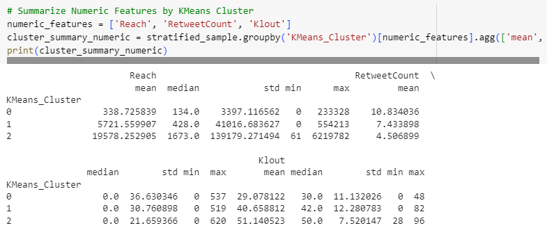
# Summarize Categorical Features by KMeans Cluster
categorical_features = ['Weekday', 'TimeSeg', 'IsReshare']
cluster_summary_categorical = {}

for feature in categorical_features:
    cluster_summary_categorical[feature] = stratified_sample.groupby('KMeans_Cluster')[feature].value_counts(normalize=True).unstack()

# Convert the dictionary to a DataFrame for better readability
cluster_summary_categorical_df = pd.concat(cluster_summary_categorical, axis=1)
print(cluster_summary_categorical_df)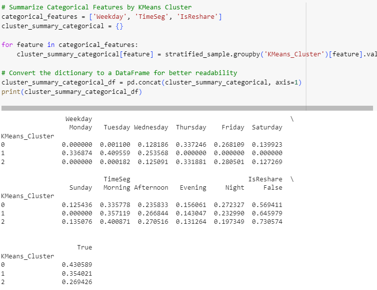
Statistics for both numerical and categorical features reveal some similar and varied patterns among clusters. Visualizing them will help us to observe the differences.
Visualize KMeans Cluster Characteristics
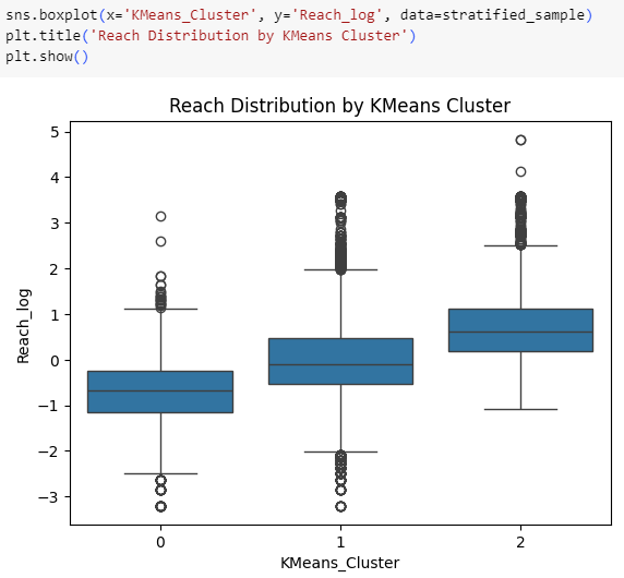
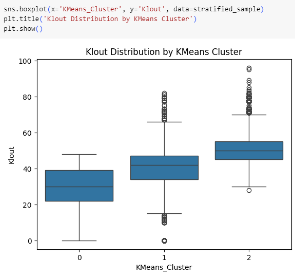
K-Means clusters that have lower Klout scores tend to have lower Reach counts as well.
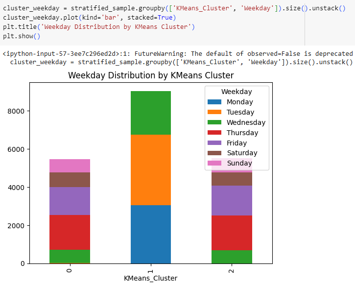
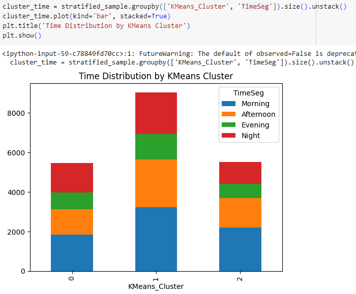
Time segments don’t show much difference for K-Means clusters, but Cluster 1 belongs to users that are active from Monday to Wednesday, while other clusters are active from Wednesday to Sunday.
Hierarchical Clusters
Summarize Numeric & Categorical Features by Hierarchical Cluster
# Summarize Numeric Features by Hierarchical Cluster
numeric_features = ['Reach', 'RetweetCount', 'Klout']
cluster_summary_numeric = stratified_sample.groupby('HC_Cluster')[numeric_features].agg(['mean', 'median', 'std', 'min', 'max'])
print(cluster_summary_numeric)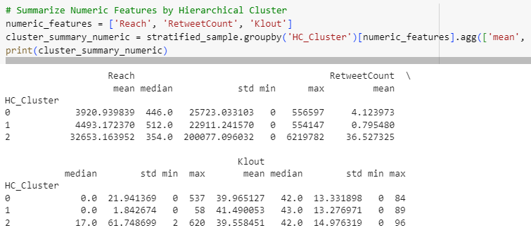
# Summarize Categorical Features by KMeans Cluster
categorical_features = ['Weekday', 'TimeSeg', 'IsReshare']
cluster_summary_categorical = {}

for feature in categorical_features:
    cluster_summary_categorical[feature] = stratified_sample.groupby('HC_Cluster')[feature].value_counts(normalize=True).unstack()

# Convert the dictionary to a DataFrame for better readability
cluster_summary_categorical_df = pd.concat(cluster_summary_categorical, axis=1)
print(cluster_summary_categorical_df)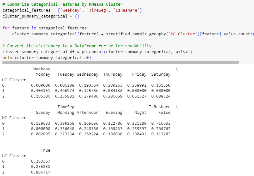
Statistics reveal some varied patterns among clusters but they don’t seem as separate as it was with K-Means. Again visualizing may help to observe.
Visualize Hierarchical Cluster Characteristics
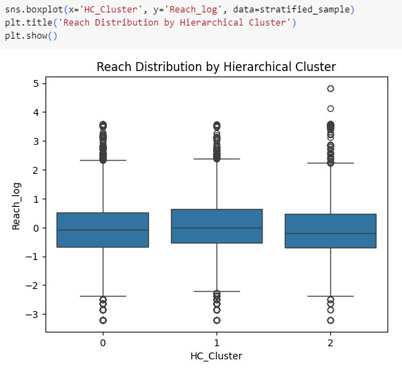
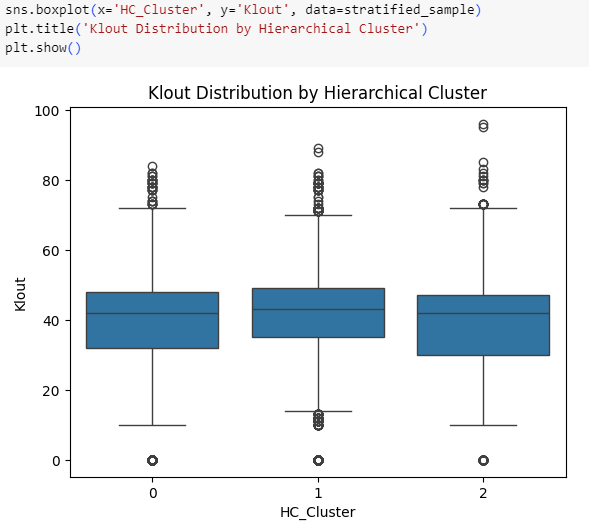
Distributions of Reach & Klout don’t seem to differ among Hierarchical clusters. Time-based differentiations will be checked below.
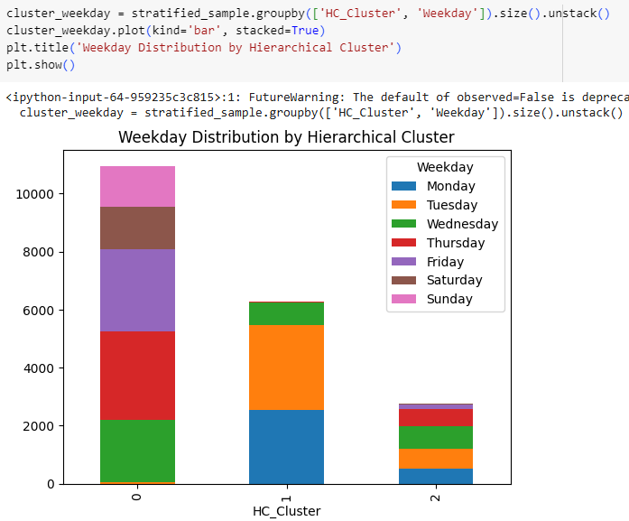
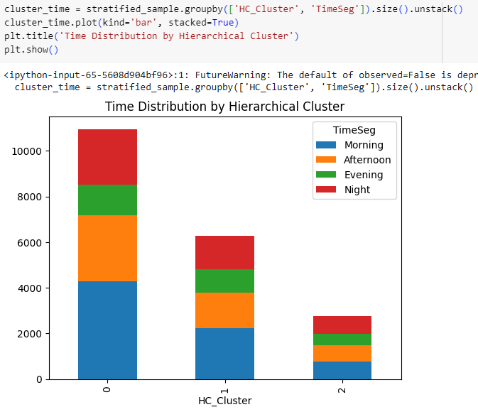
Time segments don’t show much difference for Hierarchical clusters either, and again one of the clusters belongs to users that are active from Monday to Wednesday.
DBSCAN Clusters
Since DBSCAN generated many clusters, the biggest one will be examined, that is Cluster 0 with almost 15k data points.
Summarize Numeric & Categorical Features by DBSCAN Cluster
cluster_summary_numeric = stratified_sample[stratified_sample['DBSCAN_Cluster_eps1'] == 0][numeric_features].agg(['mean', 'median', 'std', 'min', 'max'])
print(cluster_summary_numeric)
cluster_summary_categorical = stratified_sample[stratified_sample['DBSCAN_Cluster_eps1'] == 0][categorical_features].apply(lambda x: x.value_counts(normalize=True))
print(cluster_summary_categorical)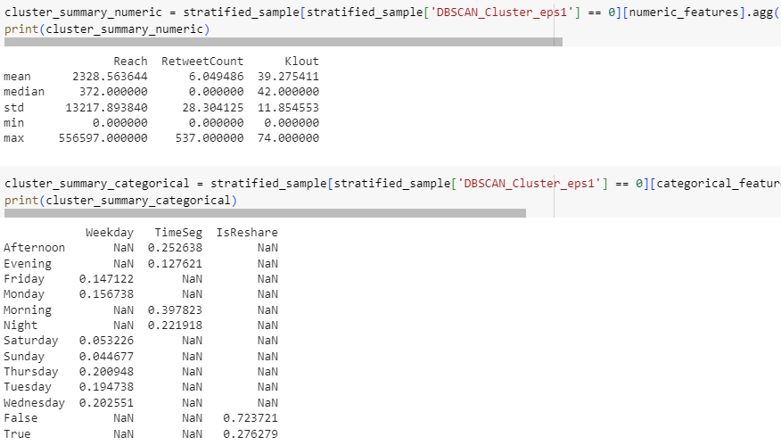
DBSCAN Cluster 0 shows similar results especially with statistics of numerical features. For a clearer observation, these results of clusters from three models will be summarized together in the last section below.
8 Concluding Remarks
Comparing Algorithms
Below tables summarizes the statistics of each cluster. The biggest cluster within each group is marked with red.
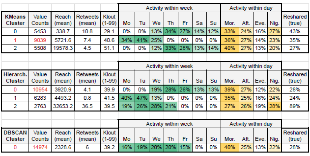
Clusters of K-Means and Hierarchical have clear distinctions among Reach and Retweets, but not a strong one for Klout. While activity levels within a day seem quite similar for all clusters of all models, they differ among days. Reshared ratio of tweets are low for all clusters but one (Hierarch. Cluster 2).
Suggestions to the Product & Marketing Team
Since the initial aim of this study is to improve user engagement and optimize personalized content delivery, these insights could bring some insights to the Product and Marketing teams. Generally two main user groups can be identified, those active on weekdays and others that are active on weekends. Weekday users can also be separated into two sub-groups, one focusing on a segment from Monday till Wednesday. These groups can also be studied separately by their engagement levels (Reach counts, Retweet numbers, or Klout levels).
However all these should be taken as a first step of future studies, since user segmentation is a target-focused task rather than finding a general pattern. Having a clear business goal (e.g., supporting viral tweets, or improving usage on weekends, etc) is essential. The insights gained in EDA phase can lead the future studies:
As demonstrated before, Friday 19:00 is the peak time-segment for retweets. Offerings for user engagement improvements can use this slot as a starting point. In addition, even though we had quite few Likes, as observed before all of them are coming from Klout segment 4, that are between Q3 and Q3 + 1.5 IQR. A dataset with a more-balanced Likes distribution can be used to double-check this segment’s engagement scores.
Evaluating Models’ Performances
It’s also important to understand models’ performances to be able to shape future works with other teams. Below five key aspects (that mentioned in the assignment paper) are compared.
Accuracy (Cluster Shape):
● K-Means: Works well if tweet engagement clusters are well-separated (e.g., low vs. high engagement). Struggles if engagement patterns are complex.
● Hierarchical: Provides a detailed hierarchy, but not optimal for noisy, large-scale engagement data.
● DBSCAN: Best for engagement data if there are non-uniform clusters and noise (e.g., extreme engagement outliers).
Robustness (Handling Noise & Outliers):
● K-Means: Not robust to outliers (high-reach, viral tweets may distort clusters).
● Hierarchical: Sensitive to noise since it forces all data points into a cluster.
● DBSCAN: Very robust, classifies outliers (viral/low-reach tweets) as noise, which can be useful.
Speed (Performance):
● K-Means: Fast, scales well for large Twitter datasets.
● Hierarchical: Very slow, not ideal for big dataset size (For this reason a sample has been used).
● DBSCAN: Moderate speed, but slows down with high-dimensional data (hence, sampling).
Interpretability (Cluster Meaning):
● K-Means: Easy to interpret, each cluster has a clear centroid representing average engagement.
● Hierarchical: Dendrograms (were not performed in this study) can provide insight into relationships between different engagement groups, but less practical at large scale.
● DBSCAN: Less intuitive but useful for detecting highly engaged vs. ignored tweets (by identifying dense vs. sparse tweet clusters).
Scalability (Handling Large Data):
● K-Means: Scales well to large data (it could handle the initial dataset with 100k rows).
● Hierarchical: Not scalable, computationally expensive for datasets >10k rows.
● DBSCAN: Moderate scalability, but needs fine-tuning (e.g., indexing) for large-scale social media data.
9 Going Forward
Next Steps
While DBSCAN performed best in terms of Silhouette scores and Davies-Bouldin Index, both scores of all models are far from being ideal. As demonstrated, each Silhouette score is still not close to 1, and all Davies-Bouldin indices are quite close to each other considering their distances to 0.
Fitting the models with different numbers of clusters (k value) could help to improve these scores and would bring different insights. However a clear business target and well domain knowledge plays a crucial role here too. A better balanced dataset with a wide range of time coverage can also help to improve models’ performances.
Previous Data Project
Next Data Project

Browse my projects by category:
ALL • Data • UX • Arch