Discount Reminder is a mobile app to track and catch weekly discounts of three biggest discount stores in Turkiye.

My role
UX Design & Research
Designing Discount Reminder app from conception to paper prototype.

Timeline
Jan ’22 – Jun ’22
Case study, self-assigned

Tools
Pen & Paper
Office Suite
OVERVIEW
The Problem
Missing features on digital platforms to check the weekly discounts effectively, such as filtering/sorting and getting notifications not to miss out the weekly opportunities.
The Goal
Design an app that allows users to be informed of the discounts, filter them according to their preferences and set future notifications for the items they are interested in.
Responsibilities
Conducting interviews, paper wireframing, low-fidelity prototyping, conducting usability studies, and iterating on designs.
Methods
Interviews
Empathy Maps
Personas
User Stories
Problem Statements
Red Routes
Competitive Audits
User Studies
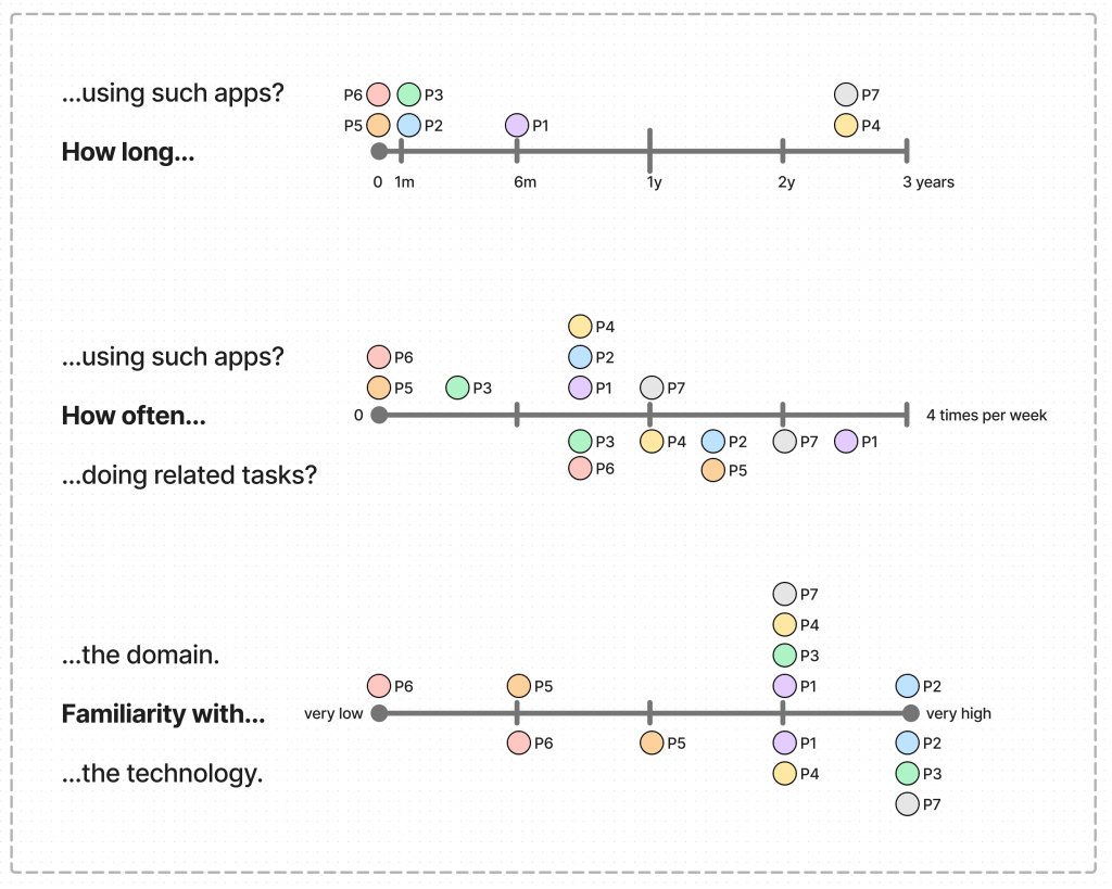
Research data *
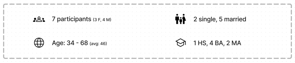
I carried out the Discount Reminder project with 7 participants in total.
Interviews & Observations
7 participants
2.5 hours in total
(75% covers observations)
User Studies
6 test runs with 3 distinct users
2.5 hours in total
(3 major iterations and countless minor ones)
* I believe in quality > quantity! These digits are only indicative for those who are not involved in these projects.
They are raw amounts of the sessions too, so in fact I spent far more time than mentioned.
PROJECT IN DETAIL
Problem
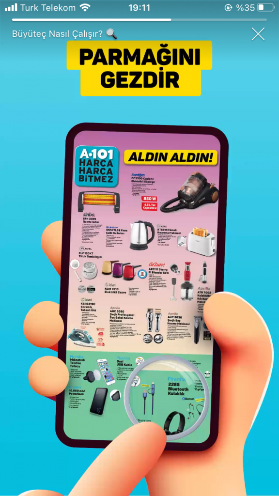
Three discount stores (a101, bim and sok) provide weekly discounts, but it is not possible to search, sort or filter these items on their apps or websites in the way that a usual marketing app provides as default.
To get the weekly discount lists, clients have to check the printed posters on the windows of the stores or the exact digital versions of the posters on their apps or websites.
None of the products come as separate data, so the clients’ main action is to zoom in and out constantly throughout the poster. One store even offers a digital magnifier to ‘easily’ navigate through their digital poster.
There is no easy access to the posters: Clients have to follow a couple of steps.There is no all-in-one app or platform to cross check the discounts along the different stores. There are a couple of ‘amateur’ Instagram discounts though, which collect all the posters and post under their account. Some of them have more than 100k followers. A101, Bim and Sok had 11.8, 11.2 and 7.6 million followers (respectively) during the research.
Audience
- A101, Bim and Sok customers.
- A101, Bim and Sok app users
and their Instagram accounts’ followers. - Potential customers who are not aware
of these weekly discounts.
Constraints
- The design solutions must be on a mobile app.
- The digital store should have only weekly discount items. (This was ignored on first two iterations to check the users’ shopping experience as a whole)
Deliverables
- I limited myself with paper prototypes only.
Research
Audit
- Mobile apps of the stated discount stores:
A101, Bim and Sok. - Mobile app of a competitor store: Migros
- Mobile apps of the popular online grocers:
Getir, IsteGelsin, Glovo, Yemek Sepeti
Interview
- Users who are not using any e-commerce app.
- Users who are not using mentioned discount stores
or their apps.
Observe
- Users who are using e-commerce apps.
- Users who are customers of mentioned discount stores.
UNDERSTANDING THE USER
User Research: Summary
For my research on discount markets, I first audited above-mentioned apps and websites. I then followed two main approaches: I developed questions to conduct user interviews and came up with tasks to observe users while they are using related apps.
Participants reported feeling badly about navigational issues and unorganized information, and they had varied opinions on using digital tools when it comes to purchasing daily products.
Interviews & Observations
I interviewed 7 participants and observed 4 of them in action while they were using related apps, to understand how they decide to shop and which tools they are using.
Main Motivations & Frustrations
Participants indicated the followings as their main frustrations:
❶ Overcrowded navigation and/or misleading information (not clear directions, unrelated search results or being have to visit multiple sites)
❷ Trust issues (payment methods, irrelevant offers, or false discounts)
They also mentioned the limited options and poor interfaces as other pain points.
Participants’ main motivations were:
❶ Convenience (to use a digital tool)
❷ Any kind of discounts and the price/performance rates of the products
“Once I deleted an app just because I could not find any banana, but all other related products like banana cake or banana milk instead!”
Participant 4
Store or Online
I asked more open questions to understand their decisions on shopping for food.
What makes them go online?
❶ Check discounts and compare prices
❷ Comfort (not to carry, buy on the doorstep, shop any time)
❸ Spontaneous purchases
What makes them go to the store?
❶ Touching the products
❷ Buying products of good quality
❸ Spending time, walking in the neighborhood
Weekly Discounts
All of the participants were aware of the weekly discounts by the subject markets. Only three of them knew the details and one of them was checking them regularly. Among the other four, only one was interested in these discounts.
Some of the participants mentioned that they use the web to check discounts for expensive items only, such as electronic devices or furniture, even though they are not using any apps nor visiting websites of the discount markets.
Tools & Capability
Participants showed varied tendencies when it comes to using digital tools, and most of them are familiar with the domain and the technology.
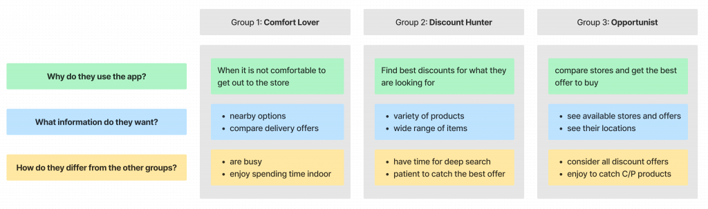
Personas
Based on the insights from user interviews I studied personas under the following three groups.
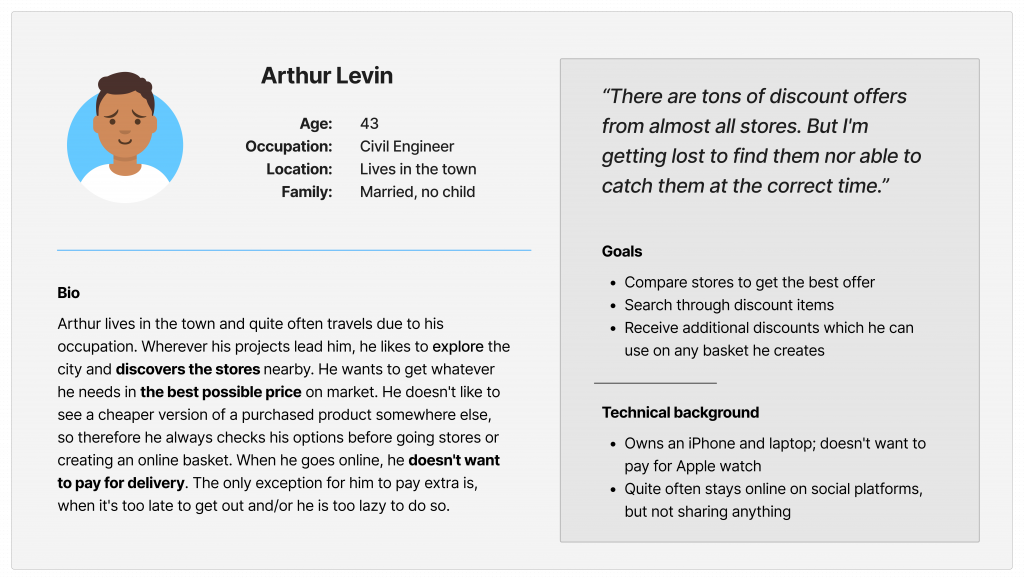
Persona: Arthur
Following this, I created a main persona to help to define the main design target.
User Stories
Based on the persona groups’ needs I created user stories as well. I aimed to capture the context via user stories, built on accurate and realistic needs.
Primary Need
Find the best price
User Stories
“As a busy mom, I want to get the best price for the products that I need but also not to lose much time to search so I can keep my eyes on my baby.”
Hunt for discounts
“As a sales person, I want to know all possible discounts available, to be sure that I am purchasing my needs with the best offers.”
Get coupons
“As a student, I want to get general discounts all the time, to support my limited budget.”
Mapping user stories revealed how helpful it would be for users to have access to a dedicated Discount Reminder app.
STARTING THE DESIGN
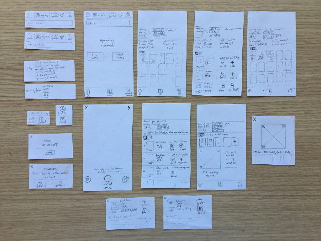
Ideation: Paper Wireframes
I did ideation exercises to come up with ideas to address main pain points and gaps identified in the competitive audit.
My focus was particularly on searching for products, comparing them and setting a reminder.
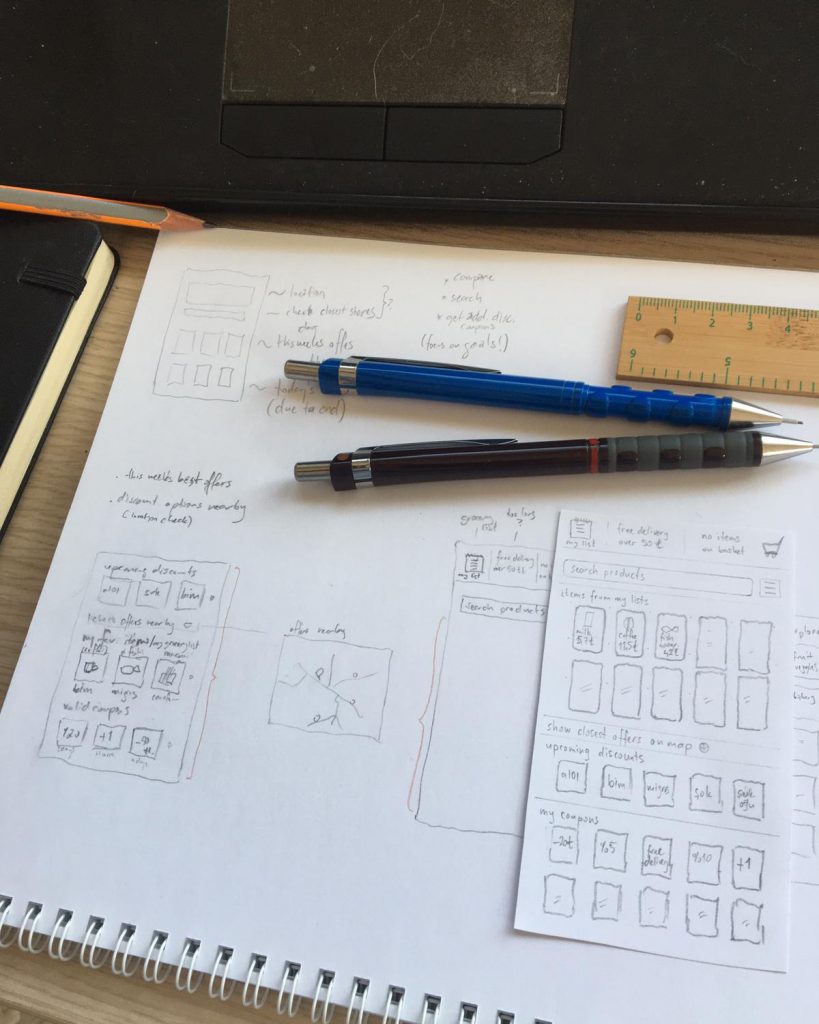
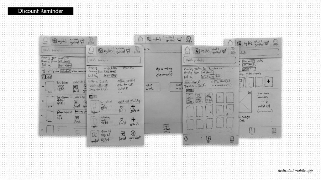
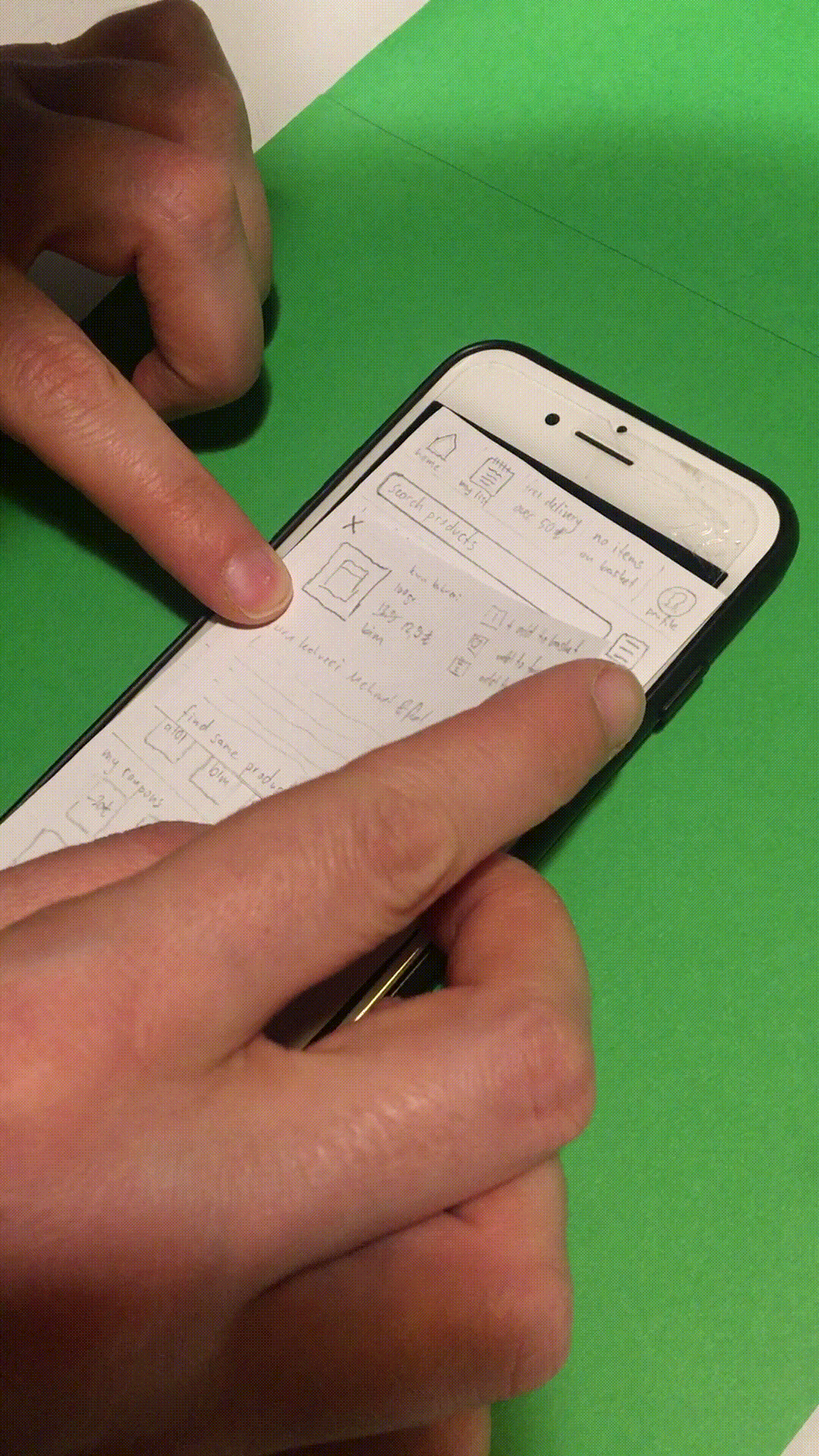
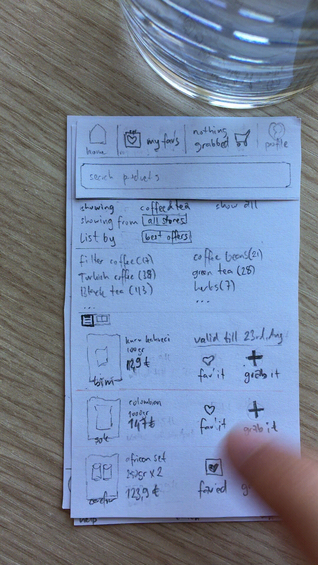
Low-fidelity Prototype
To prepare for usability testing, I created a low-fidelity prototype on paper. Three main iterations were outlined below.
Usability Studies (Lo-Fi): Parameters
Study type:
Moderated usability study
Participants:
3 Participants
Studies:
6 Test runs
Length:
20-30 minutes
Usability Studies: First Iteration
On the first version of the design, users were asked to use the app freely. I observed them to check how the app responded to their main concerns and expectations.
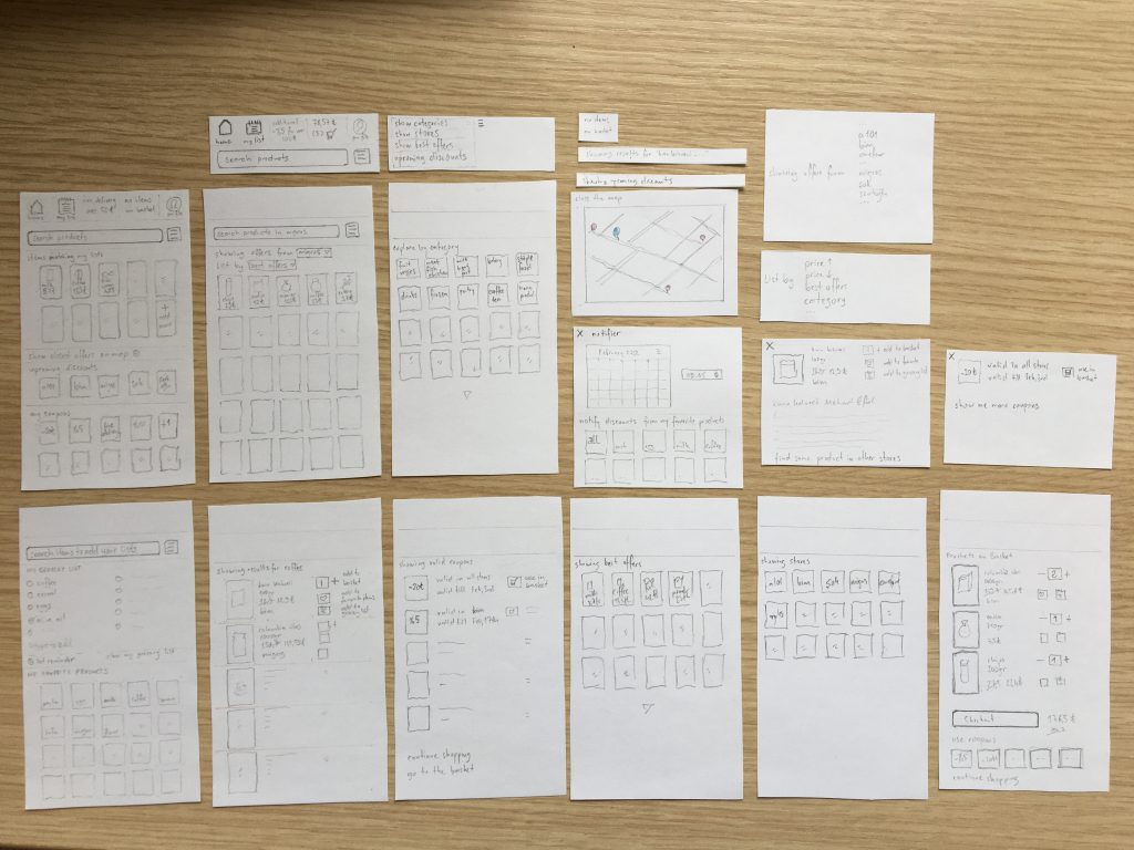
These were the main findings uncovered by the usability study:
Disadvantages:
❶ The relationship between Favorite (Items) and (Grocery) List was confusing.
❷ No interactions with the items on the list. (can’t convert the list into the basket)
❸ The main aim of the app is not clear. (to create grocery list or to track discounts)
Advantages:
❶ Being able to set a reminder.
❷ Clear interface, easy to navigate.
Usability Studies: Second Iteration
Based on the insights from the first study, I applied design changes mainly focused on simplifying the search phase and interacting with the items. I removed some features, like tracking on a map, to refine the focus of the app.
This time I gave users three tasks to follow and observe their reactions and approaches.
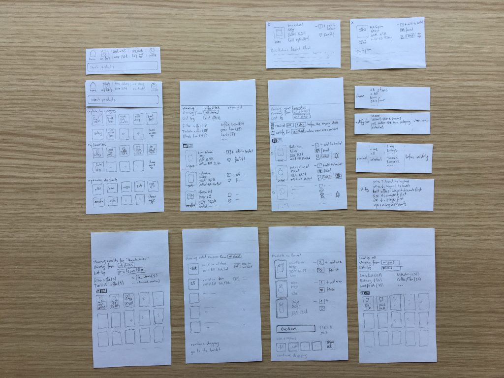
These were the main findings uncovered by the usability study:
Disadvantages:
❶ The constant search bar seemed not intuitive.
❷ After filtering the products, it is not clear from which markets they are.
❸ The term ‘checkout’ is confusing.
Advantages:
❶ ‘List by’ option.
❷ Clear directions for the coupons.
Usability Studies: Final Iteration
Based on the insights from the second study, I applied another set of design changes. Users were introduced to the ‘grab it’ feature, with which they can get the discounts in an engaging way rather than having a regular e-commerce basket.
This time four prompts were given to the users, followed by asking their overall feelings. The tasks were more defined and shorter than the previous runs.
These were the main findings uncovered by the usability study:
Disadvantages:
❶ The results are confusing in terms of discount periods. (not clear they are for this week or the next one)
❷ Using the camera to read the barcode was nice, but not intuitive. (the term ‘instant catch’ was not clear)
❸ It would be nice to have ‘similar items’ for easy access.
Advantages:
❶ Different grid options for showing results.
❷ The camera option.
❸ Smooth navigation.
GOING FORWARD
Takeaways
Impact:
Users shared that the app made the discount hunt like something they could actually pursue.
“I would use such an app, because now I am opening five links to check all these discounts!”
Participant 1 on Final Usability Study
What I learned:
This project made me clearly see the importance of defining the scope concretely. Early iterations faced struggles due to unfocused targets of the app. In later phases I could clarify the borders based on the insights from the research and came up with better-suited solutions.
“What is the aim of a UX designer? Make you spend more time on the app or less?”
Participant 1 on Second Usability Study
Next Steps
The existing state of the Discount Reminder provides easy ways for users to choose and compare available discounts. But this can be only a good start to develop, since my studies were on lo-fi levels. The future of the app can be extended with the following steps:

❶ Deepen the Insights: Proceed with hi-fi prototypes and conduct another set of user testing on how successful the app is in reaching the goal.
Active discount hunters should be involved in the studies. Because during my test runs, participants who were the regular discount checkers, were the ones who accepted the offered concept (with ‘grab it’ feature) quicker.
❷ Scope and Impact: Carry out research by widening the scope: Markets’ plans and programs are another side of such projects, so they should be involved too.
❸ Accessibility: The app should be supported by assistive technologies. It can provide voice input, image search and is designed with alt text available on each page for smooth screen reader access.
Previous UX Project
Next UX Project