Introduction
Here we’ll assume we are part of an analytics team that provides insights about our company’s sales and marketing practices. We have been assigned to a project that focuses on the use of influencer marketing. For this task, we will explore the relationship between our radio promotion budget and our sales.
The dataset provided includes information about marketing campaigns across TV, radio, and social media, as well as how much revenue in sales was generated from these campaigns. Based on this information, company leaders will make decisions about where to focus future marketing resources. Therefore, it is critical to provide them with a clear understanding of the relationship between types of marketing campaigns and the revenue generated as a result of this investment.
Imports & Load Dataset
# Import relevant Python libraries and modules
import pandas as pd
import matplotlib.pyplot as plt
import seaborn as sns
from statsmodels.formula.api import ols
import statsmodels.api as sm
This is a fictional dataset that was created for educational purposes. Assume that the numerical variables in the data are expressed in millions of dollars.
# Load the dataset into a DataFrame and save in a variable
data = pd.read_csv("marketing_sales_data.csv")
Data Exploration
# Display the first 10 rows of the data
data.head(10)| TV | Radio | Social Media | Influencer | Sales | |
|---|---|---|---|---|---|
| 0 | Low | 1.218354 | 1.270444 | Micro | 90.054222 |
| 1 | Medium | 14.949791 | 0.274451 | Macro | 222.741668 |
| 2 | Low | 10.377258 | 0.061984 | Mega | 102.774790 |
| 3 | High | 26.469274 | 7.070945 | Micro | 328.239378 |
| 4 | High | 36.876302 | 7.618605 | Mega | 351.807328 |
| 5 | High | 25.561910 | 5.459718 | Micro | 261.966812 |
| 6 | High | 37.263819 | 6.886535 | Nano | 349.861575 |
| 7 | Low | 13.187256 | 2.766352 | Macro | 140.415286 |
| 8 | High | 29.520170 | 2.333157 | Nano | 264.592233 |
| 9 | Low | 3.773287 | 0.135074 | Nano | 55.674214 |
- The data includes the following information:
- TV promotion budget (expressed as “Low”, “Medium”, or “High”)
- Radio promotion budget
- Social media promotion budget
- Type of influencer that the promotion is in collaboration with (expressed as “Mega”, “Macro”, or “Micro”, or “Nano”)
- Note: Mega-influencers have over 1 million followers, macro-influencers have 100,000 to 1 million followers, micro-influencers have 10,000 to 100,000 followers, and nano-influencers have fewer than 10,000 followers.
- Sales accrued from the promotion
# Display number of rows, number of columns
data.shape
(572, 5)
- There are 572 rows and 5 columns in the data. One way to interpret this is that 572 companies are represented in the data, along with 5 aspects about each company that reveals how they promote their products/services and the sales accrued from their promotion.
Now, check for missing values in the rows of the data. This is important because missing values are not that meaningful when modeling the relationship between two variables. To do so, begin by getting Booleans that indicate whether each value in the data is missing. Then, check both columns and rows for missing values.
# Step 1. Start with .isna() to get booleans indicating whether each value in the data is missing
# Step 2. Use .any(axis=1) to get booleans indicating whether there are any missing values along the columns in each row
# Step 3. Use .sum() to get the number of rows that contain missing values

data.isna().any(axis=1).sum()
3
- There are 3 rows containing missing values, which is not that many, considering the total number of rows. It would be appropriate to drop these rows that contain missing values to proceed with preparing the data for modeling.
# Step 1. Use .dropna(axis=0) to indicate that you want rows which contain missing values to be dropped
# Step 2. To update the DataFrame, reassign it to the result

data = data.dropna(axis=0)
# Check to make sure that the data does not contain any rows with missing values now
data.isna().any(axis=1).sum()0
Check model assumptions
We would like to explore the relationship between radio promotion budget and sales. We could model the relationship using linear regression. To do this, we want to check if the model assumptions for linear regression can be made in this context.
As we discussed before, some of the assumptions can be addressed before the model is built. After the model is built, we can finish checking the assumptions.
# Create plot of pairwise relationships
sns.pairplot(data)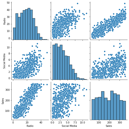
- In the scatter plot of
SalesoverRadio, the points appear to cluster around a line that indicates a positive association between the two variables. Since the points cluster around a line, it seems the assumption of linearity is met.
Model Building
We’ll start by selecting only the columns that are needed for the model that we will build from the data.
# Select relevant columns
# Save resulting DataFrame in a separate variable to prepare for regression
ols_data = data[["Radio", "Sales"]]
# Display first 10 rows of the new DataFrame
ols_data.head(10)| Radio | Sales | |
|---|---|---|
| 0 | 1.218354 | 90.054222 |
| 1 | 14.949791 | 222.741668 |
| 2 | 10.377258 | 102.774790 |
| 3 | 26.469274 | 328.239378 |
| 4 | 36.876302 | 351.807328 |
| 5 | 25.561910 | 261.966812 |
| 6 | 37.263819 | 349.861575 |
| 7 | 13.187256 | 140.415286 |
| 8 | 29.520170 | 264.592233 |
| 9 | 3.773287 | 55.674214 |
Now we’ll write the linear regression formula for modeling the relationship between the two variables of interest.
# Write the linear regression formula
# Save it in a variable
ols_formula = "Sales ~ Radio"
Implement the Ordinary Least Squares (OLS) approach for linear regression.
# Implement OLS
OLS = ols(formula = ols_formula, data = ols_data)
Create a linear regression model for the data and fit the model to the data.
# Fit the model to the data
# Save the fitted model in a variable
model = OLS.fit()
Results and Evaluation
# Get summary of results
model.summary()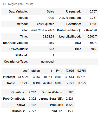
Warnings:
[1] Standard Errors assume that the covariance matrix of the errors is correctly specified.
- The y-intercept is 41.5326.
- The slope is 8.1733.
- sales = 8.1733 * radio promotion budget + 41.5326
- One interpretation: If a company has a budget of 1 million dollars more for promoting their products/services on the radio, the company’s sales would increase by 8.1733 million dollars on average.
- Another interpretation: Companies with 1 million dollars more in their radio promotion budget accrue 8.1733 million dollars more in sales on average.
Finish checking model assumptions
Now that we’ve built the linear regression model and fit it to the data, we can finish checking the model assumptions. This will help confirm our findings.
Check the linearity assumption
# Plot the OLS data with the best fit regression line
sns.regplot(x = "Radio", y = "Sales", data = ols_data)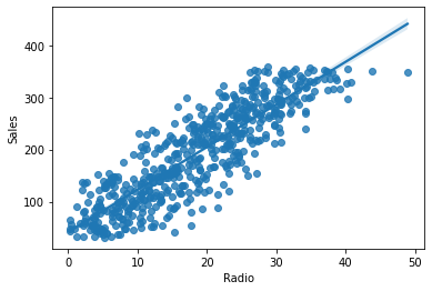
- The preceding regression plot illustrates an approximately linear relationship between the two variables along with the best fit line. This confirms the assumption of linearity.
Check the normality assumption
To get started, get the residuals from the model.
# Get the residuals from the model
residuals = model.resid
# Visualize the distribution of the residuals
fig = sns.histplot(residuals)
fig.set_xlabel("Residual Value")
fig.set_title("Histogram of Residuals")
plt.show()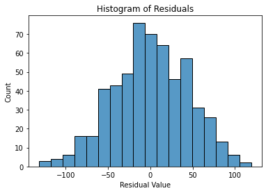
- Based on the visualization above, the distribution of the residuals is approximately normal. This indicates that the assumption of normality is likely met.
Create a Q-Q plot to confirm the assumption of normality
# Create a Q-Q plot

sm.qqplot(residuals, line='s')
plt.title("Q-Q plot of Residuals")
plt.show()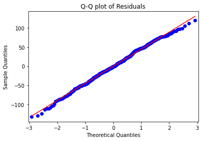
- In the preceding Q-Q plot, the points closely follow a straight diagonal line trending upward. This confirms that the normality assumption is met.
Check the assumptions of independent observation and homoscedasticity
Start by getting the fitted values from the model.
# Get fitted values
fitted_values = model.predict(ols_data["Radio"])
# Create a scatterplot of residuals against fitted values
fig = sns.scatterplot(x=fitted_values, y=residuals)
fig.axhline(0)
fig.set_xlabel("Fitted Values")
fig.set_ylabel("Residuals")
plt.show()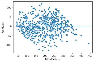
- In the scatterplot above, the data points have a cloud-like resemblance and do not follow an explicit pattern. So it appears that the independent observation assumption has not been violated. Given that the residuals appear to be randomly spaced, the homoscedasticity assumption seems to be met too.
Conclusion
- Data visualizations and exploratory data analysis can be used to check if linear regression is a well suited approach for modeling the relationship between two variables.
- The results of a linear regression model can be used to express the relationship between two variables.
What results can be presented from this work?
In the simple linear regression model, the y-intercept is 41.5326 and the slope is 8.1733.
One interpretation: If a company has a budget of 1 million dollars more for promoting their products/services on the radio, the company’s sales would increase by 8.1733 million dollars on average.
Another interpretation: Companies with 1 million dollars more in their radio promotion budget accrue 8.1733 million dollars more in sales on average.
The results are statistically significant with a p-value of 0.000, which is a very small value (and smaller than the common significance level of 0.05). This indicates that there is a very low probability of observing data as extreme or more extreme than this dataset when the null hypothesis is true.
In this context, the null hypothesis is that there is no relationship between radio promotion budget and sales i.e. the slope is zero, and the alternative hypothesis is that there is a relationship between radio promotion budget and sales i.e. the slope is not zero. So, we could reject the null hypothesis and state that there is a relationship between radio promotion budget and sales for companies in this data.
The slope of the line of best fit that resulted from the regression model is approximate and subject to uncertainty (not the exact value). The 95% confidence interval for the slope is from 7.791 to 8.555. This indicates that there is a 95% probability that the interval [7.791, 8.555] contains the true value for the slope.
How could we frame our findings to external stakeholders?
Based on the dataset at hand and the regression analysis conducted here, there is a notable relationship between radio promotion budget and sales for companies in this data, with a p-value of 0.000 and standard error of 0.194.
For companies represented by this data, a 1 million dollar increase in radio promotion budget could be associated with a 8.1733 million dollar increase in sales. It would be worth continuing to promote products/services on the radio.
Also, it is recommended to consider further examining the relationship between the two variables (radio promotion budget and sales) in different contexts. For example, it would help to gather more data to understand whether this relationship is different in certain industries or when promoting certain types of products/services.
Disclaimer: Like most of my posts, this content is intended solely for educational purposes and was created primarily for my personal reference. At times, I may rephrase original texts, and in some cases, I include materials such as graphs, equations, and datasets directly from their original sources.
I typically reference a variety of sources and update my posts whenever new or related information becomes available. For this particular post, the primary source was Google Advanced Data Analytics Professional Certificate.