Before we talked about simple linear regression, and now we’ll do a quick implementation in Python.
Loading dataset
# Import packages
import pandas as pd
import seaborn as sns
# Load dataset
penguins = sns.load_dataset("penguins")
# Examine first 5 rows of dataset
penguins.head()| species | island | bill_length_mm | bill_depth_mm | flipper_length_mm | body_mass_g | sex | |
|---|---|---|---|---|---|---|---|
| 0 | Adelie | Torgersen | 39.1 | 18.7 | 181.0 | 3750.0 | Male |
| 1 | Adelie | Torgersen | 39.5 | 17.4 | 186.0 | 3800.0 | Female |
| 2 | Adelie | Torgersen | 40.3 | 18.0 | 195.0 | 3250.0 | Female |
| 3 | Adelie | Torgersen | NaN | NaN | NaN | NaN | NaN |
| 4 | Adelie | Torgersen | 36.7 | 19.3 | 193.0 | 3450.0 | Female |
Data cleaning
For the purposes of this post, we are focusing our analysis on Adelie and Gentoo penguins, and will be dropping any missing values from the dataset. In a work setting, we would typically examine the data more thoroughly before deciding how to handle missing data (i.e., fill in, drop, etc.).
# Keep Adelie and Gentoo penguins, drop missing values
penguins_sub = penguins[penguins["species"] != "Chinstrap"]
penguins_final = penguins_sub.dropna()
penguins_final.reset_index(inplace=True, drop=True)
The dropna() function by default removes any rows with any missing values in any of the columns. The reset_index() function resets the index values for the rows in the dataframe. Typically, we use reset_index() after we’ve finished manipulating the dataset. By setting inplace=True, we will not create a new DataFrame object. By setting drop=True, we will not insert a new index column into the DataFrame object.
Exploratory data analysis
Before we construct any model, it is important to get more familiar with our data. We can do so by performing exploratory data analysis or EDA.
Since here we’ll focus on simple linear regression, we want to check for any linear relationships among variables in the dataframe. We can do this by creating scatterplots. To visualize more than one relationship at the same time, we use the pairplot() function from the seaborn package to create a scatterplot matrix.
# Create pairwise scatterplots of data set
sns.pairplot(penguins_final)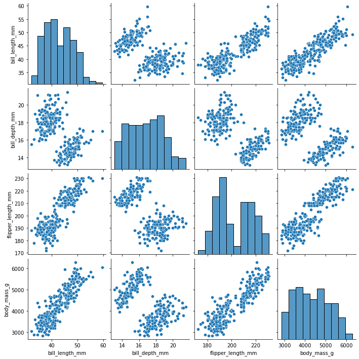
From the scatterplot matrix, we can observe a few linear relationships:
- bill length (mm) and flipper length (mm)
- bill length (mm) and body mass (g)
- flipper length (mm) and body mass (g)
Model construction
Based on the above scatterplots, we could probably run a simple linear regression on any of the three relationships identified. For now, we will focus on the relationship between bill length (mm) and body mass (g).
To do this, we will first subset the variables of interest from the dataframe. We can do this by using double square brackets [[]], and listing the names of the columns of interest.
# Subset Data
ols_data = penguins_final[["bill_length_mm", "body_mass_g"]]
Next, we can construct the linear regression formula, and save it as a string. Remember that the y or dependent variable comes before the ~, and the x or independent variables comes after the ~.
Note: The names of the x and y variables have to exactly match the column names in the dataframe.
# Write out formula
ols_formula = "body_mass_g ~ bill_length_mm"
Lastly, we can build the simple linear regression model in statsmodels using the ols() function.
# Import ols function
from statsmodels.formula.api import ols
Now we can plug in the ols_formula and ols_data as arguments in the ols() function. After we save the results as a variable, we can call on the fit() function to actually fit the model to the data.
# Build OLS, fit model to data
OLS = ols(formula = ols_formula, data = ols_data)
model = OLS.fit()
Lastly, we can call the summary() function on the model object to get the coefficients and more statistics about the model. The output from model.summary() can be used to evaluate the model and interpret the results.
model.summary()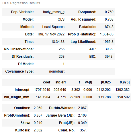
Warnings:
[1] Standard Errors assume that the covariance matrix of the errors is correctly specified.
We can use the regplot() function from seaborn to visualize the regression line.
sns.regplot(x = "bill_length_mm", y = "body_mass_g", data = ols_data)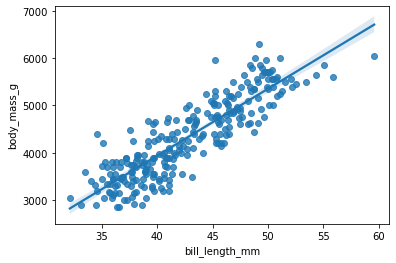
Checking model assumptions
As we checked previously, there are four main model assumptions for simple linear regression, in no particular order:
- Linearity
- Normality
- Independent observations
- Homoscedasticity
We already checked the linearity assumption by creating the scatterplot matrix. The independent observations assumption is more about data collection. There is no reason to believe that one penguin’s body mass or bill length would be related to any other penguin’s anatomical measurements. So we can check off assumptions 1 and 3.
The normality and homoscedasticity assumptions focus on the distribution of errors. Thus, we can only check these assumptions after we have constructed the model. To check these assumptions, we will check the residuals, as an approximation of the errors.
To more easily check the model assumptions and create relevant visualizations, we can first subset the X variable by isolating just the bill_length_mm column. Additionally, we can save the predicted values from the model using the model.predict(X) function.
# Subset X variable
X = ols_data["bill_length_mm"]

# Get predictions from model
fitted_values = model.predict(X)
Then, we can save the model residuals as a variable by using the model.resid attribute.
# Calculate residuals
residuals = model.resid
Check the normality assumption
To check the normality assumption, we can create a histogram of the residuals using the histplot() function from the seaborn package.
import matplotlib.pyplot as plt

fig = sns.histplot(residuals)
fig.set_xlabel("Residual Value")
fig.set_title("Histogram of Residuals")
plt.show()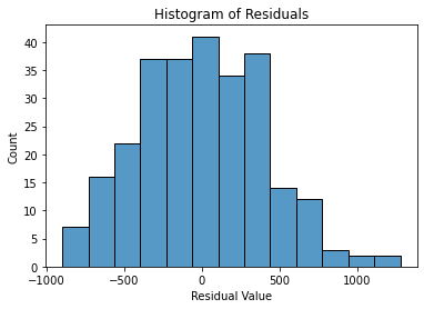
From the above histogram, we may notice that the residuals are almost normally distributed. In this case, it is likely close enough that the assumption is met.
Another way to check the normality function is to create a quantile-quantile or Q-Q plot. Recall that if the residuals are normally distributed, we would expect a straight diagonal line going from the bottom left to the upper right of the Q-Q plot. We can create a Q-Q plot by using the qqplot function from the statsmodels.api package.
import matplotlib.pyplot as plt
import statsmodels.api as sm

fig = sm.qqplot(model.resid, line = 's')
plt.show()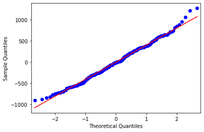
The Q-Q plot shows a similar pattern to the histogram, where the residuals are mostly normally distributed, except at the ends of the distribution.
Check the homoscedasticity assumption
Lastly, we have to check the homoscedasticity assumption. To check the homoscedasticity assumption, we can create a scatterplot of the fitted values and residuals. If the plot resembles a random cloud (i.e., the residuals are scattered randomly), then the assumption is likely met.
We can create one scatterplot by using the scatterplot() function from the seaborn package. The first argument is the variable that goes on the x-axis. The second argument is the variable that goes on the y-axis.
import matplotlib.pyplot as plt
fig = sns.scatterplot(x=fitted_values, y=residuals)

# Add reference line at residuals = 0
fig.axhline(0)

# Set x-axis and y-axis labels
fig.set_xlabel("Fitted Values")
fig.set_ylabel("Residuals")

# Show the plot
plt.show()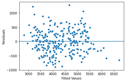
Disclaimer: Like most of my posts, this content is intended solely for educational purposes and was created primarily for my personal reference. At times, I may rephrase original texts, and in some cases, I include materials such as graphs, equations, and datasets directly from their original sources.
I typically reference a variety of sources and update my posts whenever new or related information becomes available. For this particular post, the primary source was Google Advanced Data Analytics Professional Certificate.