
My role
Data Analysis & Research
Performing a detailed EDA, building ML Models

Timeline
Jul ’23
Case study, openHPI
Data Science Bootcamp

Tools
Python
Jupyter
Office Suite
OVERVIEW
The Data
The Titanic Dataset holds records of individual passengers on the Titanic, including some demographics and their survival status.
The Goal
I’ll create different models to predict survival on the Titanic, based on the given variables.
Tools
Pandas and Numpy for basics,
Matplotlib for analysis and visualization,
Seaborn for visualization and correlation matrix,
Sklearn for regressors and classifiers.
Methods
Statistics
Data Processing
Exploratory Analysis
Recursive Partitioning
Data Visualization
Normalization
Research data *
Titanic dataset is publicly available, yet not all analyses come with a concrete description of the origin of the data. I spent some time to learn more about the data and below you will find some information on this.
* DISCLAIMER I tried my best NOT to personalize the information that comes out of this dataset. The information provided herein, including passenger names, is considered personal data and we all should respect that. I performed this analysis only for educational purposes and to demonstrate my skills and how I approach to a dataset, that has a lot of socio-psychological factors in it.
1 Introduction
The Titanic dataset was introduced us during a Data Science Bootcamp, as it is one of the most popular entry-level practice sets available publicly. Our aim was to predict the survival rates by using different models. I successfully passed the assignment, yet after finalizing the course I wanted to deepen my analysis. Once I found out that Kaggle also uses the Titanic dataset as an encouraging starting point for people like me who are new into the ML field, I decided to enter their competition, titled ‘Titanic – Machine Learning from Disaster‘.
Having said that, my main motivation is not scoring high in that competition, not at all! I chose to practice there, because when it comes to the Titanic dataset, this particular competition seems to be one of the most active ones. In fact, it runs indefinitely without rewarding ranking points. My main target is to understand the ML models better.
1.1 The Titanic Dataset
As I did in my very first data analysis project, I did spend a huge amount of time to understand the data itself: The origin of it, if it is a real set: how and when it was collected, if not: what was the goal behind, and so on. Because I believe that every data-related research should start with questioning the data itself, even if it is a practice set.
M.L. Frank’s short paper is a good place to start and this is what I got from there:
“The principal source for the Titanic passengers dataset is the Encyclopedia Titanica. The datasets were begun by a variety of researchers. One of the original sources is Eaton & Haas (1994) Titanic: Triumph and Tragedy, Patrick Stephens Ltd, which includes a passenger list created by many researchers and edited by Michael A. Findlay.”
If you’ll check online the versions of this dataset, propably you’ll come across titles such as titanic, titanic2 and titanic3. It looks like most of the Titanic dataset available online (incl. the one in the Kaggle competition) are based on the titanic3 version, which is an updated version of the previous ones by dropping duplicate passengers, correcting many errors, and filling in some missing ages. The dataset has records for the passengers only, excluding the crew.
That dataset has three more variables than the one here: ‘Boat’ (Lifeboat), ‘body’ (Body Identification Number), and ‘home.dest’ (Home/Destination). Most of the datasets that I could find online did not have these three columns as well. Probably to provide the simplicity to a practice set.
1.2 Data Dictionary
Below I’ll give a table for the columns and their descriptions. This is slightly more detailed version of the one that is provided under the competition page. The dataset holds 1309 records* under 11 variables in total. This competition by Kaggle splits the dataset in two sets: While the training-data set has 891 records (1-891), the test-data set has 418 (892-1309) excluding the Survived column (for us to predict them).
| Column Titles | Definition | Key, and additional Notes |
|---|---|---|
| Survived | Survival | 0 = No, 1 = Yes |
| Pclass | Ticket class | 1 = 1st, 2 = 2nd, 3 = 3rd / A proxy for socio-economic status |
| Name | Name of passengers | Contains name, surname, title and some has additional names |
| Sex | Sex | Female, Male |
| Age | Age in years | Age is fractional if less than 1 and if estimated, it is in the form of xx.5 |
| SibSp | No. of Siblings/Spouses aboard the Titanic | Mistresses and fiancés were ignored |
| Parch | No. of Parents/Children aboard the Titanic | Some children travelled only with a nanny, therefore parch=0 for them. |
| Ticket | Ticket number | Mostly with numbers, some has letters too |
| Fare | Passenger fare | in Pre-1970 British Pounds |
| Cabin | Cabin number | A combination of a letter and some numbers |
| Embarked | Port of Embarkation | C = Cherbourg, Q = Queenstown, S = Southampton |
*The exact number of people in Titanic is unknown. In most sources, it is mentioned that there were 2229 people (1316 passengers + 913 crew) on board.
2 Problem Statement
With this dataset, I’ll try to predict the survivals in the test-data. By doing so, I’ll examine every variable and the possibility of their effects on the survival.
2.1 Loading the Datasets
import numpy as np
import pandas as pd

import os
for dirname, _, filenames in os.walk('/kaggle/input'):
    for filename in filenames:
        print(os.path.join(dirname, filename))
train_data = pd.read_csv("/kaggle/input/titanic/train.csv")
train_data.head()| PassengerId | Survived | Pclass | Name | Sex | Age | SibSp | Parch | Ticket | Fare | Cabin | Embarked | |
|---|---|---|---|---|---|---|---|---|---|---|---|---|
| 0 | 1 | 0 | 3 | Braund, Mr. Owen Harris | male | 22.0 | 1 | 0 | A/5 21171 | 7.2500 | NaN | S |
| 1 | 2 | 1 | 1 | Cumings, Mrs. John Bradley (Florence Briggs Th… | female | 38.0 | 1 | 0 | PC 17599 | 71.2833 | C85 | C |
| 2 | 3 | 1 | 3 | Heikkinen, Miss. Laina | female | 26.0 | 0 | 0 | STON/O2. 3101282 | 7.9250 | NaN | S |
| 3 | 4 | 1 | 1 | Futrelle, Mrs. Jacques Heath (Lily May Peel) | female | 35.0 | 1 | 0 | 113803 | 53.1000 | C123 | S |
| 4 | 5 | 0 | 3 | Allen, Mr. William Henry | male | 35.0 | 0 | 0 | 373450 | 8.0500 | NaN | S |
test_data = pd.read_csv("/kaggle/input/titanic/test.csv")
test_data.head()| PassengerId | Pclass | Name | Sex | Age | SibSp | Parch | Ticket | Fare | Cabin | Embarked | |
|---|---|---|---|---|---|---|---|---|---|---|---|
| 0 | 892 | 3 | Kelly, Mr. James | male | 34.5 | 0 | 0 | 330911 | 7.8292 | NaN | Q |
| 1 | 893 | 3 | Wilkes, Mrs. James (Ellen Needs) | female | 47.0 | 1 | 0 | 363272 | 7.0000 | NaN | S |
| 2 | 894 | 2 | Myles, Mr. Thomas Francis | male | 62.0 | 0 | 0 | 240276 | 9.6875 | NaN | Q |
| 3 | 895 | 3 | Wirz, Mr. Albert | male | 27.0 | 0 | 0 | 315154 | 8.6625 | NaN | S |
| 4 | 896 | 3 | Hirvonen, Mrs. Alexander (Helga E Lindqvist) | female | 22.0 | 1 | 1 | 3101298 | 12.2875 | NaN | S |
I’ll create copies of the train and test datasets, and combine them to study the data as a whole.
# Creating copies of train and test.
train = train_data.copy()
test= test_data.copy()

# Combining them into another dataframe.
df = pd.concat([train, test])
comb_data = df.copy()

# Listing what I got.
comb_data.info()
<class 'pandas.core.frame.DataFrame'> Int64Index: 1309 entries, 0 to 417 Data columns (total 12 columns): # Column Non-Null Count Dtype --- ------ -------------- ----- 0 PassengerId 1309 non-null int64 1 Survived 891 non-null float64 2 Pclass 1309 non-null int64 3 Name 1309 non-null object 4 Sex 1309 non-null object 5 Age 1046 non-null float64 6 SibSp 1309 non-null int64 7 Parch 1309 non-null int64 8 Ticket 1309 non-null object 9 Fare 1308 non-null float64 10 Cabin 295 non-null object 11 Embarked 1307 non-null object dtypes: float64(3), int64(4), object(5) memory usage: 132.9+ KB
2.2 Detecting the Missing Values
missing_comb = comb_data.isnull().sum()
missing_comb[missing_comb > 0]
Survived 418 Age 263 Fare 1 Cabin 1014 Embarked 2 dtype: int64
All the missing values of ‘Survived’ come from the test data, we don’t touch that. But for others we need some action.
- 263 missing ‘Age’ ➡️ ≈20% 🚩 We have to consider setting median or cleaning the rows.*
- 1 missing ‘Fare’ 🚩 We can use median.*
- 2 missing ‘Embarked’ 🚩 We can use mode.*
- 1014 missing ‘Cabin’ ➡️ ≈77% 🚩 That’s a lot! Needs to be checked, but probably I will drop this column out.
*These were my first thoughts. I’ll try something else for all the missing ones.
3 Basic EDA & Handling the Missing Values
To get to know the data, I’ll go through every single column.
3.1 Passenger Id
Id starts with 1 and ends at 1309. But it won’t serve the prediction. The column is in the set to match our predictions.
comb_data["PassengerId"].describe()count 1309.000000 mean 655.000000 std 378.020061 min 1.000000 25% 328.000000 50% 655.000000 75% 982.000000 max 1309.000000 Name: PassengerId, dtype: float64
3.2 Survived
That’s our dependent variable, but let’s check the overall survival rates.
train["Survived"].value_counts(normalize=True).round(2)0 0.62 1 0.38 Name: Survived, dtype: float64
📍 The survival rate is 38% for 891 passengers, listed in the train-set.
3.3 PClass
I’ll check the total numbers of each ticket classes and their proportions.
Class_counts = comb_data["Pclass"].value_counts()
Class_percs =
comb_data["Pclass"].value_counts(normalize=True).mul(100).round(2).astype(str) + '%'
pd.concat([Class_counts, Class_percs], axis=1, keys=['count', 'perc.'])| count | perc. | |
|---|---|---|
| 3 | 709 | 54.16% |
| 1 | 323 | 24.68% |
| 2 | 277 | 21.16% |
📍 More than half of the passengers were in 3rd class, around a quarter of them were in 1st class and a bit higher than a fifth of them were in 2nd class.
3.4 Name
Apart from the name and surname, the Name column includes some titles too such as Mr. and Mrs., and some rows has additional names in paranthesis.
comb_data.Name.head(10)0 Braund, Mr. Owen Harris 1 Cumings, Mrs. John Bradley (Florence Briggs Th... 2 Heikkinen, Miss. Laina 3 Futrelle, Mrs. Jacques Heath (Lily May Peel) 4 Allen, Mr. William Henry 5 Moran, Mr. James 6 McCarthy, Mr. Timothy J 7 Palsson, Master. Gosta Leonard 8 Johnson, Mrs. Oscar W (Elisabeth Vilhelmina Berg) 9 Nasser, Mrs. Nicholas (Adele Achem) Name: Name, dtype: object
I was not thinking that the name would serve the data model but I saw some people’s analysis where they were ‘taking out’ the titles from those names and using as a variable. So I found that interesting and despite the hard-to-grasp nature of regex, I wanted to practice these as well. Here it is:
# For any case, I'll practice on a copy.
cd_title = comb_data.copy()

# Seperating the titles, that come right after the comma.
cd_title["Title"] = cd_title["Name"].str.extract(", (.*?)\.")
cd_title["Title"].value_counts()
Mr 757 Miss 260 Mrs 197 Master 61 Rev 8 Dr 8 Col 4 Mlle 2 Major 2 Ms 2 Lady 1 Sir 1 Mme 1 Don 1 Capt 1 the Countess 1 Jonkheer 1 Dona 1 Name: Title, dtype: int64
This could be clustered further as below. (Lady could be either Miss or Mrs, here assumed as Miss. Don and Dona are probably Spanish (or Portuguese) version of Mr and Mrs.)
cd_title["Title"].replace(["Ms", "Mlle", "Lady"], "Miss", inplace=True)
cd_title["Title"].replace(["the Countess", "Mme", "Dona"], "Mrs", inplace=True)
cd_title["Title"].replace(["Sir", "Jonkheer", "Don"], "Mr", inplace=True)
cd_title["Title"].replace(["Rev", "Dr", "Col", "Major", "Capt"], "Rare_Titles", inplace=True)
cd_title["Title"].value_counts()
Mr 760 Miss 265 Mrs 200 Master 61 Rare_Titles 23 Name: Title, dtype: int64
# Checking the consistency of the data, by matching the Titles and the Sex.
cd_title.groupby(['Sex'])['Title'].value_counts()
Sex Title
female Miss 265
Mrs 200
Rare_Titles 1
male Mr 760
Master 61
Rare_Titles 22
Name: Title, dtype: int64
# It looks ok. Let's find out that rare title for that lady.
female_rare = cd_title[(cd_title['Title'] == 'Rare_Titles') & (cd_title['Sex'] == 'female')]
female_rare| PassengerId | Survived | Pclass | Name | Sex | Age | SibSp | Parch | Ticket | Fare | Cabin | Embarked | Title | |
|---|---|---|---|---|---|---|---|---|---|---|---|---|---|
| 796 | 797 | 1.0 | 1 | Leader, Dr. Alice (Farnham) | female | 49.0 | 0 | 0 | 17465 | 25.9292 | D17 | S | Rare_Titles |
Ok, it was interesting but I am still not sure what this will bring more to the equation, except ‘Master’ and ‘Rare Titles’, that are -btw- very less proportionally. For now it seems to me that the ‘Title’ in its form is just another shape of ‘Sex’ and ‘Age’. But I’ll come back to this on further EDA and my thoughts will change a bit.
3.5 Sex
comb_data['Sex'].value_counts()male 843 female 466 Name: Sex, dtype: int64
📍 A little shorter than two-third of the passengers were male.
3.6 Age
comb_data['Age'].describe()count 1046.000000 mean 29.881138 std 14.413493 min 0.170000 25% 21.000000 50% 28.000000 75% 39.000000 max 80.000000 Name: Age, dtype: float64
In the data dictionary it was written that the age is fractional if it is less than one (1) and some digits come in the form of xx.5, that were estimated. Let’s first check how many of them were estimated, because it’s no good if they are too many.
# Creating a copy of the set.
data_age = comb_data.copy()

# Filling the missing values with zeros, just to be able to use the astype.
data_age['Age'] = data_age['Age'].fillna(0)

# Finding the number of estimated values.
age_estimated = data_age[(data_age['Age'] >= 1) & (data_age.Age - data_age.Age.astype(int) != 0)]
len(age_estimated)
33
Ok, they are not too many. Probably the authors had the birth years not the exact dates, so they came up with float numbers. Before considering the missing values, let’s examine the overall graph first.
# From now on, I'll need visuals.
import seaborn as sns
import matplotlib.pyplot as plt
survived = comb_data[comb_data['Survived'] == 1]
died = comb_data[comb_data['Survived'] == 0]
plt.figure(figsize=(7, 3))
sns.kdeplot(survived['Age'], color='green', label='Survived')
sns.kdeplot(died['Age'], color='red', label='Died')
sns.kdeplot(df['Age'], color='gray', label='All Passengers')
plt.title('Age Distribution')
plt.xlabel('Age')
plt.ylabel('Density')
plt.xlim(0, df['Age'].max()) # set the limits of x-axis, not to start before 0
plt.legend()
plt.show()
plt.close()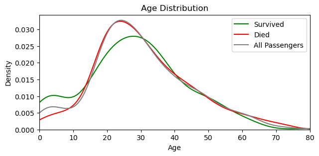
📍 More children survived than died.
3.6.1 Missing values of Age
Around 20% of ‘Age’ data is missing, which is not less. That’s why deleting them is -probably- not the best option. We can fulfill them with median, but since this will be a significant data change, I was in search of a better approach and came across the MICE (Multiple Imputation by Chained Equations) algorithm. I’ll perform this on further EDA, but let me first demonstrate what happens if we go with the median or mean.
If all age values would be integers, I’d go with the median (28) but let’s choose the mean (29.88) and round it down, closer to the median.
# Creating a seperate copy for this demonstration.
data_copy_age = comb_data.copy()

# Filling the missing values with 29.
data_copy_age['Age'] = data_copy_age['Age'].fillna(29)
Below I put two graphs on each other. Blue one is the original one with the missing values, orange one is the fulfilled one. You can see how we ‘distort’ the data towards one particular direction. That’s why I’ll try different methods on further EDA phase.
sns.histplot(comb_data["Age"])
sns.histplot(data_copy_age["Age"], alpha=0.5)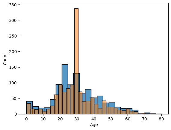
3.7 SibSp
comb_data.SibSp.value_counts()0 891 1 319 2 42 4 22 3 20 8 9 5 6 Name: SibSp, dtype: int64
📍 Most of the passengers were on board without a sibling or a spouse (or they did not prefer to mention them).
sns.histplot(comb_data["SibSp"])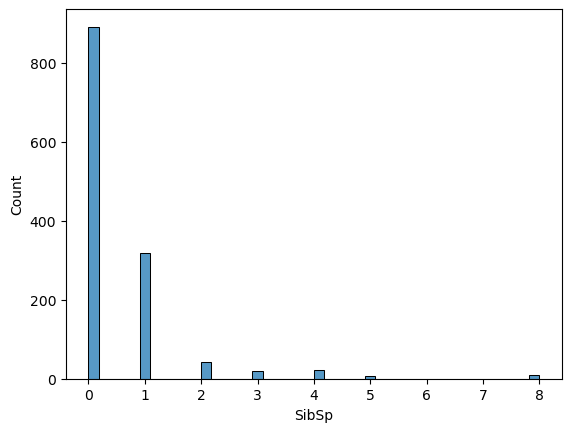
The distribution gets sparse for bigger groups. Let’s quickly check the biggest ones:
comb_data[comb_data['SibSp'] > 4].sort_values(by='SibSp', ascending=False)| PassengerId | Survived | Pclass | Name | Sex | Age | SibSp | Parch | Ticket | Fare | Cabin | Embarked | |
|---|---|---|---|---|---|---|---|---|---|---|---|---|
| 159 | 160 | 0.0 | 3 | Sage, Master. Thomas Henry | male | NaN | 8 | 2 | CA. 2343 | 69.55 | NaN | S |
| 180 | 181 | 0.0 | 3 | Sage, Miss. Constance Gladys | female | NaN | 8 | 2 | CA. 2343 | 69.55 | NaN | S |
| 201 | 202 | 0.0 | 3 | Sage, Mr. Frederick | male | NaN | 8 | 2 | CA. 2343 | 69.55 | NaN | S |
| 324 | 325 | 0.0 | 3 | Sage, Mr. George John Jr | male | NaN | 8 | 2 | CA. 2343 | 69.55 | NaN | S |
| 792 | 793 | 0.0 | 3 | Sage, Miss. Stella Anna | female | NaN | 8 | 2 | CA. 2343 | 69.55 | NaN | S |
| 846 | 847 | 0.0 | 3 | Sage, Mr. Douglas Bullen | male | NaN | 8 | 2 | CA. 2343 | 69.55 | NaN | S |
| 863 | 864 | 0.0 | 3 | Sage, Miss. Dorothy Edith “Dolly” | female | NaN | 8 | 2 | CA. 2343 | 69.55 | NaN | S |
| 188 | 1080 | NaN | 3 | Sage, Miss. Ada | female | NaN | 8 | 2 | CA. 2343 | 69.55 | NaN | S |
| 360 | 1252 | NaN | 3 | Sage, Master. William Henry | male | 14.5 | 8 | 2 | CA. 2343 | 69.55 | NaN | S |
| 59 | 60 | 0.0 | 3 | Goodwin, Master. William Frederick | male | 11.0 | 5 | 2 | CA 2144 | 46.90 | NaN | S |
| 71 | 72 | 0.0 | 3 | Goodwin, Miss. Lillian Amy | female | 16.0 | 5 | 2 | CA 2144 | 46.90 | NaN | S |
| 386 | 387 | 0.0 | 3 | Goodwin, Master. Sidney Leonard | male | 1.0 | 5 | 2 | CA 2144 | 46.90 | NaN | S |
| 480 | 481 | 0.0 | 3 | Goodwin, Master. Harold Victor | male | 9.0 | 5 | 2 | CA 2144 | 46.90 | NaN | S |
| 683 | 684 | 0.0 | 3 | Goodwin, Mr. Charles Edward | male | 14.0 | 5 | 2 | CA 2144 | 46.90 | NaN | S |
| 140 | 1032 | NaN | 3 | Goodwin, Miss. Jessie Allis | female | 10.0 | 5 | 2 | CA 2144 | 46.90 | NaN | S |
According to the family names, we can assume that they were together. We need to remember this on further EDA.
3.8 Parch
comb_data.Parch.value_counts()0 1002 1 170 2 113 3 8 5 6 4 6 6 2 9 2 Name: Parch, dtype: int64
📍 Most of the passengers were on board without a parent or a kid (or they did not prefer to mention them).
sns.histplot(comb_data["Parch"])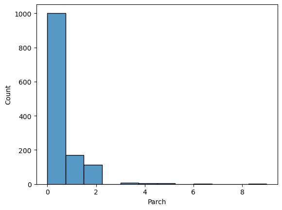
Similar to SibSp the distribution is not ‘homogeneous’. These two columns are highly related to each other. I’ll come back to them on further EDA.
3.9 Ticket
comb_data['Ticket'].describe()count 1309 unique 929 top CA. 2343 freq 11 Name: Ticket, dtype: object
A huge amount of the tickets were unique, yet some were not. Let’s have a quick look at them.
comb_data['Ticket'].head(20)0 A/5 21171 1 PC 17599 2 STON/O2. 3101282 3 113803 4 373450 5 330877 6 17463 7 349909 8 347742 9 237736 10 PP 9549 11 113783 12 A/5. 2151 13 347082 14 350406 15 248706 16 382652 17 244373 18 345763 19 2649 Name: Ticket, dtype: object
Ticket codes alone don’t give us much information, since they come in different forms, as four, five or six digits and some of them accompanied with additional letters. Investigating them deeper would be hard without a proper direction about their meanings. Maybe we can narrow down by focusing on just the duplicates:
non_unique = comb_data[comb_data.duplicated('Ticket')]
len(non_unique)
380
📍 380 people hold tickets that has minimum one more person with the same ticket number. I’ll investigate this further on following steps.
3.10 Fare
comb_data['Fare'].describe()count 1308.000000 mean 33.295479 std 51.758668 min 0.000000 25% 7.895800 50% 14.454200 75% 31.275000 max 512.329200 Name: Fare, dtype: float64
comb_data['Fare'].nunique()281
📍 We have 281 different Fare values and the standard deviation is high compared to the mean.
Let’s check the graph, but first I want to look at the min value, that is zero.
comb_data['Fare'].value_counts().get(0, 0)17
comb_data['Fare'].isna().sum()1
We have one missing value and 17 zeros. Let’s list them.
comb_data.loc[comb_data['Fare'] == 0].sort_values(by=['Ticket', 'Name'], ascending=True)| PassengerId | Survived | Pclass | Name | Sex | Age | SibSp | Parch | Ticket | Fare | Cabin | Embarked | |
|---|---|---|---|---|---|---|---|---|---|---|---|---|
| 806 | 807 | 0.0 | 1 | Andrews, Mr. Thomas Jr | male | 39.0 | 0 | 0 | 112050 | 0.0 | A36 | S |
| 266 | 1158 | NaN | 1 | Chisholm, Mr. Roderick Robert Crispin | male | NaN | 0 | 0 | 112051 | 0.0 | NaN | S |
| 633 | 634 | 0.0 | 1 | Parr, Mr. William Henry Marsh | male | NaN | 0 | 0 | 112052 | 0.0 | NaN | S |
| 815 | 816 | 0.0 | 1 | Fry, Mr. Richard | male | NaN | 0 | 0 | 112058 | 0.0 | B102 | S |
| 372 | 1264 | NaN | 1 | Ismay, Mr. Joseph Bruce | male | 49.0 | 0 | 0 | 112058 | 0.0 | B52 B54 B56 | S |
| 263 | 264 | 0.0 | 1 | Harrison, Mr. William | male | 40.0 | 0 | 0 | 112059 | 0.0 | B94 | S |
| 822 | 823 | 0.0 | 1 | Reuchlin, Jonkheer. John George | male | 38.0 | 0 | 0 | 19972 | 0.0 | NaN | S |
| 466 | 467 | 0.0 | 2 | Campbell, Mr. William | male | NaN | 0 | 0 | 239853 | 0.0 | NaN | S |
| 413 | 414 | 0.0 | 2 | Cunningham, Mr. Alfred Fleming | male | NaN | 0 | 0 | 239853 | 0.0 | NaN | S |
| 277 | 278 | 0.0 | 2 | Parkes, Mr. Francis “Frank” | male | NaN | 0 | 0 | 239853 | 0.0 | NaN | S |
| 481 | 482 | 0.0 | 2 | Frost, Mr. Anthony Wood “Archie” | male | NaN | 0 | 0 | 239854 | 0.0 | NaN | S |
| 732 | 733 | 0.0 | 2 | Knight, Mr. Robert J | male | NaN | 0 | 0 | 239855 | 0.0 | NaN | S |
| 674 | 675 | 0.0 | 2 | Watson, Mr. Ennis Hastings | male | NaN | 0 | 0 | 239856 | 0.0 | NaN | S |
| 597 | 598 | 0.0 | 3 | Johnson, Mr. Alfred | male | 49.0 | 0 | 0 | LINE | 0.0 | NaN | S |
| 302 | 303 | 0.0 | 3 | Johnson, Mr. William Cahoone Jr | male | 19.0 | 0 | 0 | LINE | 0.0 | NaN | S |
| 179 | 180 | 0.0 | 3 | Leonard, Mr. Lionel | male | 36.0 | 0 | 0 | LINE | 0.0 | NaN | S |
| 271 | 272 | 1.0 | 3 | Tornquist, Mr. William Henry | male | 25.0 | 0 | 0 | LINE | 0.0 | NaN | S |
Some ticket numbers are same, some others are sequential with one exception. We have also four rows with ‘LINE’ as the ticket code (I double-checked, there are no more LINE tickets than these four). Since we also have a NaN value, maybe we can assume that these zeros were not a poor data entry, but these passengers got on board free instead. But we can’t be sure of this of course. Let’s check the overall distribution.
sns.histplot(comb_data["Fare"])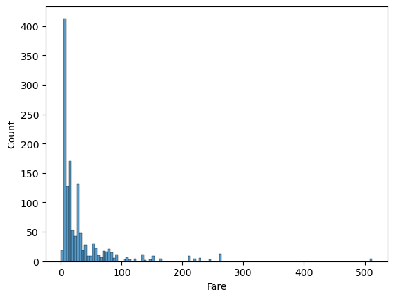
Considering that more than half of the passengers were in 3rd class, it is no surprize that this graph is right skewed. The distribution gets sparse above 100, let me check those at once.
high_fare = comb_data[comb_data['Fare'] >= 100]
len(high_fare)
84
high_fare.Pclass.value_counts()1 84 Name: Pclass, dtype: int64
When the price gets higher than 100, we see only 1st class tickets. Again (similar to the SibSp and Parch), higher values (here Fare) may mean something else, rather than (or in addition to) the names the columns carry. We’ll remember this on further EDA too.
3.10.1 Missing Value of Fare
Before moving on, let’s handle that one missing value of Fare.
comb_data['Fare'].describe()count 1308.000000 mean 33.295479 std 51.758668 min 0.000000 25% 7.895800 50% 14.454200 75% 31.275000 max 512.329200 Name: Fare, dtype: float64
We could use the median (14.45) for this, but let’s have a closer look to the entire row. Maybe we can catch something else.
comb_data.loc[comb_data['Fare'].isnull()]| PassengerId | Survived | Pclass | Name | Sex | Age | SibSp | Parch | Ticket | Fare | Cabin | Embarked | |
|---|---|---|---|---|---|---|---|---|---|---|---|---|
| 152 | 1044 | NaN | 3 | Storey, Mr. Thomas | male | 60.5 | 0 | 0 | 3701 | NaN | NaN | S |
Let me first check that we have same ticket number or not. If yes, maybe we can use its fare.
comb_data.loc[comb_data['Ticket'] == '3701']| PassengerId | Survived | Pclass | Name | Sex | Age | SibSp | Parch | Ticket | Fare | Cabin | Embarked | |
|---|---|---|---|---|---|---|---|---|---|---|---|---|
| 152 | 1044 | NaN | 3 | Storey, Mr. Thomas | male | 60.5 | 0 | 0 | 3701 | NaN | NaN | S |
There is no pair for this ticket. Now we can check the Fare rates with the same Pclass (3) and Embarked (S) values.
comb_data[(comb_data['Pclass'] == 3) & (comb_data['Embarked'] == 'S')].Fare.describe()count 494.000000 mean 14.435422 std 13.118281 min 0.000000 25% 7.854200 50% 8.050000 75% 15.900000 max 69.550000 Name: Fare, dtype: float64
The median Fare for a passenger who embarked from Southampton in 3rd class was 8.05. Let’s use this for that missing value, rather than the one from whole fares.
comb_data['Fare'] = comb_data['Fare'].fillna(8.05)comb_data['Fare'].describe()count 1309.000000 mean 33.276193 std 51.743584 min 0.000000 25% 7.895800 50% 14.454200 75% 31.275000 max 512.329200 Name: Fare, dtype: float64
3.11 Cabin
More than 1000 values are missing for Cabin, which is a huge amount of data. But anyway let’s have a look at it.
comb_data['Cabin'].describe()count 295 unique 186 top C23 C25 C27 freq 6 Name: Cabin, dtype: object
comb_data['Cabin'].value_counts().sort_values(ascending=False).head(20)C23 C25 C27 6 B57 B59 B63 B66 5 G6 5 C22 C26 4 F33 4 F2 4 B96 B98 4 C78 4 F4 4 D 4 E101 3 C101 3 B51 B53 B55 3 A34 3 E34 3 B58 B60 3 C106 2 D26 2 C2 2 B49 2 Name: Cabin, dtype: int64
These letters and numbers indiciates sections of the ship, hence the locations of the cabins. It would be very nice to have them all, in that way we could examine tickets not only per class but per location within those classes as well. Yet we have much less values in this column.
3.12 Embarked
comb_data['Embarked'].value_counts()S 914 C 270 Q 123 Name: Embarked, dtype: int64
📍 Almost 70% of passengers got on board at the port: Southampton, around 20% at Cherbourg, and a little less than 10% at Queenstown.
3.12.1 Missing Value of Embarked
comb_data['Embarked'].isna().sum()2
Since it is only 2 missing values, we could easily fill them with the mode, which is ‘S’. But first let me have a look at them like I did with the Fare.
comb_data.loc[comb_data['Embarked'].isna()]| PassengerId | Survived | Pclass | Name | Sex | Age | SibSp | Parch | Ticket | Fare | Cabin | Embarked | |
|---|---|---|---|---|---|---|---|---|---|---|---|---|
| 61 | 62 | 1.0 | 1 | Icard, Miss. Amelie | female | 38.0 | 0 | 0 | 113572 | 80.0 | B28 | NaN |
| 829 | 830 | 1.0 | 1 | Stone, Mrs. George Nelson (Martha Evelyn) | female | 62.0 | 0 | 0 | 113572 | 80.0 | B28 | NaN |
I”ll check that we have other passengers with the same ticket or not.
len(comb_data[comb_data['Ticket'] == "113572"])2
Only these two rows have this ticket, now let’s check the fare-ranges within the classes for each ports.
sns.boxplot(data=comb_data, x="Fare", y="Embarked", hue="Pclass")
plt.axvline(x=80, linestyle="dashed", color='red', alpha=0.6) # This is the fare they paid.
#plt.axvline(x=40, linestyle="dashed", color='blue') 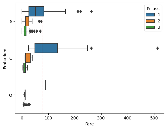
Considering the embarked port and the ticket’s class, it looks like it is better to predict them as ‘C’ Cherbourg, not ‘S’ Southampton.
❕ Side Note: In the description of the Fare column, it was written that it indicates the passenger fare, not the ticket fare. So that’s why I did not divide the fare in passenger count.
comb_data['Embarked'] = comb_data['Embarked'].fillna('C')
comb_data['Embarked'].describe()
count 1309 unique 3 top S freq 914 Name: Embarked, dtype: object
4 Further EDA & Data Processing
4.1 Pclass (and Survival)
sns.countplot(x='Pclass', hue='Survived', data=comb_data)
plt.title('Survival by Passenger Class')
plt.legend(title='Survived', labels=['No', 'Yes'])
plt.show()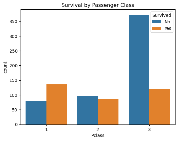
There is a big difference between the classes when we check the survival rates. I’ll consider this column into my equation.
📍 While in 1st class more passengers survived than died, in 3rd class more than twice as many passengers died as survived. 2nd class has almost equal numbers of survived ones and the victims.
4.2 Names & Titles (and Survival)
As I previously mentioned (in 3.4 Name) I was thinking that the titles I extracted from the names are -like- indicators of age and sex (except the rare ones). But to be sure of that, let me check this one visually and try to understand how the Titles spread across the Age variable.
plt.figure(figsize=(9, 4))
sns.boxplot(data=cd_title, x="Age", y="Title")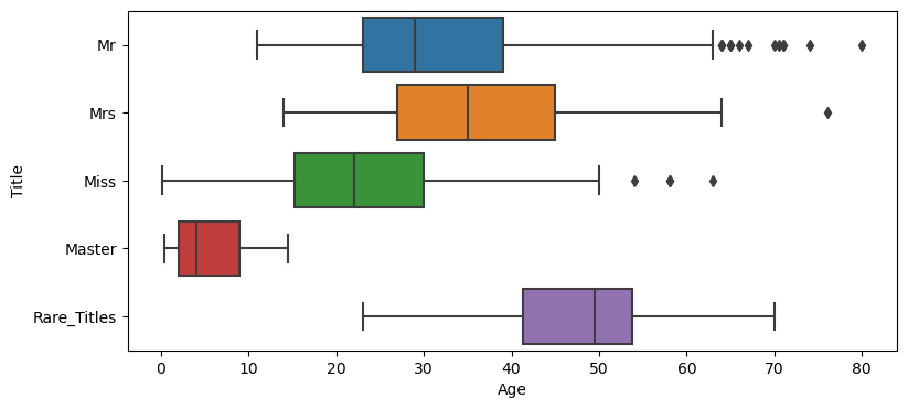
Ok, I have to admit that the image -in my mind- of a Master was quite different than pictured here. It looks like I was wrong about the possible ‘signals’ that the Title may carry. While I am still thinking that this formation above is a biased approach (because we have some distinct title for young males, but none for females*), I’d consider Title in my equation, as I think it may bring something more than the existing variables. The survival rates within the Titles are also quite ‘strong’, as shown below.
*Side Note: If you wonder how many young ladies this dataset has within the Master-range (that is Age <= 14.5), it is 57 (out of 265 Misses).
cd_title.groupby(['Title'])['Survived'].mean().round(2)Title Master 0.57 Miss 0.70 Mr 0.16 Mrs 0.80 Rare_Titles 0.28 Name: Survived, dtype: float64
Said that, considering the Names themselves would be an extremely hard task and I doubt that it would be ethical as well. Therefore, for now Titles in, Names out.
# Taking the Titles from my temporary dataframe.
comb_data['Title'] = cd_title["Title"]

# Since the Id column won't serve us, I am dropping that one too.
comb_data = comb_data.drop(columns=['PassengerId', 'Name'])
4.3 Sex (and Survival)
sns.countplot(x='Sex', hue='Survived', data=comb_data)
plt.title('Survival by Sex')
plt.legend(title='Survived', labels=['No', 'Yes'])
plt.show()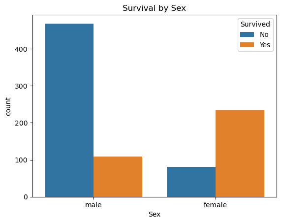
📍 Even though the majority of passengers were male, more women survived than men. (who are listed in the train-dataset)
4.4 Embarked (and Survival)
I am not sure how a departure point would effect something like survival rates. But then two things came to my mind: First, the ports may have safety instructors/boards (yes, for such a big accident, it wouldn’t be so fair to accept these as significant as some other factors) and second, these ports may represent some communities. Then again, we can’t be sure where people are really from (even so, should we really consider this as a factor?).
I still think one shouldn’t rely on such probabilities for a bigger scale, yet I want to check the embarkation points anyway.
sns.countplot(x='Embarked', hue='Survived', data=comb_data)
plt.title('Survival by Departure Ports')
plt.legend(title='Survived', labels=['No', 'Yes'])
plt.show()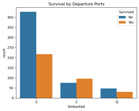
📍 Among the three ports, only the passengers who got on board from Cherbourg had a higher survival rate than died.
These digits may represent other factors (such as Pclass or Sex, as seen above) as well, but since their distributions differ I’ll consider this column as one of my independent variables too.
4.5 Ticket & Cabin
We’ve seen that the tickets’ codes don’t give us much information without knowing the meaning of those letters and numbers. For that reason, I’ll drop this column out of my equation. However, I’ll come back to the tickets that has the same code on the following steps.
I’ll drop the Cabin too, simply because that it has too many (1014) missing values.
comb_data = comb_data.drop(columns=['Ticket', 'Cabin'])4.6 Fare
Deciding what to do with the Fare was one of the hardest decisions for me in this analysis. Almost all analyses that I came across took this column as an independent variable. I simply can’t find a concrete reason that the fare could effect the survival rate directly. Because there may be tons of unrelated reasons to determine the cost of a ticket. I wouldn’t be that skeptic if we’d somehow translate the Fares into something else -say- the Cabins for instance. If all tickets were sold at the same time in the same place, maybe we could do so but unfortunately we can’t.
Let’s check the Fare-range within this dataset visually.
Class_1 = comb_data[comb_data['Pclass'] == 1]
Class_2 = comb_data[comb_data['Pclass'] == 2]
Class_3 = comb_data[comb_data['Pclass'] == 3]
plt.figure(figsize=(8, 3))
sns.kdeplot(Class_1['Fare'], color='green', label='Class_1')
sns.kdeplot(Class_2['Fare'], color='orange', label='Class_2')
sns.kdeplot(Class_3['Fare'], color='blue', label='Class_3')
plt.title('Fare Distribution')
plt.xlabel('Fare')
plt.ylabel('Density')
plt.xlim(0, comb_data['Fare'].max())
plt.legend()
plt.show()
plt.close()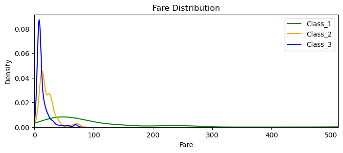
As we’ve seen before (in 3.10 Fare) there are only 1st class tickets above 100 and the above graph reveals that in a much wider perspective. We can see that 2nd and 3rd class both ends around 70-80. Their little ‘bumb-ups’ close to their tails are propably for group tickets. It is also clear that the density (for all classes) starts to get so low even around 50. When a data distribution gets that sparse, we have to be very careful. Because examining them may mean ‘examining some particular groups’, regardless of the Fare they paid. (Besides, we also have some zero values.) That’s why I decided not to consider the Fare into my equation. I will raise the same doubts for SibSp and Parch as well.
comb_data = comb_data.drop(columns=['Fare'])4.7 Change to Numerical Values
Before I move into fulfilling the missing Age rows, let me first convert the objects into numerical ones.
comb_data['Sex'] = comb_data['Sex'].map({'female':0,'male':1})
comb_data['Embarked'] = comb_data['Embarked'].map({'S':0,'C':1, 'Q':2})
from sklearn.preprocessing import LabelEncoder
le = LabelEncoder()
comb_data['Title'] = le.fit_transform(comb_data['Title'])4.8 Age (and the Missing Values)
I’ll try imputing missing values of Age by using several different models. My aim here is to find better options for those missing values than just applying the mean or median, as it will cause a great change in the distribution, as we’ve seen above (in 3.6 Age). I’ll try to keep this process as simple as possible.
In sklearn’s documentation, it is mentioned that the estimator is still experimental, hence we need to explicitly import the imputer. I’ll follow these steps:
- First I’ll try it with default features. (Right after I did that, I found out that IterativeImputer uses BayesianRidge by default, which seems that it is not the best option for predicting the age.)
- LogisticRegression is also not good for predicting ages, but for classification.
- Then I’ll try three different regressors, that I am more or less familiar with: KNeighborsRegressor, DecisionTreeRegressor, and RandomForestRegressor.
from sklearn.experimental import enable_iterative_imputer
from sklearn.impute import IterativeImputer

from sklearn.neighbors import KNeighborsRegressor
from sklearn.tree import DecisionTreeRegressor
from sklearn.ensemble import RandomForestRegressor
#import xgboost
4.8.1 Missing Values with IteraticeImputer’s Default Features
# Each copy will serve different models.
cd_age1_def = comb_data.copy()
missing_Age_def = cd_age1_def['Age'].isna()

# Applying and fitting on the data.
imputer_def = IterativeImputer(random_state=22)
imputed_values_def = imputer_def.fit_transform(cd_age1_def)
# Replacing the missing values with the imputed values.
cd_age1_def[missing_Age_def] = imputed_values_def[missing_Age_def]
cd_age1_def['Age'].describe()count 1309.000000 mean 29.512958 std 13.504016 min -4.138461 25% 21.000000 50% 28.840357 75% 36.500000 max 80.000000 Name: Age, dtype: float64
Having a minus value for age is not good (this is where I realized that I have to change the default estimator), but comparing the graph with the existing values (below) shows that I may be on the right direction.
sns.histplot(comb_data["Age"])
sns.histplot(cd_age1_def["Age"], alpha=0.5)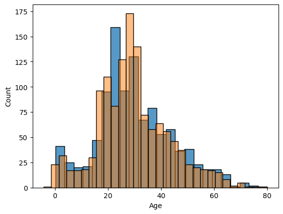
4.8.2 Missing Values with other Models
Let’s repeat the process with all other models.
cd_age2_knr = comb_data.copy()
cd_age3_dtr = comb_data.copy()
cd_age4_rfr = comb_data.copy()
#cd_age5_xgb = comb_data.copy()

missing_Age_knr = cd_age2_knr['Age'].isna()
missing_Age_dtr = cd_age3_dtr['Age'].isna()
missing_Age_rfr = cd_age4_rfr['Age'].isna()
#missing_Age_xgb = cd_age5_xgb['Age'].isna()

imputer_knr = IterativeImputer(
    estimator = KNeighborsRegressor(n_neighbors=15),
    random_state = 22
)

imputer_dtr = IterativeImputer(
    estimator = DecisionTreeRegressor(),
    random_state = 22,
    max_iter = 10
)

imputer_rfr = IterativeImputer(
    estimator = RandomForestRegressor(max_depth = 10),
    random_state = 22,
)

#imputer_xgb = IterativeImputer(
#    estimator = xgboost.XGBRegressor(),
#    random_state = 22,
#)

imputed_values_knr = imputer_knr.fit_transform(cd_age2_knr)
imputed_values_dtr = imputer_dtr.fit_transform(cd_age3_dtr)
imputed_values_rfr = imputer_rfr.fit_transform(cd_age4_rfr)
#imputed_values_xgb = imputer_xgb.fit_transform(cd_age5_xgb)
cd_age2_knr[missing_Age_knr] = imputed_values_knr[missing_Age_knr]
cd_age3_dtr[missing_Age_dtr] = imputed_values_dtr[missing_Age_dtr]
cd_age4_rfr[missing_Age_rfr] = imputed_values_rfr[missing_Age_rfr]
#cd_age5_xgb[missing_Age_xgb] = imputed_values_xgb[missing_Age_xgb]I checked them all for not having a minus value, and below I plot them all together:
Age_org = comb_data["Age"]
Age_med = data_copy_age['Age']
Age_knr = cd_age2_knr["Age"]
Age_dtr = cd_age3_dtr["Age"]
Age_rfr = cd_age4_rfr["Age"]

plt.figure(figsize=(8, 3))
sns.kdeplot(Age_org, color='green', label='Age_org')
sns.kdeplot(Age_med, color='cyan', label='Age_med')
sns.kdeplot(Age_knr, color='blue', label='Age_knr')
sns.kdeplot(Age_dtr, color='red', label='Age_dtr')
sns.kdeplot(Age_rfr, color='orange', label='Age_rfr')

plt.title('Age Distribution')
plt.xlabel('Age')
plt.ylabel('Density')
plt.xlim(0, comb_data['Age'].max())
plt.legend()
plt.show()
plt.close()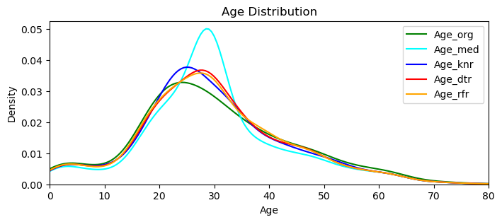
This graph reveals that all three models are performing ‘closer‘ (to the original values) than the one that we simply applied the median (cyan colored one). I’ll go with the Random Forest Regressor, that looks closer to the original distribution.
Side Note: Just to experiment further I did try xgboost as well, that is a totally new estimator to me. It performed very close to the Random Forest, but when the ‘Title’ variable were absent, it did give me minus values.
#Assigning the imputed values to the dataframe.
comb_data['Age'] = cd_age4_rfr["Age"]
4.8.3 Final Touches for the Consistency
Let me check what kind of new Age values got assigned, by observing their distributions within the Titles and try to understand if there are some ‘unnatural’ ones.
comb_data.groupby(['Title'])['Age'].describe()| count | mean | std | min | 25% | 50% | 75% | max | |
|---|---|---|---|---|---|---|---|---|
| Title | ||||||||
| 0 | 61.0 | 5.580399 | 4.209563 | 0.33 | 2.0 | 4.000000 | 9.0 | 16.379548 |
| 1 | 265.0 | 21.504435 | 11.463785 | 0.17 | 16.0 | 21.000000 | 28.0 | 63.000000 |
| 2 | 760.0 | 32.194676 | 11.356700 | 11.00 | 24.0 | 29.090242 | 38.0 | 80.000000 |
| 3 | 200.0 | 36.648803 | 12.365398 | 14.00 | 27.0 | 35.000000 | 45.0 | 76.000000 |
| 4 | 23.0 | 46.442472 | 11.737553 | 23.00 | 41.5 | 50.000000 | 53.5 | 70.000000 |
It looks not bad. All the min and max values are the same as before, except the max value of the Masters (here ‘0’). Let me first check how many we have more than 14.5, that was the initial max amount for this title.
master_older = comb_data[(comb_data['Title'] == 0) & (comb_data['Age'] > 14.5)]
len(master_older)
1
We can easily change it to 14.5 and I don’t like the fractions that come with the new imputations. I’ll change them all (except the babies less than a year old) into either whole numbers or the xx.5 format that we had in the original dataset.
#Changing the imputed max amount of Master.
comb_data.loc[(comb_data['Title'] == 0) & (comb_data['Age'] > 14.5),'Age'] = 14.5

#Handling the fractions.
comb_data['Age'] = np.where((comb_data['Age'] >= 1), round(comb_data['Age']*2) / 2, comb_data['Age'])

#Checking the final situation.
comb_data.groupby(['Title'])['Age'].describe()| count | mean | std | min | 25% | 50% | 75% | max | |
|---|---|---|---|---|---|---|---|---|
| Title | ||||||||
| 0 | 61.0 | 5.542295 | 4.143711 | 0.33 | 2.0 | 4.0 | 9.0 | 14.5 |
| 1 | 265.0 | 21.496566 | 11.466829 | 0.17 | 16.0 | 21.0 | 28.0 | 63.0 |
| 2 | 760.0 | 32.198684 | 11.366513 | 11.00 | 24.0 | 29.0 | 38.0 | 80.0 |
| 3 | 200.0 | 36.655000 | 12.361330 | 14.00 | 27.0 | 35.0 | 45.0 | 76.0 |
| 4 | 23.0 | 46.434783 | 11.735053 | 23.00 | 41.5 | 50.0 | 53.5 | 70.0 |
4.9 SibSp & Parch (and Partners or not)
Let’s remember the numbers for these two columns, but this time with their respective proportions.
comb_data['Parch'].value_counts(normalize=True).mul(100).round(2).astype(str) + '%'0 76.55% 1 12.99% 2 8.63% 3 0.61% 5 0.46% 4 0.46% 6 0.15% 9 0.15% Name: Parch, dtype: object
comb_data['SibSp'].value_counts(normalize=True).mul(100).round(2).astype(str) + '%'0 68.07% 1 24.37% 2 3.21% 4 1.68% 3 1.53% 8 0.69% 5 0.46% Name: SibSp, dtype: object
It is clearly shown that the number of passengers with a single parent/child, or with a single sibling/spouse are quite low and the passengers with more than one of those relatives are extremely low. I tried a bunch of combinations to be able to understand the relationships between passengers, like
- No SibSp, but with min one Parch, or
- No Parch, but with min one SibSp, or
- No SibSp, but with more than two Parchs (assuming that they might be adults in this formula).
For me it is hard to define those connections (if there is any). For instance, we don’t know how Parch is described for someone who may have both parents and kids on board. This can go on and on. The distribution for SibSp and Parch is not ‘homogeneous’.
Remember how we realized (above in 3.7 SibSp) that checking passengers whose SibSp is greater than 4, is actually checking only two families! ‘Being with a family’ here may mean ‘being not-alone’, however maybe it is also a much stronger indicator of ‘being a member of a particular family/group’. Therefore I don’t think that it would be fair to examine the survival rates of those families/groups and come up with a generalization based on their circumstances.
Yet we also know the importance of being not alone under such extreme circumstances such as a disaster. To take into consideration this, yet also to eliminate the effect of being a member of a one particular family/group, I’ll approach with a much more broad and ‘inclusive’ way and cluster the passengers only into two groups: with someone or without.
For sure, we can’t be quite sure and we have to trust the data entry here.
# The number of passenger who did not mark any relatives.
singleton = comb_data[(comb_data['SibSp'] == 0) & (comb_data['Parch'] == 0)]
len(singleton)
790
Let’s create a column, titled Partner and count these 790 people as singles (without someone) and the rest as with someone.
# Creating a list of the conditions.
conditions = [
    (comb_data['SibSp'] == 0) & (comb_data['Parch'] == 0),
    (comb_data['SibSp'] >= 1) | (comb_data['Parch'] >= 1),
    ]

# Creating a list of the values that I want to assign for each condition.
values = [0, 1]

# Creating a new column and use np.select to assign values to it.
comb_data['Partner'] = np.select(conditions, values)

# Displaying updated DataFrame.
comb_data.head()| Survived | Pclass | Sex | Age | SibSp | Parch | Embarked | Title | Partner | |
|---|---|---|---|---|---|---|---|---|---|
| 0 | 0.0 | 3 | 1 | 22.0 | 1 | 0 | 0 | 2 | 1 |
| 1 | 1.0 | 1 | 0 | 38.0 | 1 | 0 | 1 | 3 | 1 |
| 2 | 1.0 | 3 | 0 | 26.0 | 0 | 0 | 0 | 1 | 0 |
| 3 | 1.0 | 1 | 0 | 35.0 | 1 | 0 | 0 | 3 | 1 |
| 4 | 0.0 | 3 | 1 | 35.0 | 0 | 0 | 0 | 2 | 0 |
# Double-checking the changes.
comb_data['Partner'].value_counts()
0 790 1 519 Name: Partner, dtype: int64
There may be passengers who did not marked them as family or who are on board with a friend too. Now let’s try to enrich this by considering that ‘dublicate’ Tickets that I mentioned in the 1st phase of EDA (in 3.9 Ticket). For this I’ll need Ticket column again.
# Getting the Ticket column back into the dataframe.
comb_data['Ticket'] = df['Ticket']

# The number of 'singles' that holds identical tickets with someone else.
friend_tickets = comb_data[(comb_data.duplicated('Ticket') == True) & (comb_data['SibSp'] == 0) & (comb_data['Parch'] == 0)]
len(friend_tickets)
80
80 passengers had same ticket codes and yet get on board without a ‘relative’. Yes, we can’t be sure that they were really together, or even so that they were close enough. But then we may have ‘not-that-close-relatives’ within those families too, or real acquaintances without any sign (SibSp, Parch or same code) on the ticket. / I’ll count these 80 passengers* as they were accompanied by others too.
*Side Note: I double-check the followings too: 44 of them were in train set and 21 of those survived.
# Changing their Partner status.
comb_data['Partner'] = np.where((comb_data.duplicated('Ticket') == True) & (comb_data['SibSp'] == 0) & (comb_data['Parch'] == 0), 1, comb_data['Partner'])

# Checking the changes.
comb_data['Partner'].value_counts()
0 710 1 599 Name: Partner, dtype: int64
4.9.1 Partner (and Survival)
I want to quickly check the survival rates within this new Partner column as well:
sns.countplot(x='Partner', hue='Survived', data=comb_data)
plt.title('Survival by Partner')
plt.legend(title='Survived', labels=['No', 'Yes'])
plt.show()
Looks like, being with someone ‘moderates’ the survivals, but being alone most-likely ‘harms’ the rate. But I am not saying these as an outcome. This Partner variable is just to mark those who may have someone onboard they were acquainted with, that’s all. Looking only to this graph won’t be an accurate approach! But I believe considering the relationships of the passenger in such a broad way is more fair than looking every single families seperately.
# Dropping these columns out, but keeping the Partner variable in.
comb_data = comb_data.drop(columns=['Ticket', 'SibSp', 'Parch'])
#Final list of the columns.
comb_data.info()<class 'pandas.core.frame.DataFrame'> Int64Index: 1309 entries, 0 to 417 Data columns (total 7 columns): # Column Non-Null Count Dtype --- ------ -------------- ----- 0 Survived 891 non-null float64 1 Pclass 1309 non-null int64 2 Sex 1309 non-null int64 3 Age 1309 non-null float64 4 Embarked 1309 non-null int64 5 Title 1309 non-null int64 6 Partner 1309 non-null int64 dtypes: float64(2), int64(5) memory usage: 81.8 KB
5 Prediction with Different Models
At long last, here I am to build some models and get the predictions. Even though I am not after scoring high in the competition, I still need to do this and compare the results. I’ll start with Logistic Regression and then try three more models: K-Neighbors Classifier, Decision Tree Classifier and finally Random Forest Classifier. At the end I’ll compare their performs.
I will use all the remaining columns as variables and I already convinced myself with the decisions I took in the above steps, yet anyway I want to quickly check the correlation matrix as well.
corr_matr = comb_data.corr()
sns.heatmap(corr_matr, annot=True, cmap='coolwarm', square=True)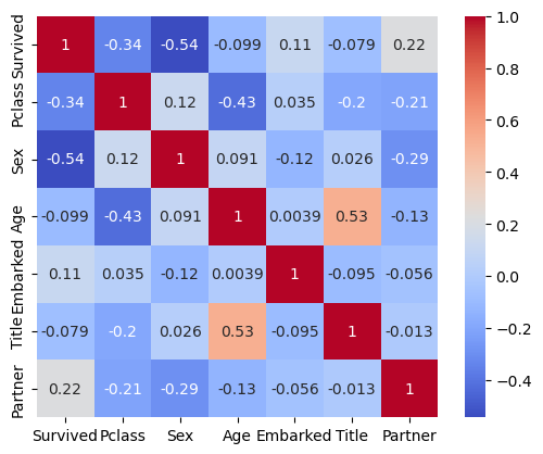
5.1 Split into Train and Test Sets
First I need to split the data back to its original train and test sets. But to get our model’s score, we need the PassengerId column back too.
comb_data['PassengerId'] = df['PassengerId']
comb_data = comb_data[['PassengerId'] + [col for col in comb_data.columns if col != 'PassengerId']] #Locating it at the beginning.(not a must though)
comb_data.head()| PassengerId | Survived | Pclass | Sex | Age | Embarked | Title | Partner | |
|---|---|---|---|---|---|---|---|---|
| 0 | 1 | 0.0 | 3 | 1 | 22.0 | 0 | 2 | 1 |
| 1 | 2 | 1.0 | 1 | 0 | 38.0 | 1 | 3 | 1 |
| 2 | 3 | 1.0 | 3 | 0 | 26.0 | 0 | 1 | 0 |
| 3 | 4 | 1.0 | 1 | 0 | 35.0 | 0 | 3 | 1 |
| 4 | 5 | 0.0 | 3 | 1 | 35.0 | 0 | 2 | 0 |
train_data = comb_data.iloc[:891,:]
test_data = comb_data.iloc[891:,:]train_data.info()<class 'pandas.core.frame.DataFrame'> Int64Index: 891 entries, 0 to 890 Data columns (total 8 columns): # Column Non-Null Count Dtype --- ------ -------------- ----- 0 PassengerId 891 non-null int64 1 Survived 891 non-null float64 2 Pclass 891 non-null int64 3 Sex 891 non-null int64 4 Age 891 non-null float64 5 Embarked 891 non-null int64 6 Title 891 non-null int64 7 Partner 891 non-null int64 dtypes: float64(2), int64(6) memory usage: 62.6 KB
test_data.info()<class 'pandas.core.frame.DataFrame'> Int64Index: 418 entries, 0 to 417 Data columns (total 8 columns): # Column Non-Null Count Dtype --- ------ -------------- ----- 0 PassengerId 418 non-null int64 1 Survived 0 non-null float64 2 Pclass 418 non-null int64 3 Sex 418 non-null int64 4 Age 418 non-null float64 5 Embarked 418 non-null int64 6 Title 418 non-null int64 7 Partner 418 non-null int64 dtypes: float64(2), int64(6) memory usage: 29.4 KB
5.2 Normalization
# Creating X, y from the data frame.
feature_columns = ['Age', 'Pclass', 'Sex', 'Partner', 'Embarked', 'Title']
X = train_data[feature_columns].values
y = train_data['Survived'].values

X_test = test_data[feature_columns].values
y_test = test_data['Survived'].values
# Feature scaling.
from sklearn.preprocessing import StandardScaler
scale = StandardScaler()
X_scaled = scale.fit_transform(X)
X_test_scaled = scale.transform(X_test)5.3 Creating ML Model 1: Logistic Regression
from sklearn.linear_model import LogisticRegression
from sklearn.neighbors import KNeighborsClassifier
from sklearn.tree import DecisionTreeClassifier
from sklearn.ensemble import RandomForestClassifier

from sklearn.metrics import classification_report, confusion_matrix
model_lr= LogisticRegression(random_state=2)
model_lr.fit(X_scaled, y)#Predicting the test set results.
y_predict_m1_lr = model_lr.predict(X_test_scaled)accuracy_score_lr = round(model_lr.score(X_scaled, y) * 100, 2)
print("Accuracy of LogisticRegression for train set:", accuracy_score_lr, "%")Accuracy of LogisticRegression for train set: 80.02 %
confusion_matrix(y, model_lr.predict(X_scaled))array([[473, 76],
[102, 240]])
5.3.1 Calculating my own probability of survival
# Age: 41 / Class: 2 / Sex: 1 - male
# Partner: 1 - with my wife
# Embarked: 0 - assume, boarded in Southampton
# Title: 2 - Mr

X_alper = pd.DataFrame([[41, 2, 1, 1, 0, 2]])
X_alper_scaled = scale.transform(X_alper)

# Using the model to predict the outcome for me.
pred_prob = model_lr.predict_proba(X_alper_scaled)
print(f"Probability of survival for Alper: {pred_prob[0][1]*100:.2f}%")
Probability of survival for Alper: 15.11%
My own survival probability is very low. If I would have a 3rd class ticket, the rate drops down to less than 5%, travelling in 1st class raises the rate up to 39% for me.
5.4 Creating ML Model 2: K-Neighbors Classifier
model_knn = KNeighborsClassifier(n_neighbors=5)

# Fitting the model.
model_knn.fit(X_scaled, y)

# Predicting the test set results.
y_predict_m2_knn = model_knn.predict(X_test_scaled)
accuracy_score_knn = round(model_knn.score(X_scaled, y) * 100, 2)
print("Accuracy of KNeighborsClassifier for train set:", accuracy_score_knn, "%")Accuracy of KNeighborsClassifier for train set: 86.53 %
confusion_matrix(y, model_knn.predict(X_scaled))array([[500, 49],
[ 71, 271]])
5.5 Creating ML Model 3: Decision Tree Classifier
model_dtc = DecisionTreeClassifier(max_depth=5, random_state=2)

# Fitting the model.
model_dtc.fit(X_scaled, y)

# Predicting the test set results.
y_predict_m3_dtc = model_dtc.predict(X_test_scaled)
accuracy_score_dtc = round(model_dtc.score(X_scaled, y) * 100, 2)
print("Accuracy of DecisionTreeClassifier for train set:", accuracy_score_dtc, "%")Accuracy of DecisionTreeClassifier for train set: 84.18 %
confusion_matrix(y, model_dtc.predict(X_scaled))array([[530, 19],
[122, 220]])
5.6 Creating ML Model 4: Random Forest Classifier
model_rfc = RandomForestClassifier(n_estimators=100, max_depth=5, random_state=2)

# Fitting the model.
model_rfc.fit(X_scaled, y)

# Predicting the test set results.
y_predict_m4_rfc = model_rfc.predict(X_test_scaled)
accuracy_score_rfc = round(model_rfc.score(X_scaled, y) * 100, 2)
print("Accuracy of RandomForestClassifier for train set:", accuracy_score_rfc, "%")Accuracy of RandomForestClassifier for train set: 84.51 %
confusion_matrix(y, model_rfc.predict(X_scaled))array([[523, 26],
[114, 228]])
5.7 Comparing the ML Models
The below table shows a comparison of the four models on train dataset. I can’t tell how they will perform on test set before I submit them seperately, but propably they’ll perform lower.
| Train Score | 0:0 | 0:1 | 1:0 | 1:1 | |
|---|---|---|---|---|---|
| Log Reg | 80.02 % | 473 | 76 | 102 | 240 |
| K-NN | 86.53 % | 500 | 49 | 71 | 271 |
| Des Tre | 84.18 % | 530 | 19 | 122 | 220 |
| Ran For | 84.51 % | 523 | 26 | 114 | 228 |
5.7.1 Reading the Results
Before interpreting the results, I want to underline that these insights shouldn’t be read as the concrete outcome for the following reasons:
- These scores are based on the train-set, hence the data that our models have already seen.
- Again, my main motivation is not high scores, but understanding the structure of these models.
- Said that, there are many other models to be studied with.
- Any slight tweaks in the parameters of the regressors would change the results. Therefore, I tried to stay within the default boundaries of them.
5.7.2 Comparing the Results
- Overall (with the above configurations), the K-Neighbour performs the best and the Logistic Regression the worst.
- While K-Neighbour predicts the Survived ones the best, both Tree-Models performs better on predicting the Victims.
- While Logistic Regression predicts the Victims the worst, it performs better than both of the Tree-Models on predicting the Survived ones. (Side Note: On some of my iterations, Desicion Tree reached Logistic Regression, Random Forest could not)
5.7.3 Tweaking the Parameters
Even though I wanted to keep this as simple as possible, I also played with the adjustments slightly out of curiosity and to understand the model’s behaviours better.
- K-Neighbour: 86.53% (n neighbour:5) > 83.05% (n:11) > 82.72% (n:21) > 80.25% (n:31)
- Decision Tree: 84.18% (max depth:5) > 91.36% (d:10) > 93.49% (d:15) > 93.49% (d:20)
- Random Forest: 84.51% (max depth:5) > 92.82% (d:10) > 93.49% (d:15) > 93.49% (d:20)
Looks like, Trees getting overfit while getting deeper in max-depth.
5.7.4 Final Words on Model Comparison
Since my main aim is to understand the models’ behavior better, here are the inferences I could come up with:
- K Neighbour‘s slightly better performance might be coming from its type that is of instance-based learning, hence non-generalizing learning.
- Mostly I am somehow distant to the decision trees, because whenever I checked their results visually, it seems to be they are not ‘natural’ at all. They don’t provide smooth, continuous lines. I guess, exactly because of this behaviour they are prone to overfitting.
- In its documentation, it is recommended to balance the dataset prior to fitting with the decision tree. Therefore, I applied feature scaling above.
- I think Random Forests are to provide alternatives to individual decision trees, that tend to overfit by exhibiting high variances. However, here in this analysis both performs very similarly.
6 Going Forward
Takeaways
What I learned:
- Data analysis is an iterative work. I understand the importance of working with copies.
- When facing with missing values, it is easier to handle them with mean or median. But there may be more accurate approaches. They don’t even have to be much complicated.
- Numeric correlations don’t necessarily mean ‘real’ relations, let alone hinting the causation.
Next Steps
If I’d have more time, I could study the followings:
❶ Since the data is publicly available, the survivals from the test-data can be gathered and the models’ performance could be studied further by considering different metrics, such as precision, f1-score or recall.
❷ Different ML models can be built.
❸ Some variables could be investigated further, such as trying to find some patterns in ticket codes or fare rates.
Previous Data Project
Next Data Project

Browse my projects by category:
ALL • Data • UX • Arch